Hello everyone  ,
,
Today I want to share a very simple guide that can really add a nice touch to your app.
It’s about a custom progress bar made entirely with native components.

Let’s get started!
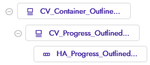
The layout is really simple
Two CardViews, one HorizontalArrangement, and the Decoration component.
The first CardView CV_Container_Outlined_Rounded (cornerRadius = 100) will be the outline of our progress bar, while the second CardView CV_Progress_Outlined_Rounded (cornerRadius = 100) and the HorizontalArrangement HA_Progress_Outlined_Rounded (starting width = 0) will form the progressive bar.
The blocks are also few and simple.
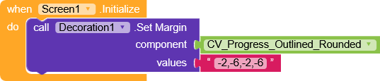
During the screen initialization, we set the negative margins on
CV_Progress_Outlined_Rounded to get the same spacing on all sides.
And this is the only function we’ll need
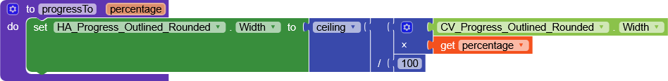
it sets the width of
HA_Progress_Outlined_Rounded.
At this point, it’s enough to call the function with the percentage you want the bar to reach

(very handy for events where you’re given the loading percentage, otherwise you’ll need to do a bit more calculation).
AIA
CustomLinearProgressBar.aia (13.1 KB)
That’s it
.
.
.
Ok, that’s not true  ,
,
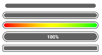
Although I had never used this progress bar in other ways, I thought of creating some other variants as well to show the potential of building your own custom progress bar.
AIA
CustomLinearProgressBars.aia (15.3 KB)
There are really only minimal variations between them, but each one has its own character.
If something isn’t clear, feel free to ask.
Happy  oding!
 b
b