I accept any designer tip that makes the screens prettier, whether with a background image, background color, lettering or anything visual.
the work theme is smart home, it’s an app that controls the lights in a house.
These are some screens you have.
Get inspired by dribbble.com
Do not exaggerate in colors
Use a color palette template
Buttons can be curved by inserting them into a CardView
Look for more standard icons - Material Icon -Google
Fonts Google Fonts
3 Likes
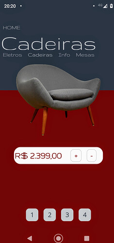
Well, if you want design tips then you should study some designing theory.
You should:
- Do not use Button component and use more Card view component as button.
- Stop using ugly images and instead use icons from Material Design or Font Awesome.
- Choose your brand color and use it in design.
- Maybe you can change font which fits in your design.
1 Like