Hello community,
When I run my application on phones with a small screen, it looks like this;
but when I run it on a normal sized phone it looks like this;

How do I make it look right on both phones ?
Hello community,
When I run my application on phones with a small screen, it looks like this;
but when I run it on a normal sized phone it looks like this;
How do I make it look right on both phones ?
If your card views radius is set to 100, then change it to 50.
i did but the problem continues 
radius 20
And how to you set height and width ? Using persentage or not ?
I set it as a percentage
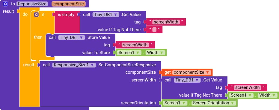
Use this extension to make your app 100% responsive in both orientations.
And use this procedure created by me woth this extension for more effective work.
did not help solve this problem
What’s the error?
what’s the result you are getting that should be show us