Maybe themes bacame harder to change.
We should wait for Admins’ reply.
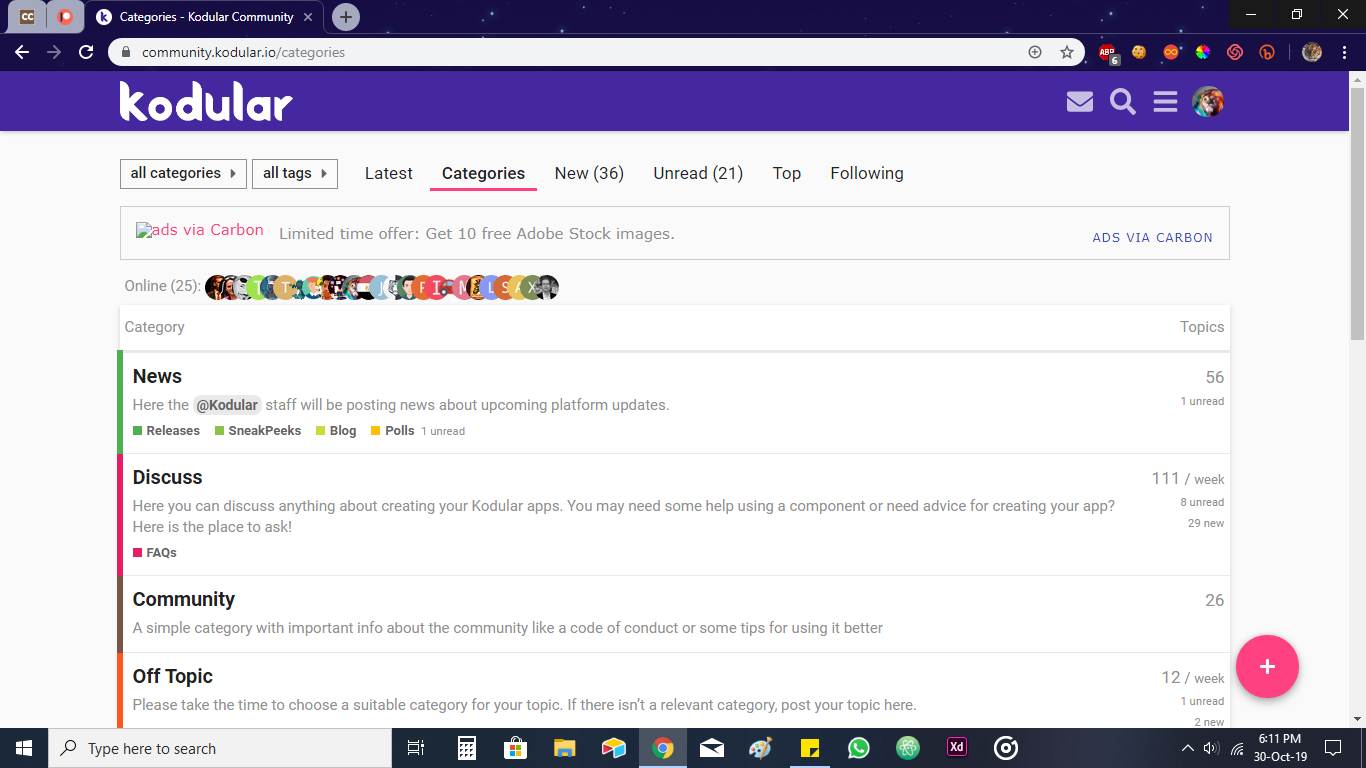
The home panel has been split into two pages. Earlier, both categories and latest topics used to be shown together.
2 Likes
Oh I didn’t noticed it because I got used with it 
1 Like
But I think most of the users (including me) liked the old way of categories and latest topics to be shown together.
And I’m also noticing the changed colours of topic tags.
1 Like
Your votes say otherwise
4 Likes
That’s true but just saying that I was used to that look.
You can easily change the view, there is an answer above that indicates how
1 Like
I would like to go back to the previous one
same here 

1 Like
#me_too want the previous version of community forum
1 Like
Yes previous kodular community design was much better
1 Like
I did not vote or I think you saw not the vote originally


No…
Nothing has been changed…
Nothing has been split…
If you want to see Categories + Latest topics pick Categories tab
If not, pick Latest
That has been like that forever
2 Likes
Ummm, @Diego
Categories tab shows full width categories… Not like previous main page (half categories, half latest)
1 Like
I tried it already we want old design
1 Like
Yes problem ia everytime when we go back from post dropdown sets to latest so this shows that type but before the default option of dropdown is categories and if it set to categories after backing from post its default if latest
1 Like
we request to put categories and latest posts side by side as before. can you pleasee do it back to normal.
3 Likes