Bubble Picker extension is a circular form of the slider with a smooth animation.
The extension includes customization of Background Gradient Colors, text view in the picker and more 
Blocks
Here is the usage of all the blocks.-
Value changed

- Event is fired when any bubble picker’s value is changed. Value is the changed value with the id being the picker’s id.
-
Create animation
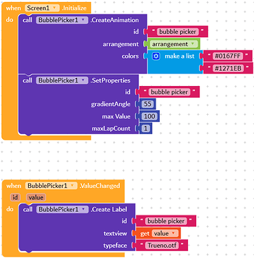
- Creates the Bubble Picker animation in the view. Any views in the given arrangement will be removed before adding the picker into it. The colours parameter accepts a list of colours for the gradient. The colour value can be a normal colour block or colour from a hex value.
-
Set properties

- Sets the gradient angle, max value (starting from 1 to given value) and the max lap count. MaxLapCount should be the number of rounds the the user has to do to hit the max value.
-
Create a label

- Creates a text view on the centre of the animation. Textview parameter can be a label or simple text block. If you provide it with a Label component, the extension will apply those properties to the text view on the animation. The typeface can be an asset or file path from external storage. Use the empty value for typeface if a custom typeface is not needed.
Demo blocks
Below are the demo blocks to create a simple bubble picker animation.
Extension
- Download extension: xyz.kumaraswamy.bubblepicker.aix (30.1 KB)
- Google Drive: Extension - Bubble Picker
Check the result video - YouTube.
The extension is built with Rush :)
Check out the extension sources on GitHub.


