Hi!
I want to detect a click on a vertical arrangement, but it has many labels and other arrangements inside that don’t allow it.
How can I do that?
Thank you very much for your answers!
If you don’t use the dynamic extension, try enabling the Full Clickable Option on Properties
Hi!
I use the Dynamic extension… and I don’t see the Full Clicable option on the vertical arrangement properties
There isn’t a fullclickable property in an arrangemnt.
You may wait for the next update of my [FREE] Component tools extension i’m putting the fullclickable property in my to-do list ![]()
I solved the problem changing all the spaces for labels without text and using the the Any component click block.
Thank you very much for your answers!
It’s true ![]()
In my case, i built whole arrangement within Card view with full clickable option enabled and it worked well without any issues, by the way i set all side margins to “0-zero” and no radious too - to have like regular vertical or horizontal look.
Actually, i prefer this because ANY card or any arrangement click option may not be helpful in case if there are more than one but seperate arrangements.
Just sharing my experience thinking it might be helpful to someone like me who struggled a lot to know this ![]() . And this is with default available options without any extensions.
. And this is with default available options without any extensions.
Hello @Mohamed_Tamer
hope you are doint well ![]()
I just read that you are on the way to add fullclickable property for components.
I suppose it will be available for arrangement which is in my case a big feature that I’m very impatient to get !!
Maybe the udpate to the Component Tool extension is ready soon ? ![]()
Thanks for all your crazy work ! ![]()
I will just finish a bug with Repositioning tools and then i will update the component tools as soon as possible ![]() I think the block code is finished just waiting for release
I think the block code is finished just waiting for release
Suggestion:
This can be achieved by using Card view as your arrangement and set it to full clickable.
Padding can be adjusted to 0 to make it looks like vertical arrangement.
Without using any extension.
Actually this is what i’ just tested but i’m facing a difference.
The cardview is ot fitting the entire width of the screen, but an arrangement is align left/rigth with screen border.
My goal is to create a screen with different clickable part separated with borders. Each part is fully clickable event if there are component inside it (checkbox, image, labels,…). Most of app have this in their parameter screen.
Here Gmail app:
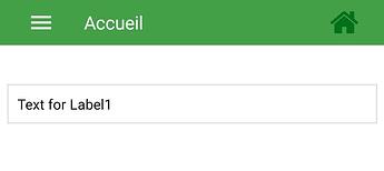
My result with CardView component Grren Action bar is made with an arrangement):
I’m searching a way to do it since a lot of time but here nobody already answered me ![]()
Don’t use card view stroke width as border, instead of that take horizontal arrangement on both sides that means on above and below of the card view.
Set horizontal arrangement height to 1px. This will work as border line, background colour to black or grey.
Set card view width to fill parent, height to automatic, paddings 0 and most imp as full clickable.
Everything is possible, you just need to play with some logic. Try new things. ![]()
If you want to ask anything regarding UI designing, you can ask here.
@The_K_Studio : I already tested it too ! ![]()
But I’m not able to set the height of my “border” arrangement to 1px… If i set 1 it means 1% and then the border is really too big ![]()
I will remember this and PM if any ![]()
![]()
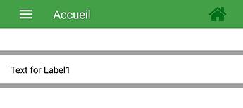
Tested with 1 for Horizontal Arrangement height:
You have to type “p” and “x” after 1 to set height in pixels. ![]()
Oh ok, I just learnt something ![]()
This topic was automatically closed 30 days after the last reply. New replies are no longer allowed.


