Dynamic Delivery Listview
Hello Awesome Friends!
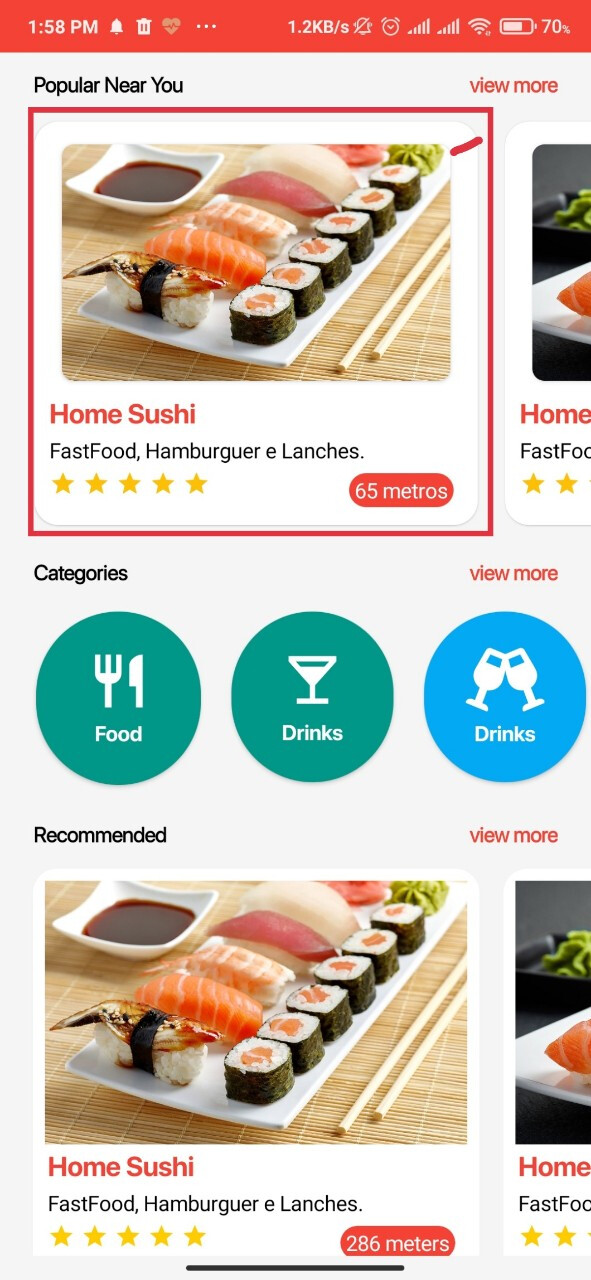
Today i present to you a very simple and clean UI for a Delivery app that i found on Behance. The design was quite impressive so I thought why not make it with dynamic components extension. The source code is open source so anyone can use it freely.
Design Reference : https://www.behance.net/gallery/92019977/Groad-Food-Ordering-System-UIUX-Case-Study?tracking_source=search_projects_recommended|food%20figma%20mobile
Screenshots of my design
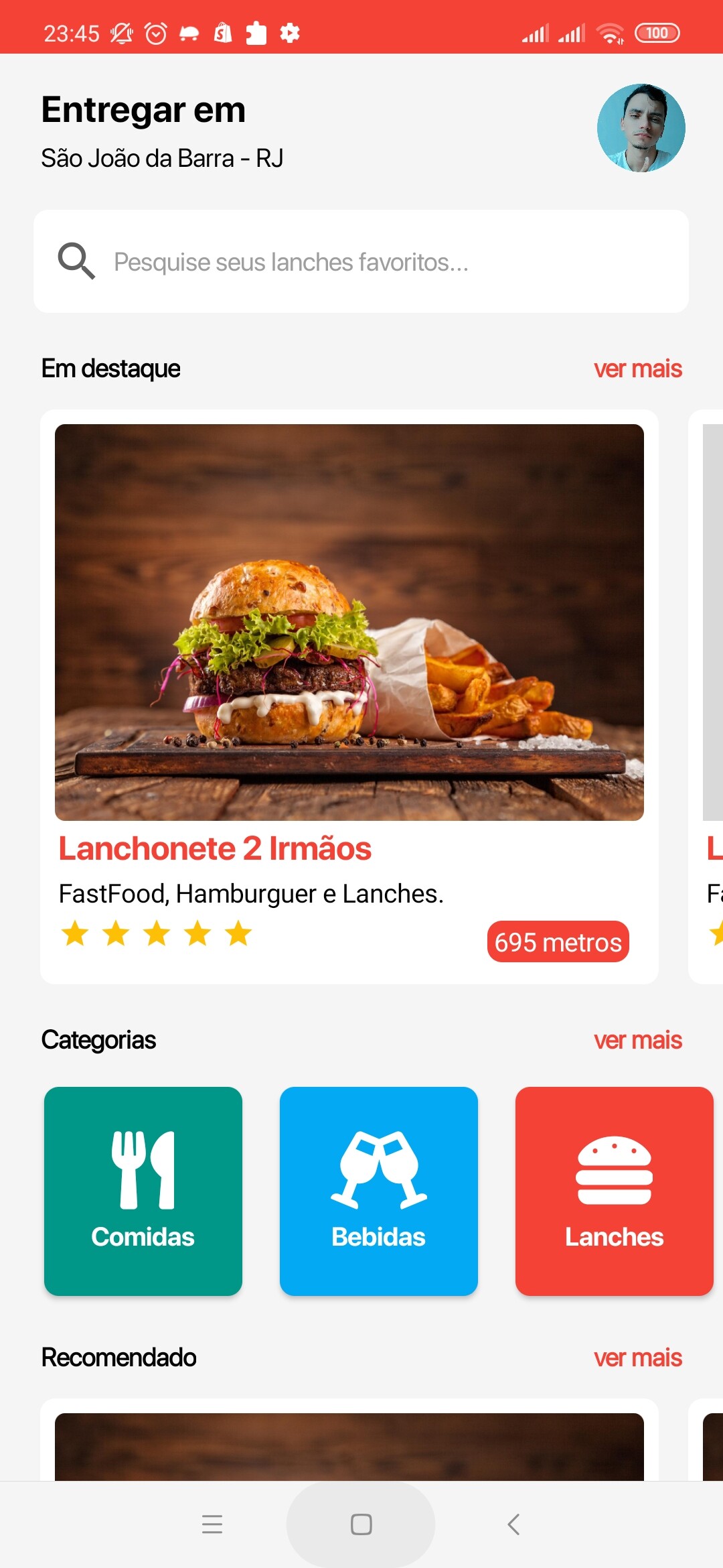
The main part of this design which is the images and its descriptive labels are fully dynamic and fully customizable. Therefore you can change any part of the design according to your desire.
JSON Template
{
“name”: “Dynamic Delivery Listview”,
“metadata-version”: 1,
“author”: “Thiago Cavalcanti”,
“platforms”: [
“Kodular”
],
“keys”: [
“count”,
“image”,
“image2”,
“title”,
“sub”,
“review”,
“tempo”
],
“components”: [
{
“id”:“cardz_{count}”,
“type”:“MakeroidCardView”,
“properties”: {
“WidthPercent”: 90,
“Height”: 320,
“CornerRadius”: 8,
“Elevation”:0,
“FullClickable”: true
},
“components”: [
{
“id”:“img_{count}”,
“type”:“VerticalArrangement”,
“properties”: {
“Width”: -2,
“Height”: -2
},
“components”: [
{
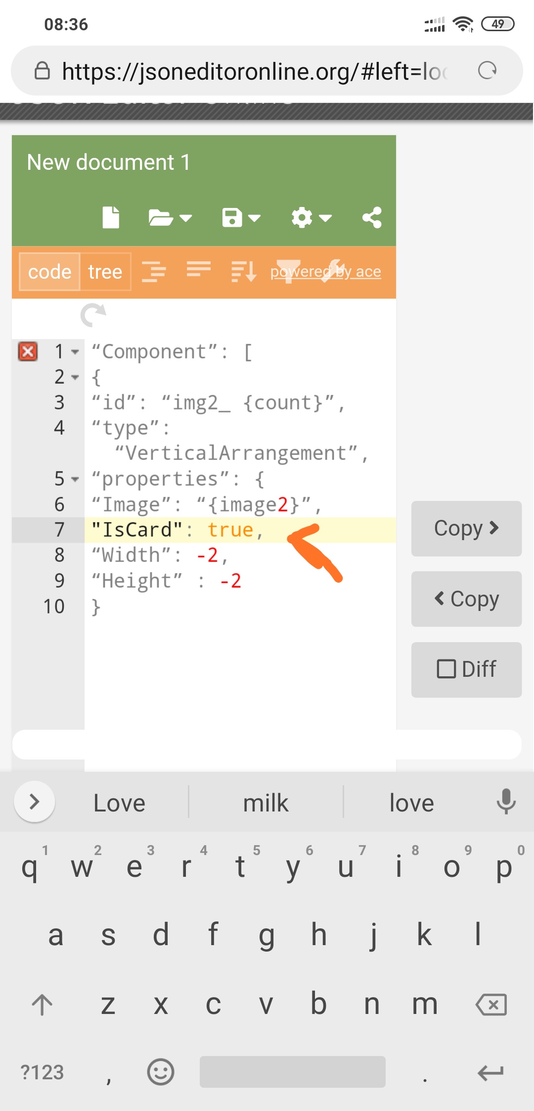
“id”:“img2_{count}”,
“type”:“VerticalArrangement”,
“properties”: {
“Image”: “{image2}”,
“Width”: -2,
“Height”: -2
}
}
]
},
{
“id”:“title_{count}”,
“type”:“Label”,
“properties”: {
“Text”: “{title}”,
“FontSize”: 18,
“FontColor”: -769226
}
},
{
“id”:“sub_{count}”,
“type”:“Label”,
“properties”: {
“Text”: “{sub}”,
“FontSize”: 14
}
},
{
“id”:“hz_{count}”,
“type”:“HorizontalArrangement”,
“properties”: {
“Width”: -2
},
“components”: [
{
“id”:“star_{count}”,
“type”:“Label”,
“properties”: {
“Width”: -2,
“Text”: “{review}”,
“FontSize”: 18
}
},
{
“id”:“circle_{count}”,
“type”:“MakeroidCardView”,
“properties”: {
“Elevation”:0,
“ContentPaddingTop”:0,
“ContentPaddingLeft”:2,
“ContentPaddingRight”:2,
“ContentPaddingBottom”:0,
“CornerRadius”: 8,
“BackgroundColor”: -3355444
},
“components”:[
{
“id”:“tempo_{count}”,
“type”:“Label”,
“properties”: {
“Text”: “{tempo}”,
“FontSize”: 14
}
}
]
}
]
}
]
}
]
}
Free aia
ListViewDelivery.aia (5.2 MB)