Hello, seeing that the borders on visual elements (Buttons, text boxes and cards) are turning design pattern into many applications out there, I decided to try my own solution with Kodular, and it worked, now I am sharing with you my solution.
The main
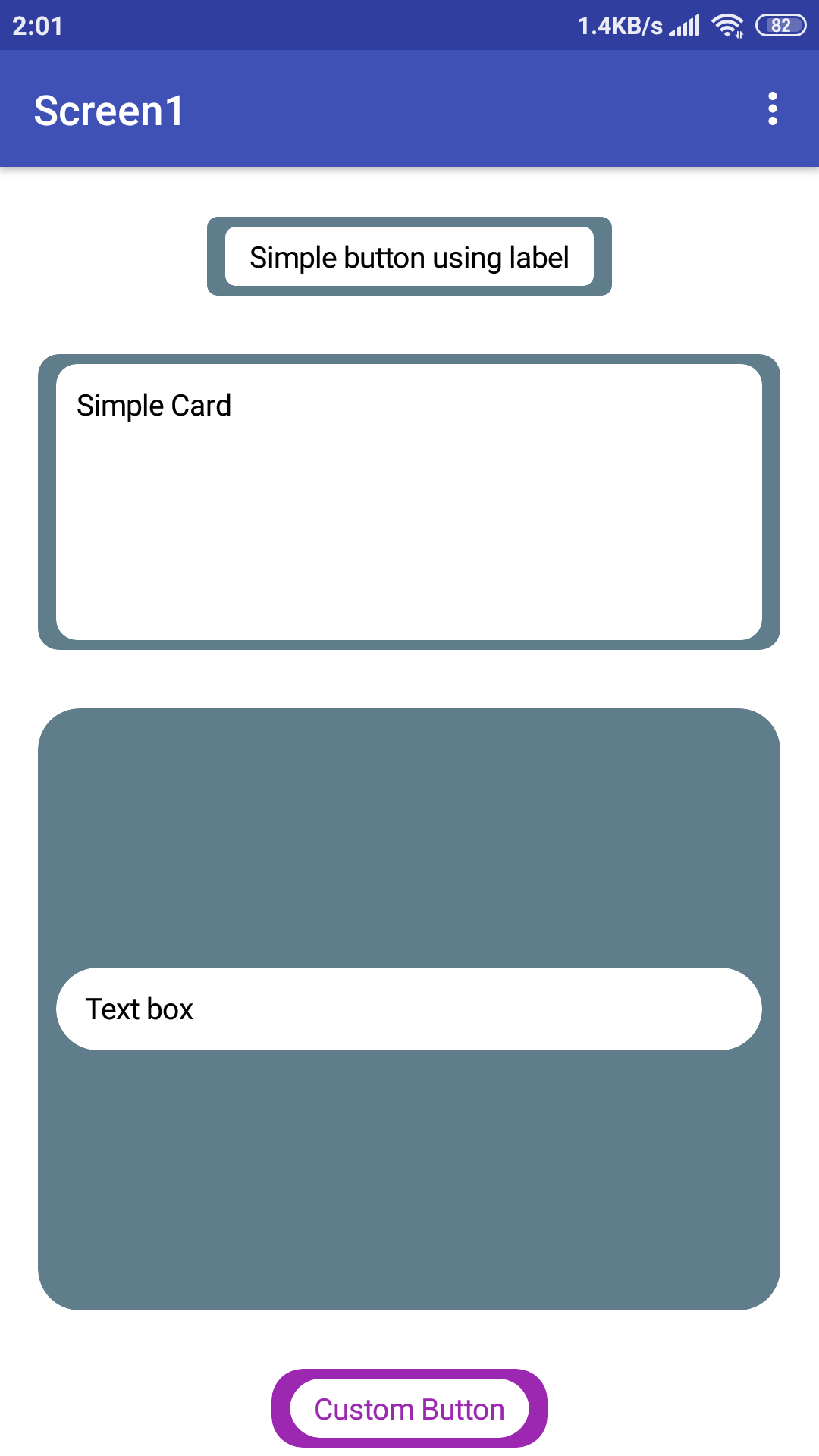
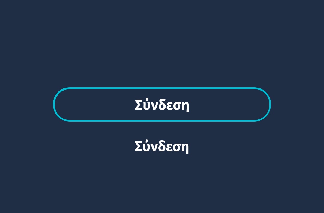
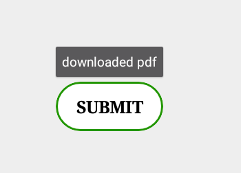
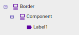
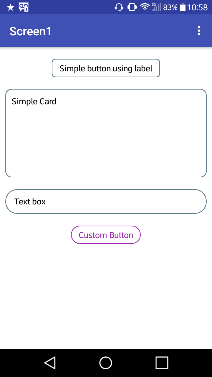
Add two cards, one will serve as the border, the other will house the elements, in which case I’ll use a label to create a button:
Why not a button?
The buttons have a “proper border” because of their shadow (even if the border shadow property is disabled), this makes the card view look extremely larger than the button, instead of being the same size, I preferred to use one caption to create my own button for this, but it stays at your will.
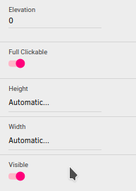
These will be the properties of the border:
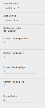
The background color you define, as well as the fill (which will serve as the border thickness), the radius of the border should follow the radius of the element you put inside the card view.
Now see different components with their edges:
AIA:
Border_Elements.aia (1,9 KB)