Image by Dev.to
Flexbox
Flexbox is a layout extension which brings the similar capabilities of CSS Flexible Box Layout Module to Android. I am super excited to share it with you.
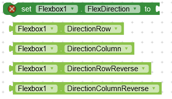
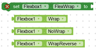
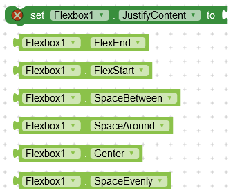
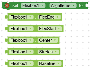
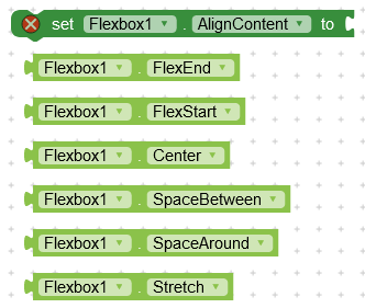
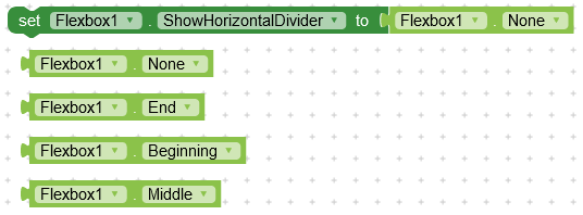
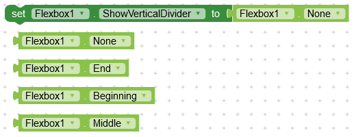
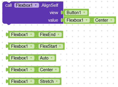
Note : All the possible values for a block are shown with that block in the image.
Docs

Create flexbox in a layout

Add a new component to the flexbox
Flex Container Properties
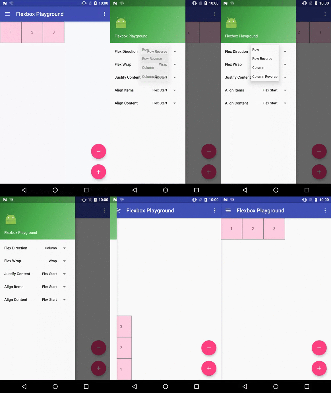
This attribute determines the direction of the main axis (and the cross axis, perpendicular to the main axis). The direction children items are placed inside the Flexbox layout.
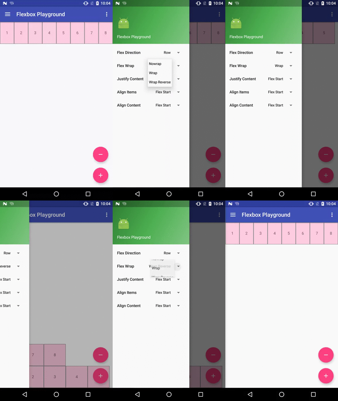
This attribute controls whether the flex container is single-line or multi-line, and the direction of the cross axis.
This attribute controls the alignment along the main axis.

This attribute controls the alignment along the cross axis.

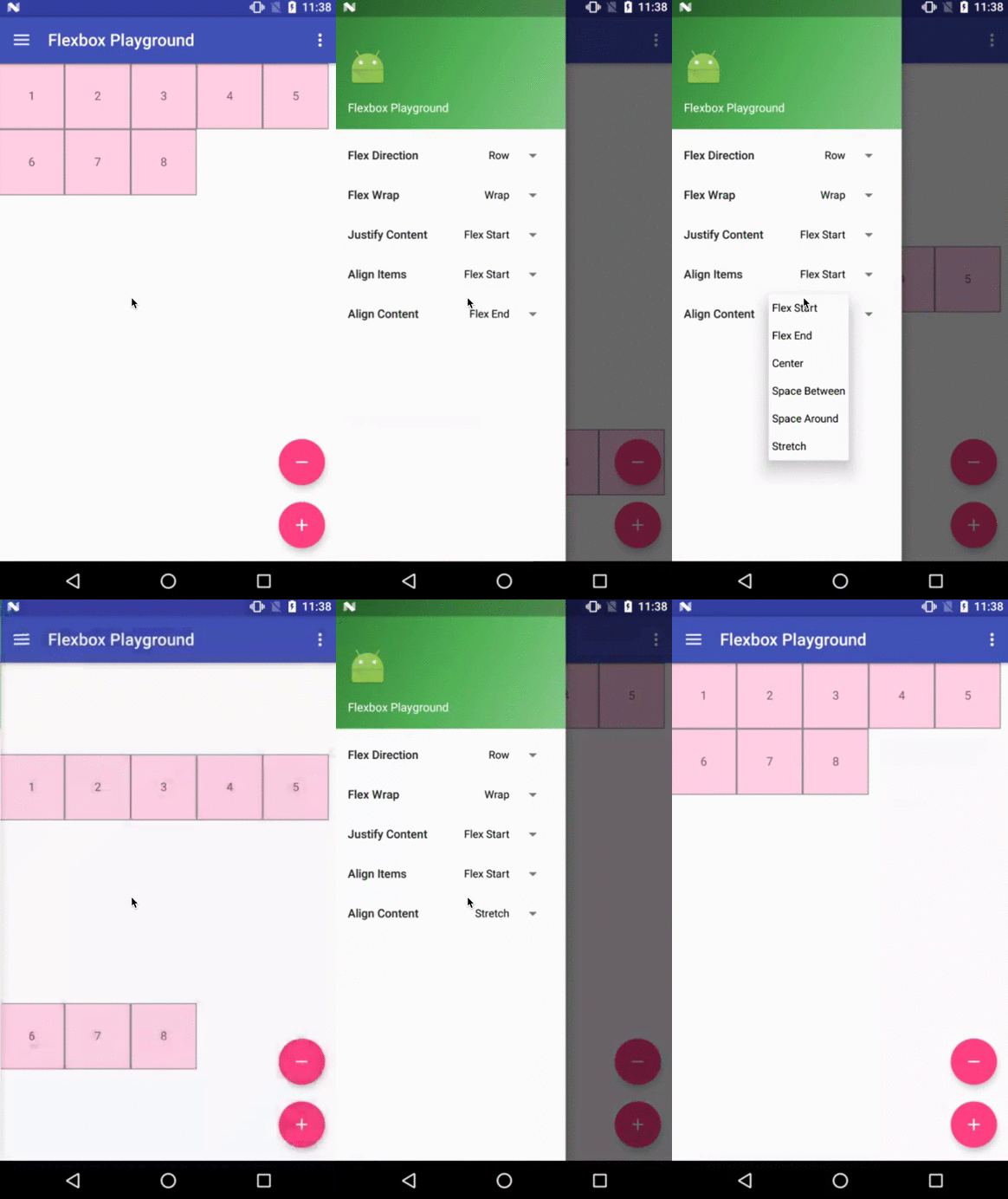
This attribute controls the alignment of the flex lines in the flex container.
![]()
Puts horizontal dividers between flex lines. Use asset images
![]()
Puts vertical dividers between flex lines
Specify the location where divider should be shown
Specify the location where divider should be shown
Flex Item Properties

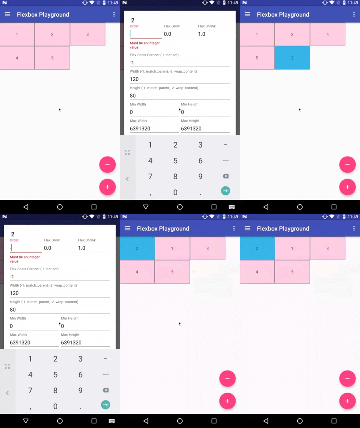
This attribute can change how the ordering of the children views are laid out. By default, children are displayed and laid out in the same order as they are added. If not specified, 1 is set as a default value.

This attribute determines how much this child will grow if positive free space is distributed relative to the rest of other flex items included in the same flex line. If a flex item has a positive lflexGrow value, the item will take up the remaining space in the flex line. If multiple flex items in the same flex line have positive flexGrow values, the remaining free space is distributed depending on the proportion of their declared flexGrow value.
In simple words, the component will try to cover the free space that is left in the current flex line.
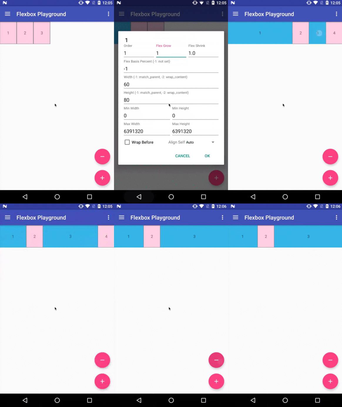

This attribute determines how much this child will shrink if negative free space is distributed relative to the rest of other flex items included in the same flex line. If not specified, 1 is set as a default value.
In simple words, the component will try to shrink to give space to other flex items

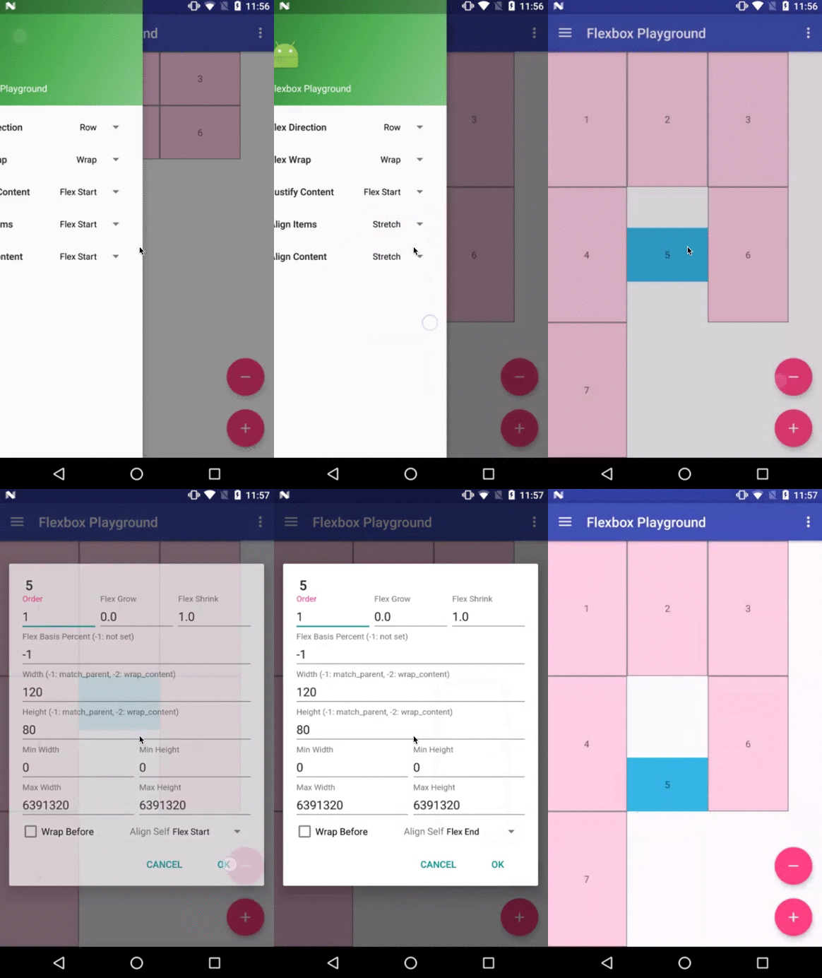
This attribute determines the alignment along the cross axis (perpendicular to the main axis). The alignment in the same direction can be determined by the alignItems in the parent, but if this is set to other than auto , the cross axis alignment is overridden for this child.

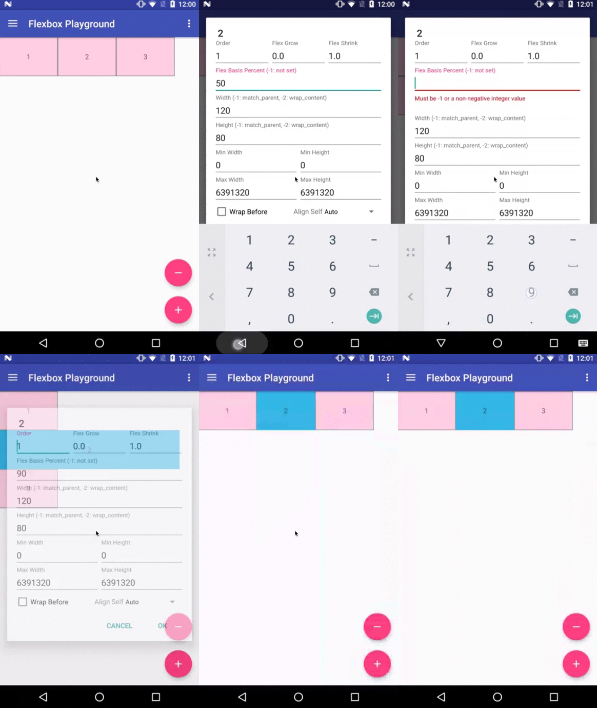
The initial flex item length in a fraction format relative to its parent. The initial main size of this child view is trying to be expanded as the specified fraction against the parent main size. If this value is set, the length specified from width (or height ) is overridden by the calculated value from this attribute.

This attribute imposes minimum width for the flex item. A child view won’t shrink less than the value of these attributes
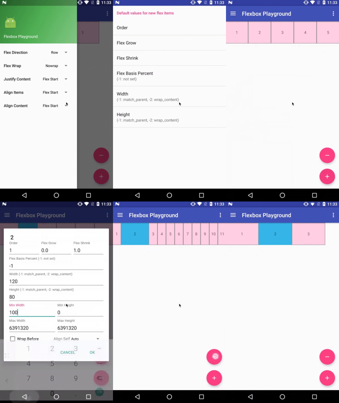

This attribute imposes maximum width for the flex item. A child view won’t be expanded more than the value of these attributes
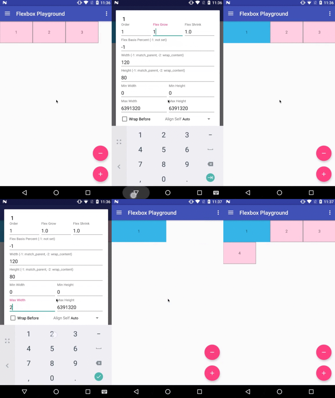

This attribute imposes minimum height for the flex item. A child view won’t shrink less than the value of these attributes


This attribute imposes maximum height for the flex item. A child view won’t be expanded more than the value of these attributes


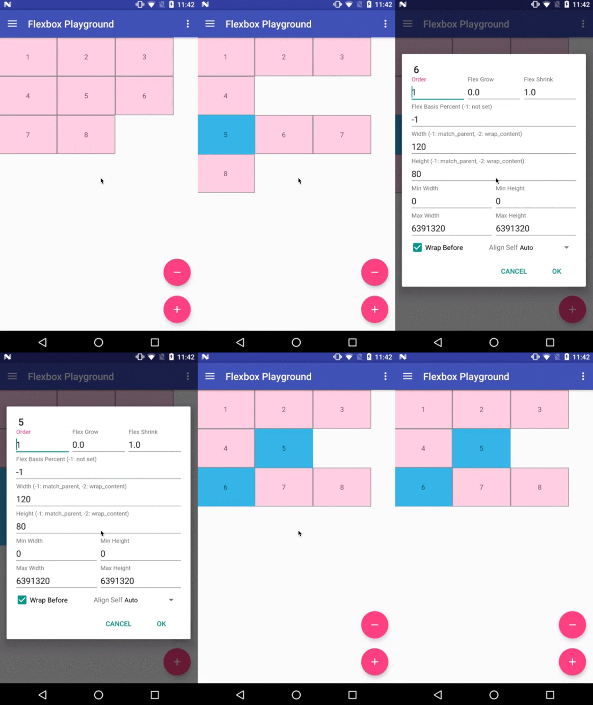
This attribute forces a flex line wrapping, the default value is false . i.e. if this is set to true for a flex item, the item will become the first item of a flex line. (A wrapping happens regardless of the flex items being processed in the previous flex line) This attribute is ignored if the flex_wrap attribute is set to nowrap .
Ahhhhhhhhh Finally. I hate writing docs ![]()
![]()
Downloads
Aix File : com.dreamers.flexbox.aix (52.8 KB)
Aia File : FlexBox.aia (55.5 KB)
I am sorry if I could not explain well. This is because Flexbox itself is very complicated if you see for the first time. However if you have used flexbox in css, then you wont get confused.
Special thanks to @KodularCreator for this platform and @Shreyash for super awesome Rush ( Specially for Kotlin )
