I don’t think so
fonts also look different on different devices
1 Like
Hmmm
April 13, 2021, 6:31am
22
@Amit_Narwal try using 5to6 times more than your font or height then it will be working proper
Amit_Narwal:
I don’t think so
No Amit its the best extension available,
Hmmm:
I tried everything for SAMSUNG old TouchWiz devices, even written thousands of blocks and tried many extensions, nothing fixed my problem in list view and in settings screen the problem was only in TouchWiz (like Galaxy J7 prime) and some old 16:9 models but an FREE extension did that and I tested all 16:9 devices available in my home and It worked GREAT.
1 Like
Excellent extension, I use it in my main project.
But now that I’m creating dynamic components, I don’t know how to implement them.
Any ideas?
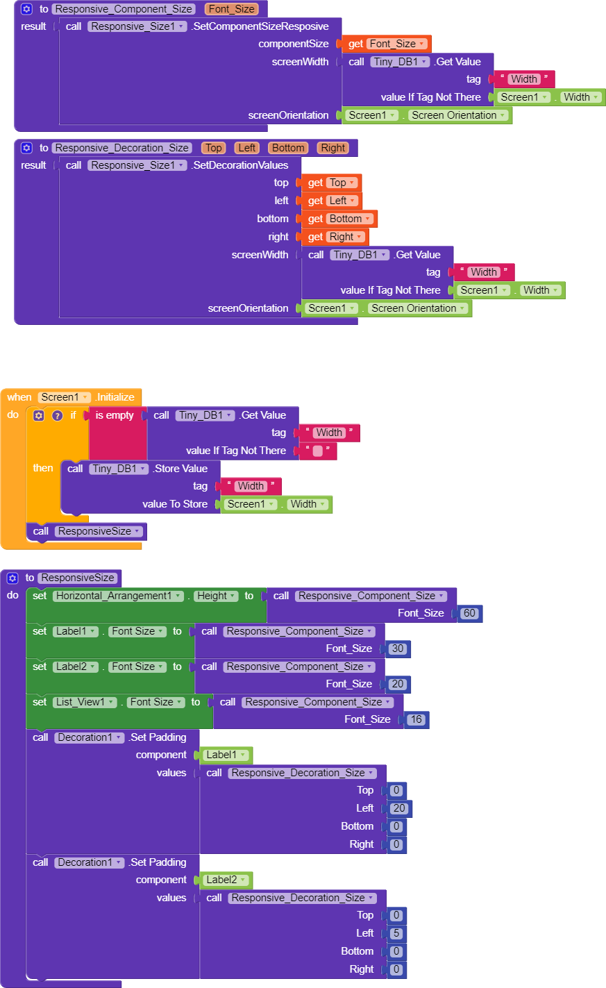
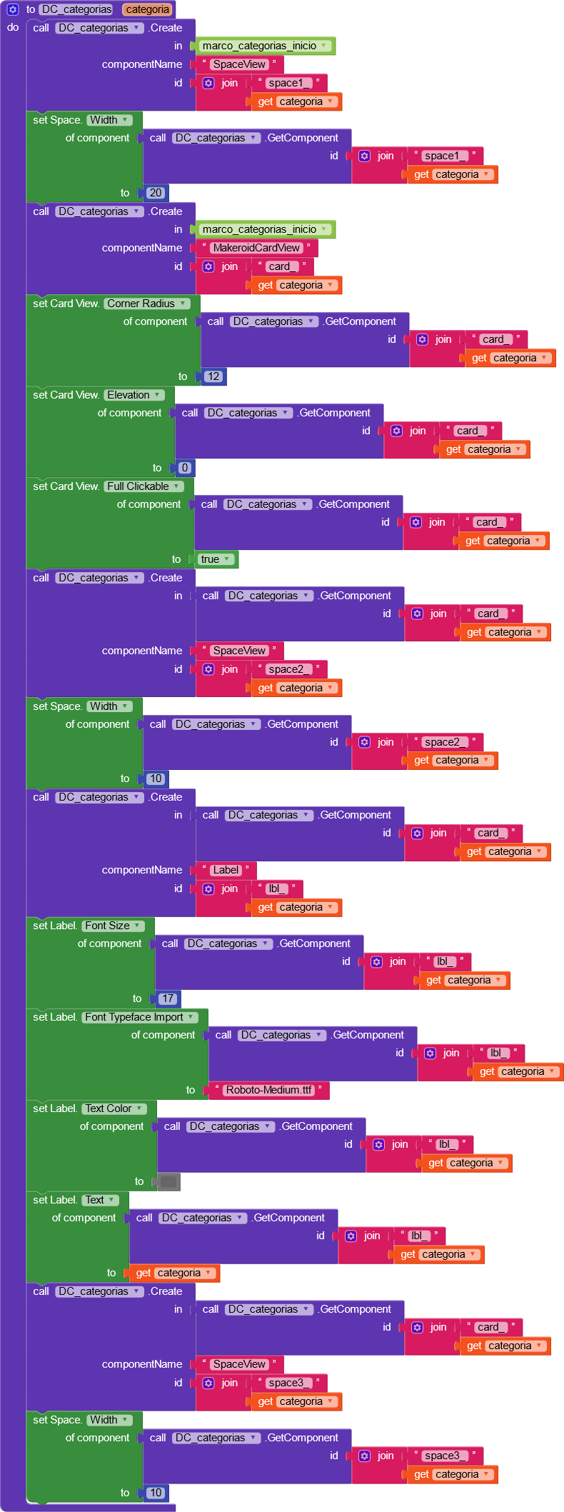
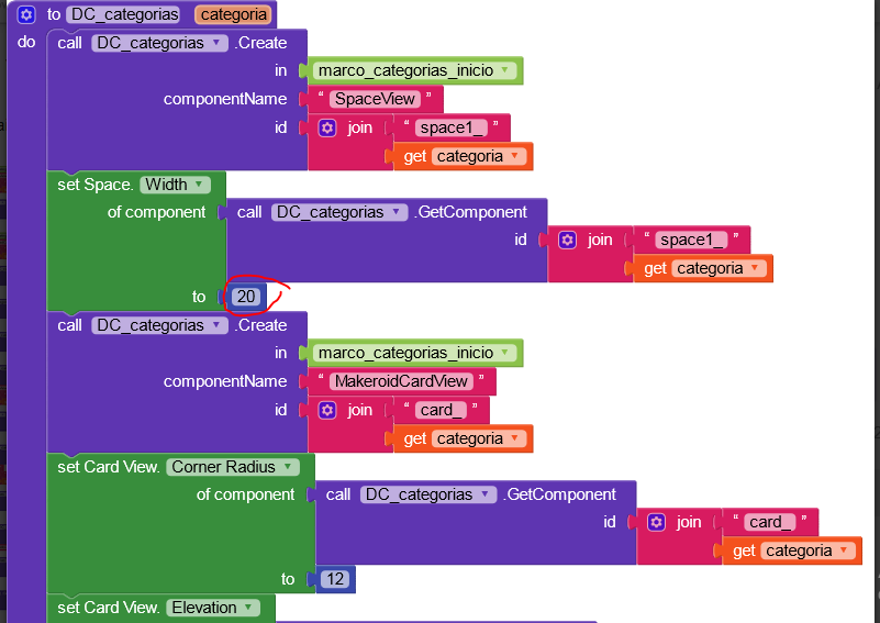
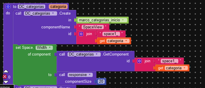
Let me explain, I have these blocks that generate a group of dynamic components.
How do I make the dynamic components to create adapt to all mobile devices?
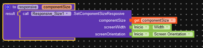
You can use our extension to set some component’s width, font size, and height, etc. so just delete by default width and font-size value and use our extension there.
please use screen width with tiny db like this
1 Like
are you use our extension???
1 Like
Hye App helper thanku for this amazing Extension .
But I have a Question I used this in my 2 apps ya 80% working fine
And -1 also(very bad ) can you help me for this ?
-2 is only for fill parant and -1 is only for automatic. -2 and -1 is automatically adjust for all devices
So we no need to ? Declare these with your Extension???
no , now i am try you aix
no, you do not need -1 or -2 responsive.
Why is it important to save screen width in tinyDB?
1 Like
Not WoRK PLZ HelpTest24(1).aia (784.4 KB)
