How can I create rounded button with text but without card view
1 Like

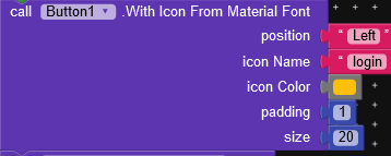
Can you also tell me how can I add icon before text in button?
Something like this:

Well you can use Decoration component and give corner radius to button with stroke also.
1 Like
If possible can you share block with contents? Coz I only see margin and padding I am unable to understand that set shape
in component give button.
is round = True
bg color = color
border color = color
that’s it why not try by yourself and understand parameters and do some experiments instead of readymade blocks.

2 Likes
But the easiest option is modifying default button values in its properties page. Why do have to drag another component to do this easy work?
1 Like
Thank you so much for this material icon block.
This topic was automatically closed 30 days after the last reply. New replies are no longer allowed.