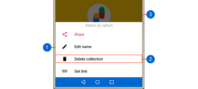
The Bottom Sheet component is a container that is attached to the bottom of the screen and displays information additional to that shown on the main screen. This information can be an alternative menu that the user can use or simply some dialogue information. It is a modal window and therefore requires a user action to disappear.
Fig. 1 Bottom Sheet example
- Sheet
- Contents
- Main Screen
Creating a Bottom Sheet
In the component palette, click on the category User interface and drag the Bottom Sheet component into the design viewer.

Fig. 2 Bottom Sheet component
Bottom Sheet is a non-visible component so it is located at the bottom of the viewer and its properties are available in the properties panel on the right side.
You can build a Bottom Sheet in two ways:
- Register a component that will be the bottom sheet. To do this drag to the screen the component that will be shown in the Bottom Sheet. In this example we use a Label component.
In the blocks window, click on the Bottom Sheet component and select the Register Component As Dialog procedure block and build something like this:

Fig. 3 Registering a component in the Bottom Sheet
The registered component, in this case Label1, will be displayed on the Bottom Sheet.
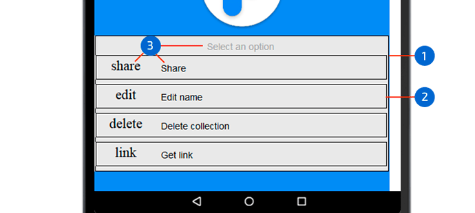
- Register a layout that can contain several components. To do this, create the layout you want, using components from the Layout category and others. In this example we use a Vertical Arrangement component, inside which we place four Label components with the texts Share, Edit name, Delete collection and Get link.
In the blocks window, click on the Bottom Sheet component and select the Register Layout As Dialog procedure block and build something like this:

Fig. 4 Registering a layout in the Bottom Sheet
The layout you just registered will be the Bottom Sheet and should look similar to figure 1.
Showing Bottom Sheet
To show the Bottom Sheet (component or layout) you must use the Show Dialog procedure of the Bottom Sheet component, placed inside a component event. In this example we use the event Click of a button. Add a button component and build something like the following:
Fig. 5a Registering a component and displaying the Bottom Sheet
Fig. 5b Registering a layout and displaying the Bottom Sheet
NOTE: Use only one of the two options
Checking the status (open / closed) of the bottom sheet
You can know if the bottom sheet was opened or closed and build the corresponding event handler. In this case we use a Notifier component to show an alert when one of the two events (Open / Close) of the bottom sheet happens. Add a Notifier component and build something like this:

Fig. 6 Bottom_Sheet Opened Event

Fig. 7 Bottom_Sheet Closed Event
Hiding the Bottom Sheet
You can programmatically hide the Bottom Sheet. To do this, use the Hide Dialog procedure of the Bottom Sheet component, placed inside a component event. In this example we use the Click event of a button. Add another button and build something like this:

Fig. 8 Hide the Bottom Sheet
If you want to create a Bottom Sheet like the one shown in Fig. 1, do the following:
- Build the following layout:
Fig. 9 Layout
- Vertical Arrangement (1)
- Horizontal Arrangement (4)
- Label (9)
Note: You can name the labels like this: lblIconShare and lblShare and so on. For icon labels (such as lblIconShare) you must set the Font Typeface property to Material Icons
- Register layout

Fig. 10 Registering the layout
Note: You can create the createBottomSheet procedure.
- Initializes the screen.

Fig. 11 Initializing the screen
- Call the Show Dialog procedure from some event

Fig. 12 Showing the Bottom Sheet
- Builds the event handler for each menu option.
Fig. 13 Example of Event handler for the selected item
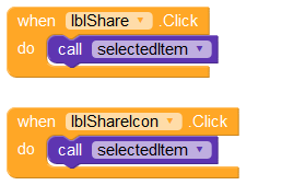
- Places the event handler in the event Click of the labels
Fig. 14 Event handler in the event Click of the labels
Happy Koding!


