So I’m opening this discussion on to talk about making Makeroid more Material Design. Please give suggestions about your opinions, maybe bugs about Material Design components and etc.
Since Makeroid is a Material Design based builder, I wanted to help to improve this. Also, since this discussion is for everybody I’m also going to give suggestions please say what you think about these.
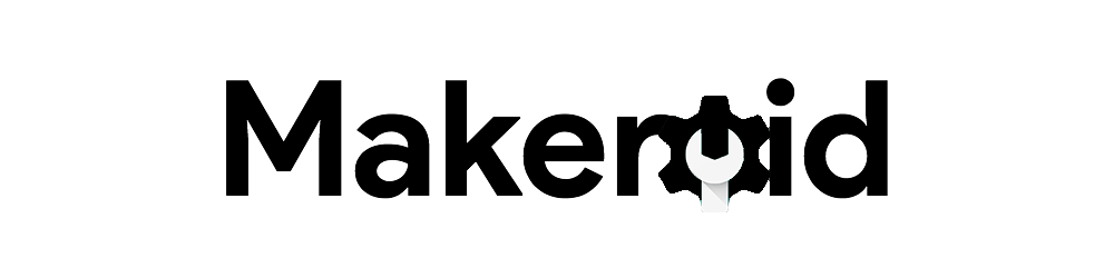
A suggestion of mine: Is the logo going to change? With Google’s font maybe? (Product Sans)
These look more “Material Design” @Sander @Conor @Ben @Diego @Mika @vishwasadiga
Ben
November 19, 2017, 4:02pm
3
I like it, the last one looks pretty cool.
1 Like
@Ben Glad you liked it.
The reason I’m suggesting to change the logo is this one is so “oldish”. I liked the gear idea so I implemented to the new logo too.
The logo should represent Material Design as this system is based on Material Design. Right?
Sander
November 19, 2017, 4:06pm
6
@vishwasadiga is our designer and he might have some new things ready for later
1 Like
@Sander that’s good. Hope he’s going to see this discussion and decide what to do. I would like to see something new
1 Like
Sander
November 19, 2017, 4:08pm
9
Believe me, there will be new stuff
2 Likes
Vishwas
November 19, 2017, 4:10pm
10
Thanks for the suggestions @TurboProgramming .
By the way, the logo you’ve proposed looks rad!
2 Likes
So happy to see that!
No problem, thanks to you.
Diego
November 19, 2017, 7:43pm
13
Current one is already with Google fonts fonts.google.com ), then I edited then the O and made the ‘Makeroid’ font. And finally, I converted it to a vector and edit it with colors frame by frame
BTW, isn’t your O the Google Admin logo?
1 Like
By Google’s font I mean “Product Sans”, the Google logo and the product font.
Yep, that’s the Google Admin Logo
Conor
November 19, 2017, 9:44pm
15
Product Sans isn’t open source and isn’t actually allowed to be used publicly, especially commercially.
4 Likes
Hmm,
Sander
November 20, 2017, 4:34pm
17
We are going to use the Roboto font
2 Likes
That’s a good choice
Sander
November 20, 2017, 4:36pm
19
I am not sure, but I think @vishwasadiga will keep the gear icon
2 Likes
Hopefully, because like it’s something iconic for Makeroid