Hi everyone!
I am kind of new in kodular, but I have been building apps in AppyBuilder for a long time.
I want to present you a game I made in Kodular in its entirety, using Phase to do animations and currently I’m trying to implement the Google Play Game Services.
What I’m trying to share here, is how to improve your own apps aesthetics User Interface (UI) to make it easier to use.
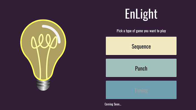
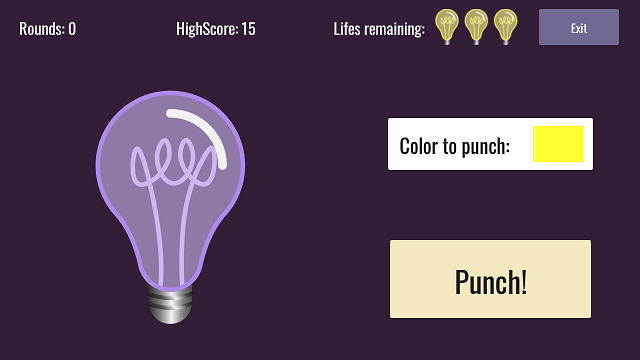
My game is this:
It is a simple sequence game to test the user’s memory and improve it, and other minigames. But there is a twist, you can play randomized so every sequence will be different and will add 1 extra movement every time you do it right.
Here is the GooglePlay link so you can try it if you want:
https://play.google.com/store/apps/details?id=io.kodular.mayoiha.EnLight
I am not a Graphic Designer by any means, but I have spent a lot of time watching youtube tutorials and reading books to understand elemental keys to make a goodlooking UI. I recommend visiting “Humble Bundle” to check for great programming and graphic design books very cheap.
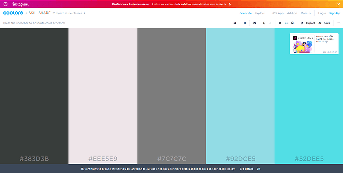
First, you will need a Color Palette (if you already have your app idea). Remember that colors can transmit feelings, so try reading about “Color Theory” to understand better this concept. Use that knowledge to create your color palette. I use the page Coolors.co because it gives you nice color palettes, with complementary and opposite colors.
My personal recommendation is not using saturated colors, because it is hard to see for a long time. And remember, Contrast is King.
When choosing a Font, I use Google Fonts, because they are free and there are a lot to use. If your app has a lot of text, use easy to read fonts. Every font has a meaning of use, so do your research about fonts.
And that is my contribution for making better apps. I hope this will get you started in improving your app graphics and give it that PLUS.
I will make another post about User Interface when I finish the third minigame of the app.
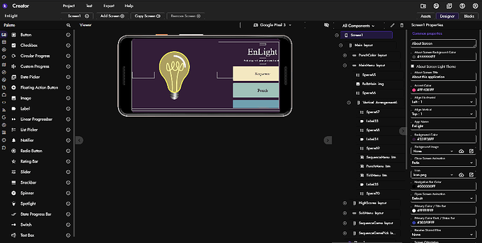
Proof I made it with Kodular:
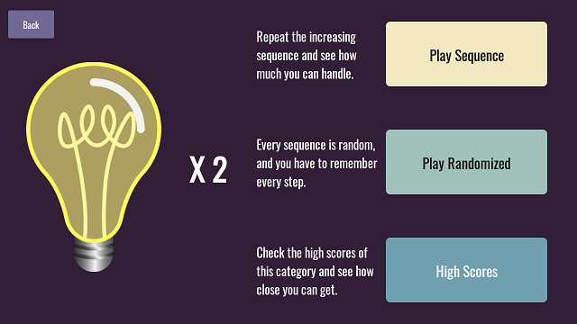
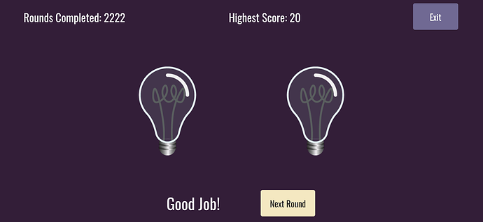
More of my app images:
Happy Koding!
