🧩 PieMenuX
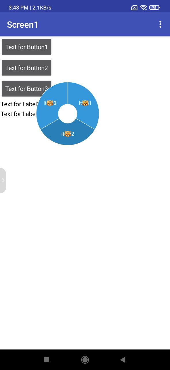
An extension for MIT App Inventor 2.A dynamic radial pie menu component that features customizable slices with adjustable sizes, colors, and animation effects. Incorporate the ability to add multiple menu items, which should be displayed evenly in a circular layout around the center. The design should resemble a game power menu, with an emphasis on intuitive interaction and smooth visual transitions. Ensure the component is flexible enough to modify the number of slices, their appearance, and animation styles, all while maintaining a clean, user-friendly interface suitable for integration into interactive applications or game UIs.Developed by TechHamara.
Find More Extension
Terms & Conditions
Find More On BuyMeCoffee Page
 Specifications
 Package: io.th.piemenux
 Size: 21.57 KB
 Version: 1.0
 Minimum API Level: 14
 Updated On: 2026-01-10T18:30:00Z
 Built & documented using: FAST v5.3.2
 Buy Aix Price 4USD
 , INR 360rs UPI. here on BuyMeCoffee
Find more Info on GitHub
Demo

Blocks
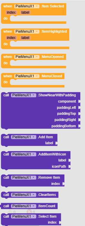
Events:
PieMenuX has total 4 events.
1. ItemSelected
Event fired when the user selects a menu item.
| Parameter | Type |
|---|---|
| index | number |
| label | text |
2. ItemHighlighted
Event fired when the user touches a menu item.
| Parameter | Type |
|---|---|
| index | number |
| label | text |
3. MenuOpened
Event fired when the menu finishes its opening animation.
4. MenuClosed
Event fired when the menu finishes its closing animation.
Methods:
PieMenuX has total 12 methods.
1. ShowNearWithPadding
Shows the pie menu near the specified component with custom padding. Padding values offset the menu position: positive left moves right, positive top moves down, positive right moves left, positive bottom moves up.
| Parameter | Type |
|---|---|
| component | component |
| paddingLeft | number |
| paddingTop | number |
| paddingRight | number |
| paddingBottom | number |
2. AddItem
Adds a menu item with the given label.
| Parameter | Type |
|---|---|
| label | text |
3. AddItemWithIcon
Adds a menu item with a label and icon from assets.
| Parameter | Type |
|---|---|
| label | text |
| iconPath | text |
4. RemoveItem
Removes the menu item at the given index (0-based).
| Parameter | Type |
|---|---|
| index | number |
5. ClearItems
Removes all menu items.
6. ItemCount
Returns the number of menu items.
- Return type:
number
7. SelectItem
Programmatically selects the item at the given index.
| Parameter | Type |
|---|---|
| index | number |
8. GetSelectedIndex
Returns the currently selected index, or -1 if none selected.
- Return type:
number
9. Open
Opens the pie menu with animation.
10. Close
Closes the pie menu with animation.
11. Toggle
Toggles the pie menu between open and closed.
12. IsOpen
Returns true if the menu is currently fully open.
- Return type:
boolean
Designer:
PieMenuX has total 15 designer properties.
1. Radius
- Input type:
non_negative_integer - Default value:
200
2. InnerRadiusPercent
- Input type:
float - Default value:
0.3
3. StartAngle
- Input type:
float - Default value:
-90
4. TotalDegrees
- Input type:
float - Default value:
360
5. SliceColor
- Input type:
color - Default value:
3498DB
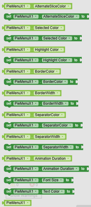
6. AlternateSliceColor
- Input type:
color - Default value:
2980B9
7. SelectedColor
- Input type:
color - Default value:
27AE60
8. HighlightColor
- Input type:
color - Default value:
E74C3C
9. BorderColor
- Input type:
color - Default value:
FFFFFF
10. BorderWidth
- Input type:
float - Default value:
2
11. SeparatorColor
- Input type:
color - Default value:
FFFFFF
12. SeparatorWidth
- Input type:
float - Default value:
2
13. AnimationDuration
- Input type:
non_negative_integer - Default value:
300
14. TextSize
- Input type:
float - Default value:
32
15. TextColor
- Input type:
color - Default value:
FFFFFF
Setters:
PieMenuX has total 15 setter properties.
1. Radius
The radius of the pie menu in pixels.
- Input type:
number
2. InnerRadiusPercent
The percentage of the radius that forms the inner hole (0.0 to 1.0).
- Input type:
number
3. StartAngle
The starting angle offset in degrees. -90 starts from the top.
- Input type:
number
4. TotalDegrees
Total degrees to draw (360 for full circle, less for partial arc).
- Input type:
number
5. SliceColor
The default color for menu slices.
- Input type:
number
6. AlternateSliceColor
The alternate color for odd-indexed slices.
- Input type:
number
7. SelectedColor
The color for the currently selected slice.
- Input type:
number
8. HighlightColor
The color for the slice being touched.
- Input type:
number
9. BorderColor
The color of the outer and inner circular borders.
- Input type:
number
10. BorderWidth
The width of the circular borders in pixels.
- Input type:
number
11. SeparatorColor
The color of the lines separating slices.
- Input type:
number
12. SeparatorWidth
The width of the separator lines in pixels.
- Input type:
number
13. AnimationDuration
Duration of open/close animations in milliseconds.
- Input type:
number
14. TextSize
The text size for item labels in pixels.
- Input type:
number
15. TextColor
The color for item labels.
- Input type:
number
Getters:
PieMenuX has total 13 getter properties.
1. Radius
The radius of the pie menu in pixels.
- Return type:
number
2. InnerRadiusPercent
The percentage of the radius that forms the inner hole (0.0 to 1.0).
- Return type:
number
3. StartAngle
The starting angle offset in degrees. -90 starts from the top.
- Return type:
number
4. TotalDegrees
Total degrees to draw (360 for full circle, less for partial arc).
- Return type:
number
5. SliceColor
The default color for menu slices.
- Return type:
number
6. AlternateSliceColor
The alternate color for odd-indexed slices.
- Return type:
number
7. SelectedColor
The color for the currently selected slice.
- Return type:
number
8. HighlightColor
The color for the slice being touched.
- Return type:
number
9. BorderColor
The color of the outer and inner circular borders.
- Return type:
number
10. BorderWidth
The width of the circular borders in pixels.
- Return type:
number
11. SeparatorColor
The color of the lines separating slices.
- Return type:
number
12. SeparatorWidth
The width of the separator lines in pixels.
- Return type:
number
13. AnimationDuration
Duration of open/close animations in milliseconds.
- Return type:
number
Thanks
TechHamara