Hello everybody!! I need help. When I rotate the tablet or use my app on another tablet or mobile, I don’t see the full screen.
I have selected the full sensor option, but when I rotate, it rotates but I only see half of my screen layout. Does anyone know how to do it? Can I see my application on all devices?
I have a lot of items and would like to know if there is any alternative instead of sending width and height.
Thank you!!
Did you use fix pixel width for your labels, textboxes, buttons etc?
You might want to do a search in the community for Responsive…
Probably a screenshot of your screen might help others to help you…
Taifun
1 Like
have you set the height and width to automatic ?
and also have use used responsive option
1 Like
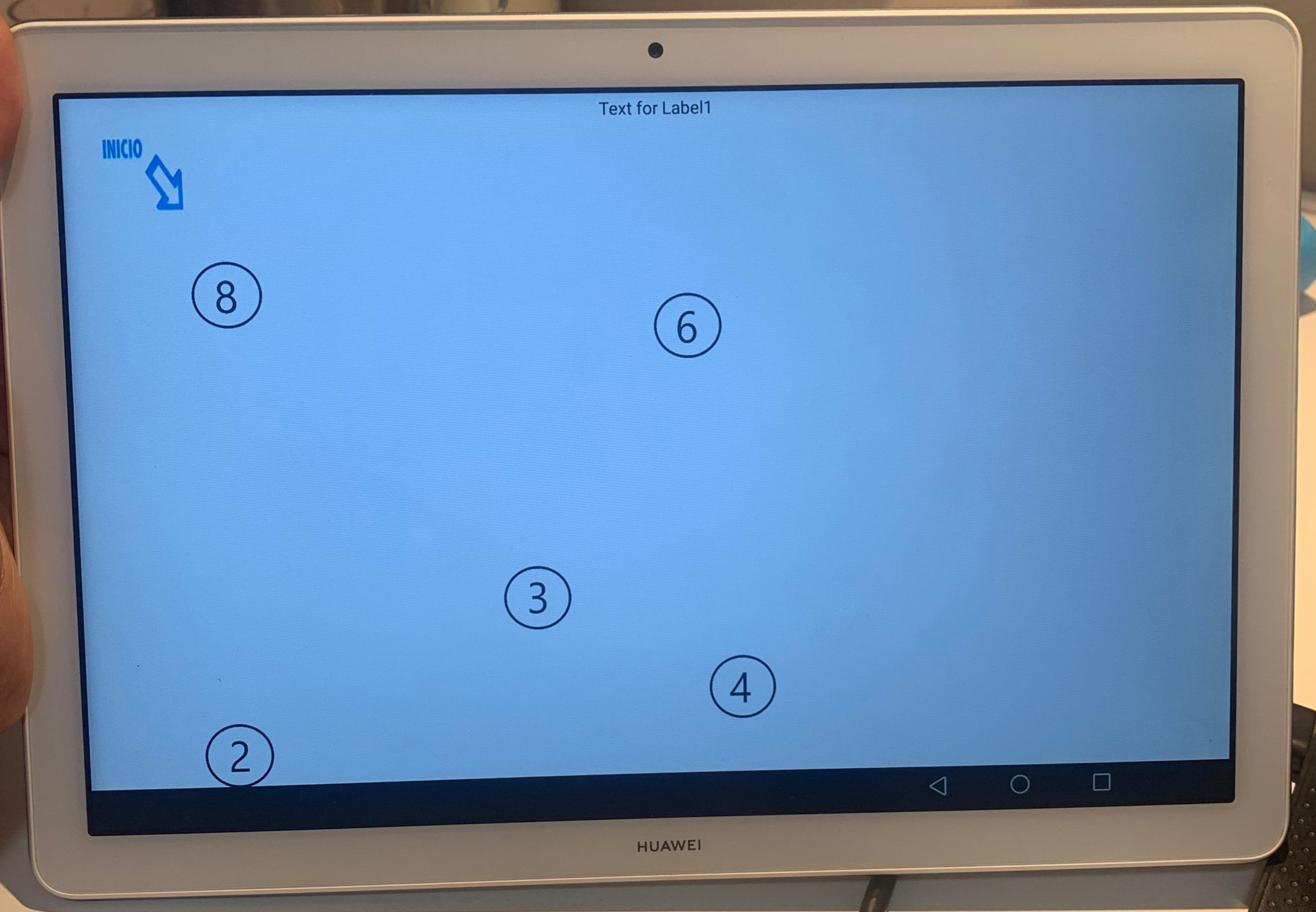
Hello, thank you very much for answering. Yes I used width in px and canvas in fill parent but this doesn’t work.
Attached screenshots of the vertical screen where you can see all the numbers but when rotating and placing it horizontally, it is not seen as a whole.
I couldn’t download a responsive extension.
Any idea?
Thank you very much

Hello, thank you very much for answering. I have set it to fill parent but also tried with the automatic option. I don’t know how to use responsive option.
It is very important that my app works in all the devices.
Thanks a lot.
Use this extension this will help you