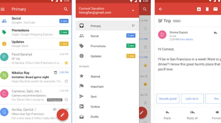
If possible, there could be an option to add those separators in a Side Menu Layout much like we see in Google’s Gmail App Gmail Screens. I know right now I could use a regular arrangement and set it as my Side Menu just like old days and build it as I please, but the Side Menu layout makes it much easier e clean. For those category names I already use disabled menu items, but there could be some other way too.
I meant those little lines separating the groups in a Navigation Drawer. Right now, the grouping in the Side Menu only adds a larger space between items. I’d like to add a visual line in such space. (other than building my own arrangement to use as a side menu, that is).
1 Like
So use the horizontal and vertical arrangement in the app for more space
Did you read my post? I was requesting a new feature for the express purpose to avoid resorting to the old way of implementing a side menu through a regular arrangement. I know that through this method I can build a side menu to my exact specifications, with all elements I might need and such and I actually used to use that earlier in my development but with the new Side Menu Layout the process became a much easier, cleaner and overall better way to do it. That’s why I requested the new feature, to increment a already good component. But if in the end this feature cannot or would not be implemented, that won’t affect too much. Its just a minor design part.
3 Likes