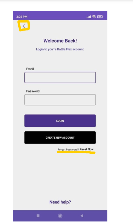

Have been trying to improve my UI skills how dose it looks like ![]()
Also This UI is for my app witch im working at the moment.
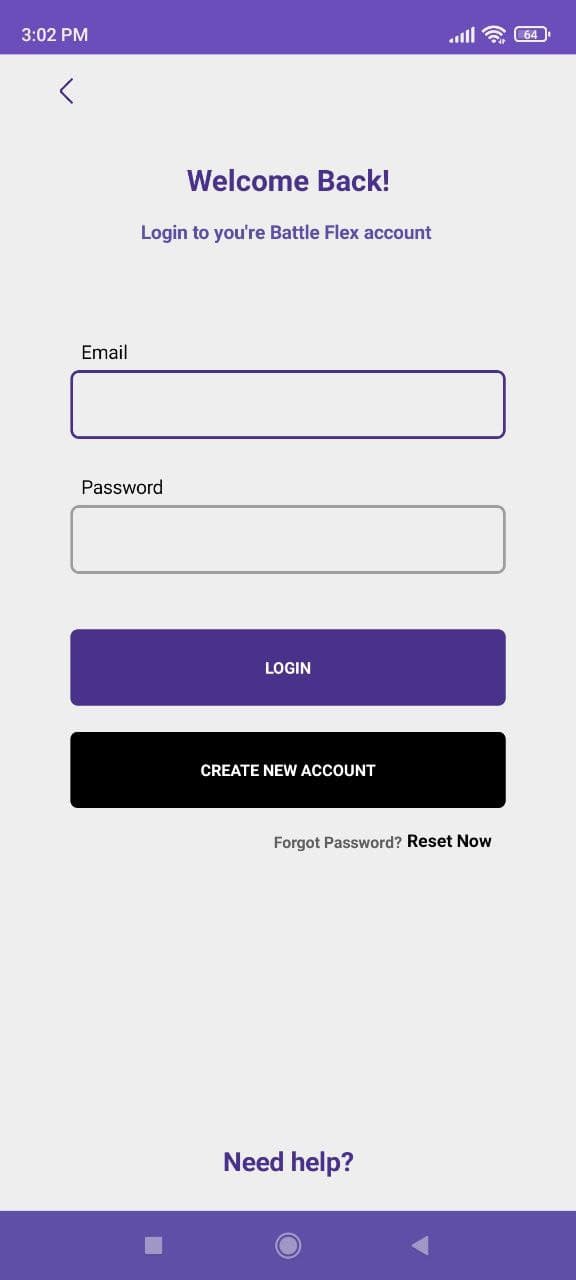
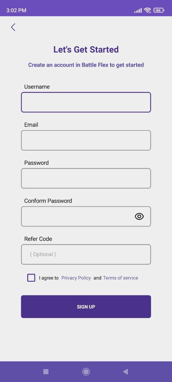
Have been trying to improve my UI skills how dose it looks like ![]()
Also This UI is for my app witch im working at the moment.
Everything is awesome and pleasant but fix these
looking good nice work
I’d say change the “create new account” button to more inviting color other than black
and the back button I think should have same distance from top and the left side, BTW it’s in different places in both screens try to keep everything consistent
it’s nitpicking really it doesn’t need anythingt ![]()