I am making a portrait oriented app.
I am using a lot of text and button components.
I am trying to make it look similar in different devices such as tablets and phones.
My phone’s screen height is 640 and width is 360
25 is ok as font size in my phone. When I made this calculation ((640x360)/25) I reach a number 9216
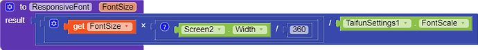
And when I use this block
I get 25 as font size in my phone and 68 font size in my tablet.
And It looks similar and good.
Do you think its a good idea for getting responsive font size?
Yes.. that’s how it works. It has to be “1” for my device, cause I designed the app according to my device, So the font size has to be the same. For another app with a different Screen.Width the value won’t be ‘1’. Like if the Screen.Width is 480 then the value will become 480/360 which is “1.33”. And the font size will get multiplied by 1.33. It’s a simple logic. If the user changes the font size from their phone settings then it will affect this math. That’s why we have to use Taifun’s extension. You can’t do that without that extension.
 This one probably is the best way to get Responsive text.