7 Likes
Yes it is looking nice but I think the backpack should be changed
I liked it as you have added delete button also![]()
1 Like
Liked this design It should be implemented
2 Likes
Yes we can
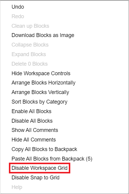
Oops, I didn’t know it. Thanks.
1 Like
@username02, your ideas are really nice. These may improve the look and feel of UI.
2 Likes
The buttons and backpacks is nice Should Be added to kodular
2 Likes
The icons are so nice!
1 Like