Can someone suggest me which one is better


- 1st One
- 2nd One
- 3rd One
0 voters
I liked the first one 
First One. Also you can add polls to your post in case you want to
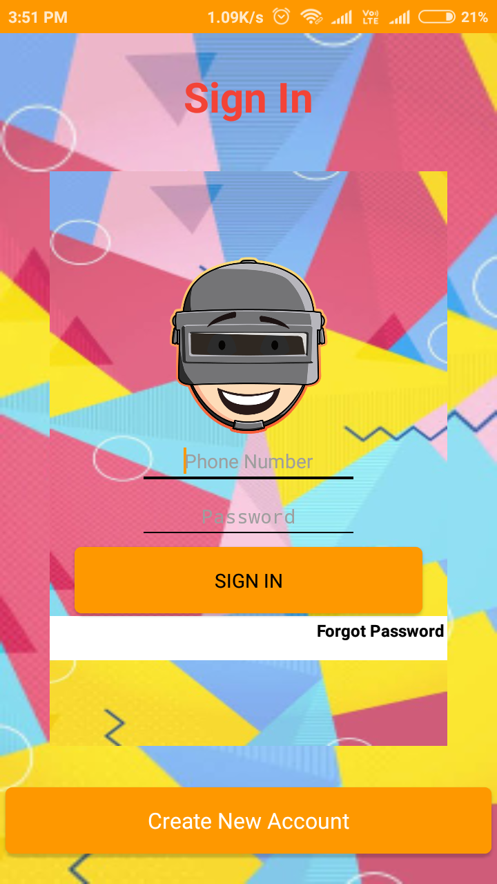
Enable card view in Arrangement by this it is looks better then all
Thanks I’ll Try
Try and upload the screenshot
Uploaded!!
It looks amazing
Poll Here For The Fourth One
0 voters
4th one, however the contrast on the Sign In needs work
Try the Kodular purple for it.
I think it would be better if only the textbox was white background.
But from the given choices I liked number 4
Number 2 was the worse for me.
The best at my opinion would be number 3 with white background at textbox or number 4 just like it is now.
I think for people with bad eyes number 3 is a little difficult to read
Thanks For Your Suggestion, I’ll Definitely Work On It