Custom Spotlight Extension
Release Date: 2021-03-13T22:00:00Z
Last Update Date: 2021-03-14T22:00:00Z
Current Update: 1.1
Required Permissions: None ( it would require the READ_EXTERNAL_STORAGE when reading a custom typeface from the external storage )
Used Libraries: A customized version from the Spotlight-3 by matrixxun and TakuSemba
Description
This extension creates a spotlight on visible components, or on a specific coordinate on the screen, with a different style than kodular’s built-in component. you can customize the title, description and mask properties or use your custom layout. This extension can be useful to create a tutorial when the user enters your app for the first time, to point out to the primary functions and their description.
Blocks Picture
Documentation
Ended
Called when a spotlight ends.
| Params | |
| String | id |
Started
Called when a spotlight starts.
| Type | Name | Description |
| String | id | the spotlight's id |
Error
Called when an error occurs, if you don't handle this event, the error would be dispatched to app's UI.
| Type | Name | Description |
| String | error | the full error message |
Target Closed
Called when a target is closed.
| Type | Name | Description |
| String | error | the id of the target, uses the spotlight id when using one of the blocks that shows a single spotlight |
Dismiss Spotlight
Dismisses the whole currently shown spotlight.![]()
Dismiss Target
Dismisses the currently shown target.![]()
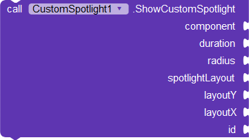
Show Custom Spotlights
Shows a spotlight using a custom layout.| Type | Name | Description |
| Component | component | the component to show the spotlight on, can be any visible component, or a FloatingActionButton |
| Number | duration | the duration that the spotlight show take to show or hide, in melliseconds |
| Number | radius | the spotlight circle radius |
| Componet | spotlightLayout | the layout used for the spotlight |
| Number | layoutY | tthe y position of the layout, in pixels |
| Number | layoutX | the X position of the layout, in pixels |
| String | id | a unique id for the spotlight, used when calling the Started and Ended events |
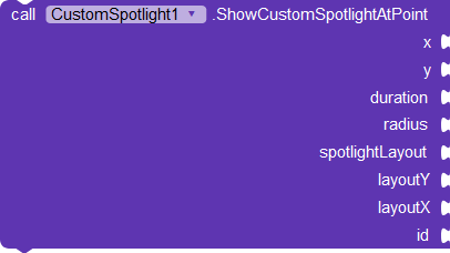
Show Custom Spotlights At Point
Shows a spotlight at a specific coordinate using a custom layout.| Type | Name | Description |
| Number | x | the x coordinate to show the spotlight at, in pixels |
| Number | y | the y coordinate to show the spotlight at, in pixels |
| Number | duration | the duration that the spotlight show take to show or hide, in melliseconds |
| Number | radius | the spotlight circle radius |
| Componet | spotlightLayout | the layout used for the spotlight |
| Number | layoutY | the y position of the layout, in pixels |
| Number | layoutX | the X position of the layout, in pixels |
| String | id | a unique id for the spotlight, used when calling the Started and Ended events |
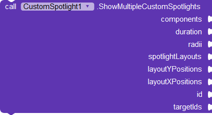
Show Multiple Custom Spotlights
Shows multiple spotlight using a custom layout.| Type | Name | Description |
| List | components | ta list of components to show the spotlights on |
| Number | duration | the duration that the spotlight show take to show or hide, in melliseconds |
| List | radii | a list of the spotlights' circle radii |
| List | spotlightLayouts | a list of layouts used for the spotlight |
| List | layoutYPositions | a list of the y positions of the layout, in pixels |
| List | layoutXPositions | a list of the x positions of the layout, in pixels |
| String | id | a unique id for the spotlight, used when calling the Started and Ended events |
| List | targetIds | the ids of the targerts, used when calling TargetClosed event |
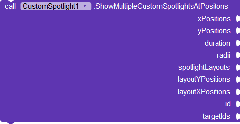
Show Multiple Custom Spotlights At Positions
Shows multiple spotlight using a custom layout at a specific coordinate.| Type | Name | Description |
| List | xPositions | a list of x coordinate to show the spotlight at, in pixels |
| List | yPositions | a list of y coordinate to show the spotlight at, in pixels |
| Number | duration | the duration that the spotlight show take to show or hide, in melliseconds |
| List | radii | a list of the spotlights' circle radii |
| List | spotlightLayouts | a list of layouts used for the spotlight |
| List | layoutYPositions | a list of the y positions of the layout, in pixels |
| List | layoutXPositions | a list of the x positions of the layout, in pixels |
| String | id | a unique id for the spotlight, used when calling the Started and Ended events |
| List | targetIds | the ids of the targerts, used when calling TargetClosed event |
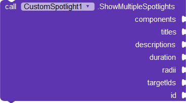
Show Multiple Spotlights
Shows multiple spotlights on the components given.| Type | Name | Description |
| Component | component | the component to show the spotlight on, can be any visible component, or a FloatingActionButton |
| List | titles | a list of the spotlights' titles, supports HTML text |
| List | descriptions | a list of the spotlights' descriptions, supports HTML text |
| Number | duration | the duration that the spotlight show take to show or hide, in melliseconds |
| List | radii | the spotlight circle radius |
| String | id | a unique id for the spotlight, used when calling the Started and Ended events |
| List | targetIds | the ids of the targerts, used when calling TargetClosed event |
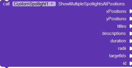
Show Multiple Spotlights At Positions
Shows multiple spotlights on a specific coordinates.| Type | Name | Description |
| List | xPositions | ta list of x coordinate to show the spotlight at, in pixels |
| List | yPositions | ta list of y coordinate to show the spotlight at, in pixels |
| List | titles | a list of the spotlights' titles, supports HTML text |
| List | descriptions | a list of the spotlights' descriptions, supports HTML text |
| Number | duration | the duration that the spotlight show take to show or hide, in melliseconds |
| List | radii | the spotlight circle radius |
| String | id | a unique id for the spotlight, used when calling the Started and Ended events |
| List | targetIds | the ids of the targerts, used when calling TargetClosed event |
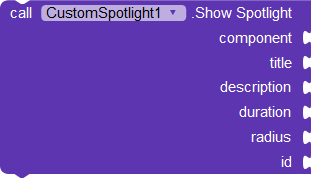
Show Spotlight
Shows a spotlight on the given component.| Type | Name | Description |
| Component | component | the component to show the spotlight on, can be any visible component, or a FloatingActionButton |
| String | title | the spotlight's titles, supports HTML text |
| String | description | the spotlight's descriptions, supports HTML text |
| Number | duration | the duration that the spotlight show take to show or hide, in melliseconds |
| List | radii | the spotlight circle radius |
| String | id | a unique id for the spotlight, used when calling the Started and Ended events |
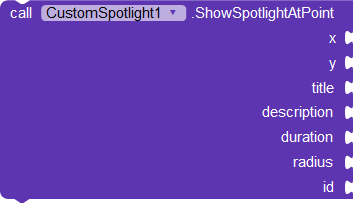
Show Spotlight At Point
Shows a spotlight at a specific coordinate.| Type | Name | Description |
| Number | x | the x coordinate to show the spotlight at, in pixels |
| Number | y | the y coordinate to show the spotlight at, in pixels |
| String | title | the spotlight's titles, supports HTML text |
| String | description | the spotlight's descriptions, supports HTML text |
| Number | duration | the duration that the spotlight show take to show or hide, in melliseconds |
| List | radii | the spotlight circle radius |
| String | id | a unique id for the spotlight, used when calling the Started and Ended events |
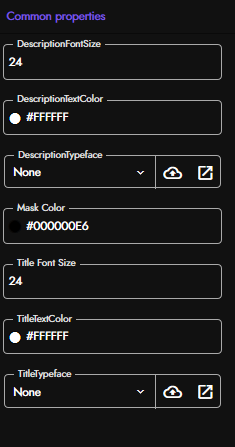
Designer Properties
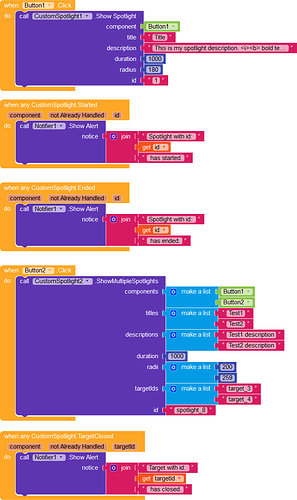
Usage Example
This is a very simple example blocks that demonstrates how to use this extension, you will find the AIA attached in the Downloads section
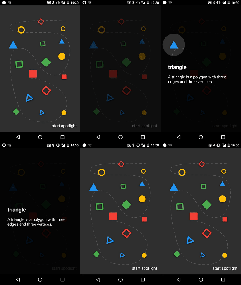
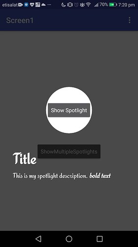
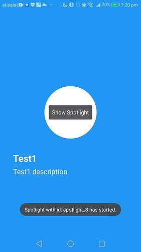
Screenshots And Screen Recordings
Downloads
Version 1.0
AIX: io.mohamed.CustomSpotlight.aix (61.0 KB)
AIA: spotlight_test.aia (218.6 KB)
APK: spotlight_test.apk (5.6 MB)
AIX: io.mohamed.CustomSpotlight.aix (62.0 KB)
AIA: spotlight_test(1).aia (219.5 KB)
APK: spotlight_test(1).apk (5.6 MB)
Change Logs
Version 1.1
New Blocks
1-
2-
Improvments
- Added helpUrl
- Removed the android support library. Since it’s no longer needed.
Bug Fixes
- Fixed a bug when using assets as a custom TypeFace in the companion, on android 10+ devices.
Open Source
This extension and the code of the customized library are open source:
Credits
Thanks for @themaayur for suggesting the extension’s idea, and for testing the extension.
Also thanks for the library authors, and for Kodular stuff for creating this awesome platform.
Thank You!

