[Free] Fluid Slider Extension - An extension for creating beautiful sliders in apps

Fluid Slider Extension

Hello everyone, I am again publishing my new extension that create beautiful slider for your UI. This is my first extension with kotlin library as the updates comes yesterday in Rush :grinning:.
This extension is based on this library.
This extension is very simple to use and work awesome.

Thanks to @Henry for sponsoring this extension :blush:.

Let see some blocks and their documentation

All Blocks

Documentation

component_event(3)

This event raises when slider touched or holds to move it

component_event(1)

This event raises when the slider’s position changes. It gives you the id of that slider!

component_event(2)

This event raises when user releases the slider

component_method(2)

This block do the main job. This block creates the slider in given layout for given ID.

component_method(3)

This block delete the created slider with given id

component_method(4)

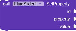
This block helps to set the property of the slider with given id and given property. There are many property block you can use them for setting the property.

component_method(5)

This block helps you to set the margins of the slider with given id and given list of margins

component_method(6)

This block returns you the property of the slider component with given id and property name.

component_set_get(1)

This property is for setting or getting the text color of the text that is present under the bubble or floating circle of the slider.

component_set_get(3)

This property is set to set or get the end text of the slider. It is the text that is called max value of the slider. You can give string value for max value in this extension.

component_set_get(4)

This property is used to set and get the text that is located under the bubble or floating circle

component_set_get(6)

This block is used to set or get the current position of the thumb of the slider

component_set_get(7)

This property is used to set or get the start text or min value of the slider. You can give the string in start text too.

component_set_get(8)

This property is used to set or get the whole slider color.

component_set_get(9)

This property is used to set or get the duration of slider floating circle.

component_set_get(10)

This property is used to set or get the text size of the text that is located under the floating circle or bubble

component_set_get(11)

This property is used to set or get the text color of the Min and Max or Start and End text of the slider.

component_set_get(12)

This block is used to set or get the background color of the floating circle or bubble.

component_set_get(13)

This property is used to set or get the width of the slider

Usage

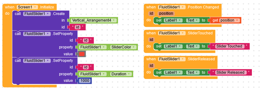
The extension is very simple to use. Just use little block to create it

Preview
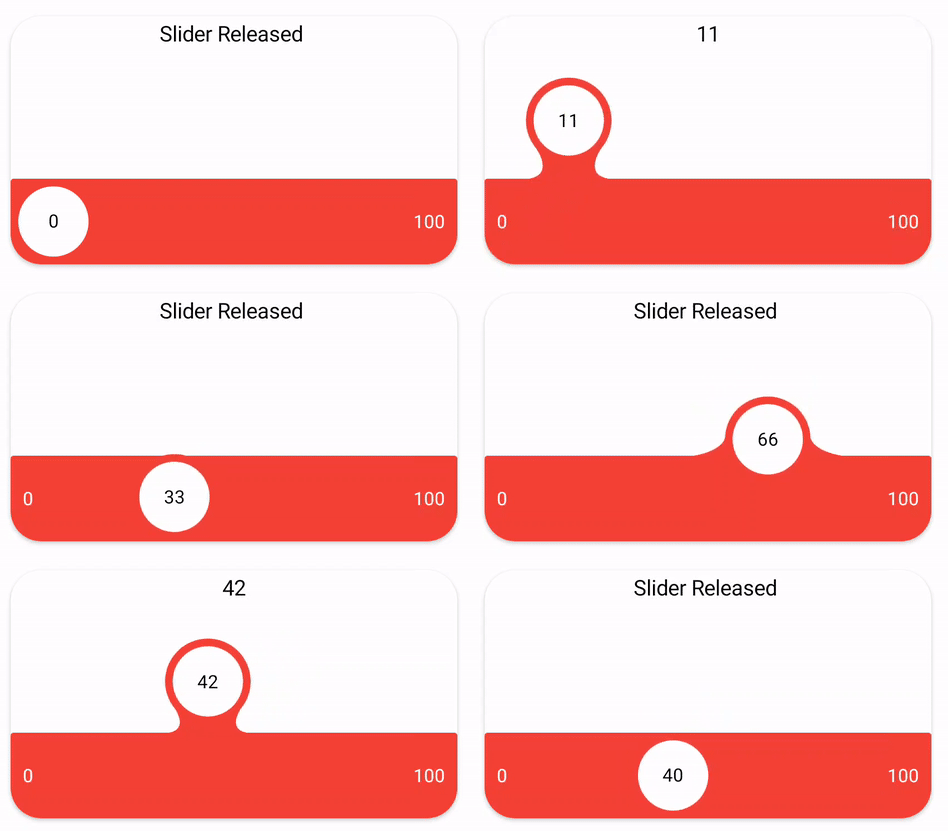
ezgif.com-gif-maker

Download

Credit

Thanks to @Shreyash for his super Rush and also @Shreyash helps me lot for this extension

Suggestion and issue are welcome

If you like the extension then like the topic
Thank You All

Donate

If you like my work then donate if you can :slightly_smiling_face:

34 Likes

Awesome work @iamwsumit and @Shreyash :star_struck:
I had a doubt can I use it in bottom navigation bar

Nice Extension :+1:

2 Likes

NYC extension :heart_eyes:

         And small dought can we give different colour for  infront of bubble and  Behind the bubble
3 Likes

This post was flagged by the community and is temporarily hidden.

4 Likes

But also very nice extension i loved it :cupid: :cupid:

2 Likes

Nice extension :blush: :blush:
Keep up your very good work !

1 Like

Nice extension.
How about that the minimum and maximum value can be set.
For example: minValue = 50 and maxValue = 1000. Because one of the biggest problems / limitations with the Slider component is that it basically distributes 100 units over the respective interval.

2 Likes

How can it used there?

Thank you​:slightly_smiling_face:

I didn’t understand you​:neutral_face:.

Definitely​:grin:

Thank you all​:grinning:

Well, AFAIK this extension has no minimum and maximum value. It has just start and end text. You can also pass string there.

It went over to my little brain​:sweat_smile:. I didn’t understand exactly. But as far as I understand, you are trying to say that slider return the position between 0 and 100 weather the min and max value are anything?

It’s very simple:

The following applies to the Slider component:
For example, if: minValue = 0, maxValue = 100
Then Slider.ThumbPosition returns the following values:
0, 1, 2, 3, …, 100 → 100 values

If: minValue = 0, maxValue = 10
Then Slider.ThumbPosition returns the following values:
0, 0.1, 0.2, …, 0.9, 1.0 → 100 values

So, as I said before, basically 100 units are distributed over the appropriate interval.

I understand you now completely. This extension returns always the value between 0-100. As the position of the thumb. If you set minValue = 0 , maxValue = 100 then it will return the same values as you said. But if the minValue = 0 , maxValue = 10 then it will also return the value between 0-100.
Because this extension is not based on min and max value as I have said earlier that you can pass the strings too. You can suppose that this extension return the position of thumb in percentage.
Like if your thumb position is half of the slider then it will return 50 mean you have covered the 50% of the slider wether the min and max value are anything

How can i use custom colour itsnot supporting.

May you post your blocks here? That you’re trying.

Are you using inbuilt color blocks?

Blocks


Error

Reply please @Sumit1334

Can’t you wait sometime.?
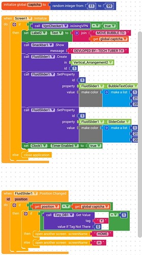
I tried the blocks and the error is caused by the extension. It looks like some datatype issue. I will soon check it and post a solution.

Thank you :smiling_face_with_three_hearts:

Well your recent extension are amazing and this one is really awesome.
I think you are just gonna give a powerful challenge in UI to @nikzdevz .
And @nikzdevz i am just setting u as an example so don’t take it otherwise.
:smiling_face_with_three_hearts::smiling_face_with_three_hearts::smiling_face_with_three_hearts::smiling_face_with_three_hearts::smiling_face_with_three_hearts::smiling_face_with_three_hearts::smiling_face_with_three_hearts::smiling_face_with_three_hearts::smiling_face_with_three_hearts:

Check out this animation

hi @iamwsumit
how can set min value and max value can be possible ?
i will use of component opacity but opacity possible only 0 to 1 value.