🧩 FontResizer
An extension for MIT App Inventor 2.Responsive Font Resizer (screen-width based, min–max bounded)
 Specifications
 Package: jsr.fontresizer
 Size: 8.60 KB
 Minimum API Level: 14
 Updated On: 2026-01-13T18:30:00Z
 Built & documented using: FAST v5.3.2-premium
Special thanks to @JEWEL for his wounderfull platform for making extension.
 FontResizer Extension – Quick Guide
 What this extension does
FontResizer automatically adjusts font sizes based on screen width only.
 Text is readable on small phones
Text scales up on big phones, tablets, foldables
Font size stays within minimum and maximum limits
When screen size returns → font size also returns
No manual font setting needed per device
How it works (simple idea)
The extension uses this rule:
Font Size = Base Font × (Current Screen Width ÷ 360dp)
- Base screen width: 360dp
- Base font size: 14sp
- Final font size is always kept between minSp and maxSp
So the same screen width always gives the same font size.
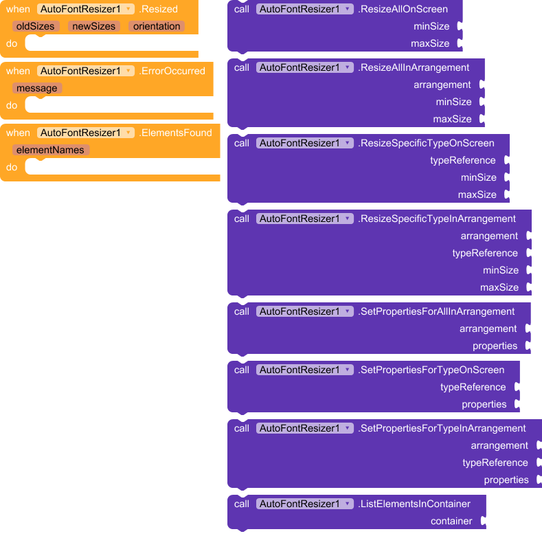
Functions
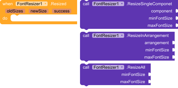
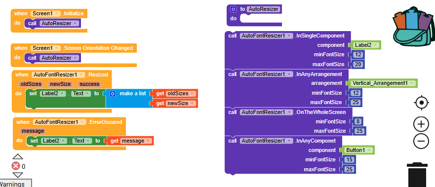
 ResizeSingleComponent
Resize font for one component (Label, Button, TextBox, etc.)
ResizeSingleComponent(component, minSp, maxSp)
Example
ResizeSingleComponent(Button1, 8, 26)
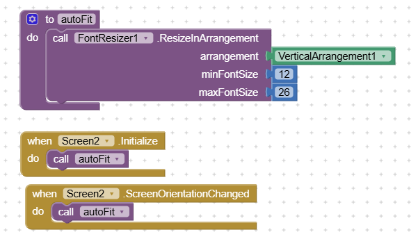
 ResizeInArrangement
Resize font for all text components inside an arrangement
ResizeInArrangement(Arrangement1, 8, 26)
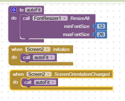
 ResizeAll
Resize font for the entire screen
ResizeAll(8, 26)
 This is the most commonly used function.
Event
Resized
Triggered after fonts are resized.
Resized(oldSizes, newSize, success)
- oldSizes → list of previous font sizes
- newSize → applied responsive font size
- success → true if resize worked
(Event is optional; you can ignore it if not needed.)
Automatic behavior (important)
Fonts resize automatically when the app opens
Works even if the app opens directly on a big or small screen
Recommended extra call:
when Screen.OrientationChanged
    call FontResizer.ResizeAll(8, 26)
This ensures perfect resizing on rotation.
Recommended usage (best practice)
-
Set all component font sizes to 14sp in Designer
-
Add FontResizer extension
-
Use:
ResizeAll(8, 26) -
(Optional) Call again on orientation change
That’s it
What this extension does NOT use
 Text width auto-fit
Screen height
Device-specific hacks
Manual per-device font sizes
This keeps behavior stable, predictable, and readable.
Ideal for
Phones
Tablets
Foldables
Accessibility-friendly apps
Apps with many screen sizes
In short
Design once, read everywhere.
FontResizer handles screen size — you focus on your app.
How to set autoResponsive for a particular arrangemnt?
How to set AutoResponsive for the whole screen?
Suggestions are welcome.
