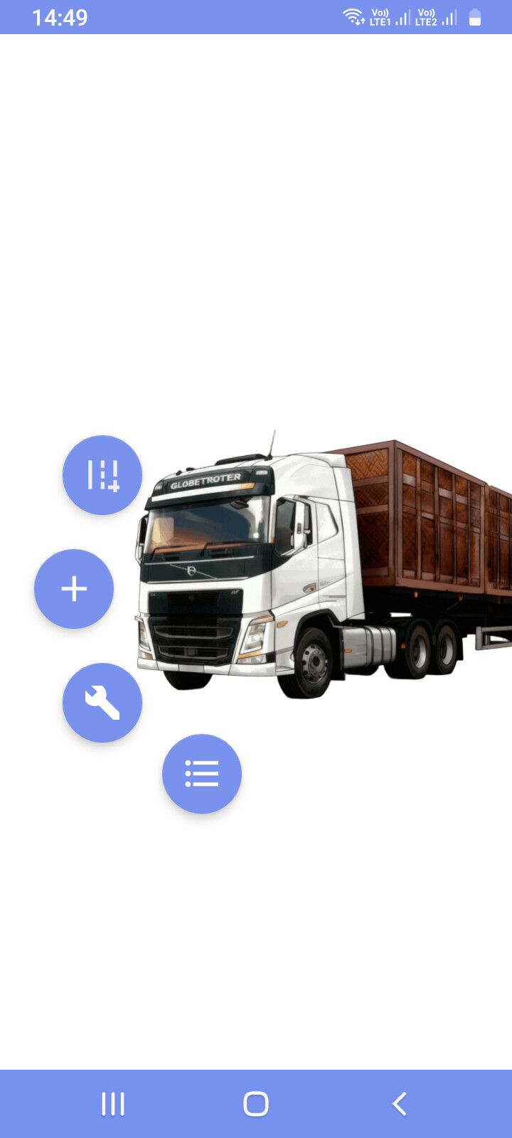
Everything was fine on the first cell phone.
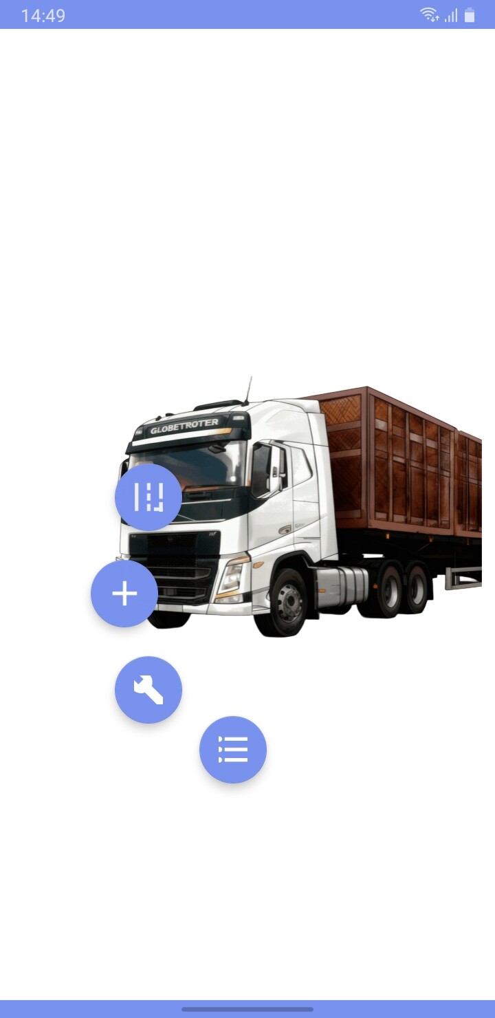
In another instance, the responsive design isn’t working.
Hi dear,
It would be very helpful if you could show how you created this layout.
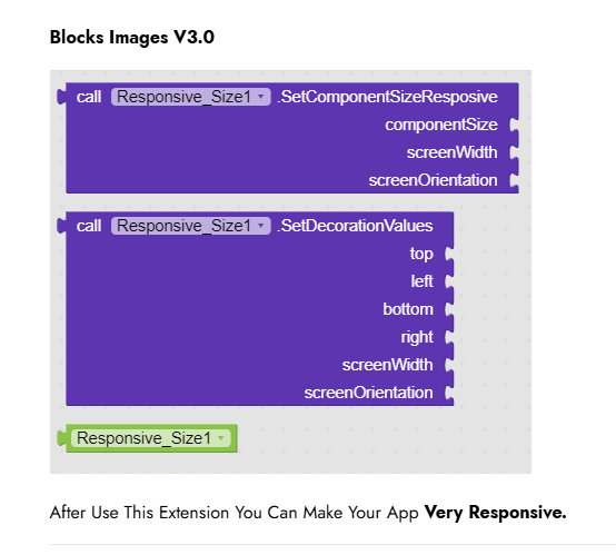
Trying to use the AppHelper_Studio extension
[Free Extension] Responsive App Size Extension (Best Update V3.0)
but without success here
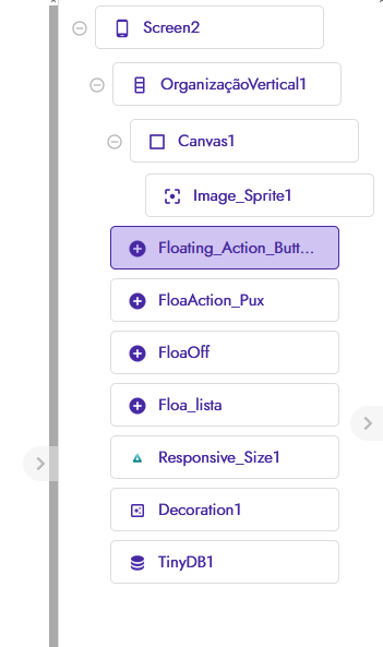
Take a look here
Nothing different can help.
What did you try, show us in blocks.
Auto resize will not work with, i think, floating icons
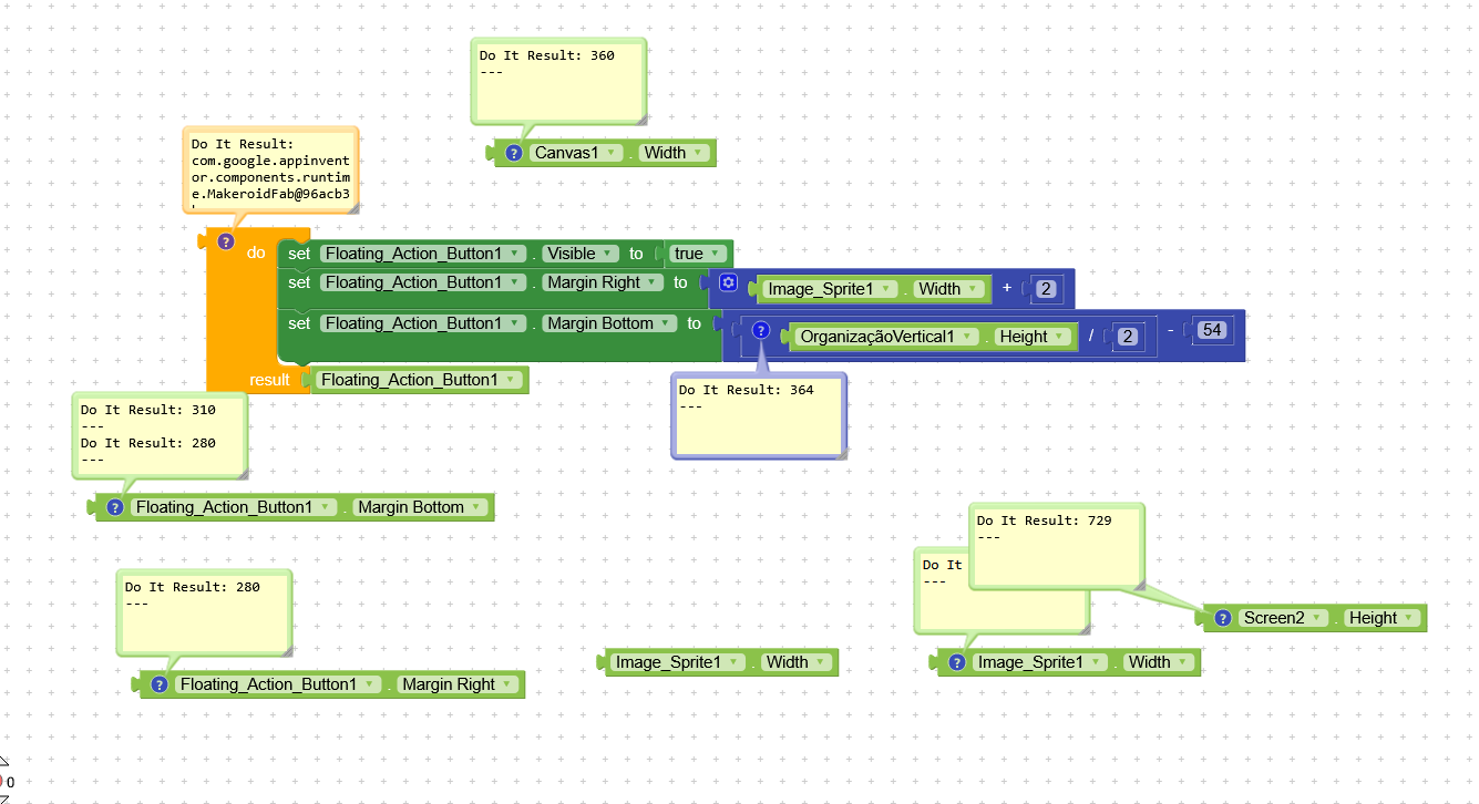
I thought of it this way and it worked. The logic is going to get complicated.
But it’s worked so far.
Still wrong
Thinking…
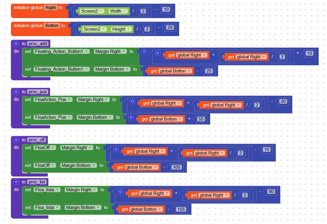
Different devices will have a different screen height and width (sometimes even two identical devices, depending on how they are setup).
All your positioning values will need to be based upon your screen height and width.