OTP_Input Extension: Customizable OTP Boxes with Auto-Hide & Scroll Support 
Description
OTPInput is a free Kodular/MIT App Inventor extension to create multiple OTP input boxes with full customization. Enter any number of boxes, style them with custom colors, text size, bold/italic, corner radius, border, and even auto-hide entered digits for security. Supports horizontal scrolling for overflow, making it perfect for all screen sizes.
Price: Free ( donations appreciated)
Released On: Sep 26, 2025
Size v1: ~22 KB (approximate size), New Size v2 : ~30 KB (approximate size)
Support me if you love this free extension:
PayPal.Me
Explanation
OTPInput allows developers to add a secure, visually appealing OTP input field to their apps. Each box is individually customizable and supports automatic focus navigation, hint characters, auto-hide for security, and scrollable layout for smaller screens. Ideal for login, registration, and verification screens.
Features
- Dynamic Number of Boxes: Add 1–10+ OTP boxes dynamically.
- Custom Text Size: Adjust the size of digits inside boxes.
- Bold & Italic Support: Make OTP digits bold, italic, or both.
- Custom Box Width & Height: Set the size of each OTP box.
- Custom Margin: Space between OTP boxes is adjustable.
- Background Color: Set the box background color.
- Border Color & Width: Customize the border color and thickness.
- Corner Radius: Rounded corners for modern look.
- Text & Hint Colors: Customize text and hint colors for better design.
- Auto-Hide Entered Digits: Hides the digit after a configurable delay for security.
- Horizontal Scroll Support: Overflow boxes scroll horizontally automatically.
- Arrangement Compatible: Works in Horizontal, Vertical, or Scroll Arrangements.
- OTP Retrieval: Get OTP as a single string from all boxes.
- Clear Function: Clear all boxes programmatically.
- Completion Check: Check if all boxes are filled.
- Refresh Styles: Update all boxes with new styling dynamically.
- OTPEntered Event: Raised when the last box is filled.
- Fully Compatible: With Kodular, Nitron or any App Inventor platform..
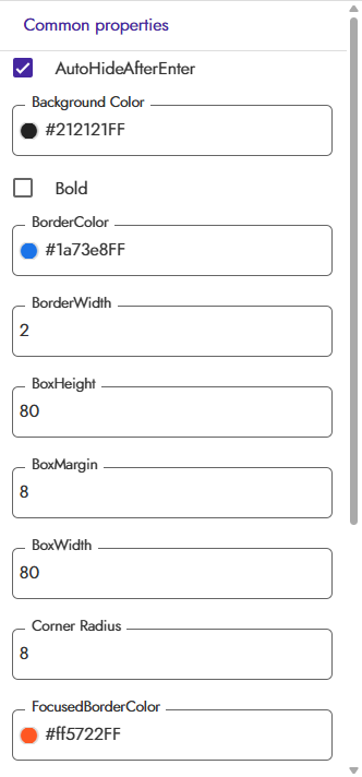
Designer Properties

Blocks

How to Use (Block Steps)
- Add to Project:
- Import the .aix file via Kodular’s Extensions tab.
- Drag the OTPInput component into your screen.
- Connect to Arrangement:
- Block: ConnectToArrangement
- Parameters: arrangement (component, e.g., HorizontalArrangement1)
- Example:
When Screen1.Initialize
Call OTPInput1.ConnectToArrangement arrangement: HorizontalArrangement1
- Get OTP Value:
- Block: GetOTP
- Example:
Set Label1.Text to OTPInput1.GetOTP
- Clear OTP Boxes:
- Block: ClearOTP
- Example:
Call OTPInput1.ClearOTP
- Check if OTP is Complete:
- Block: IsOTPComplete
- Example:
If OTPInput1.IsOTPComplete
Then Show Alert "OTP Complete"
Else Show Alert "OTP Incomplete"
- Remove All Boxes:
- Block: RemoveFromArrangement
- Example:
Call OTPInput1.RemoveFromArrangement
- Refresh Styles:
- Block: RefreshStyles
- Example:
Call OTPInput1.RefreshStyles
- Handle Events:
- Block: OTPEntered
- Example:
When OTPInput1.OTPEntered
Show Alert "OTP Fully Entered"
Demo Video

Use Cases
- Secure OTP Input: For login, registration, or verification screens.
- Customizable UI: Fits light or dark themes with full styling control.
- Dynamic Layouts: Horizontal scroll for small screens or many boxes.
- Developer Friendly: Fully controllable via blocks, with clear and refresh options.
Installation
- Import the
.aixfile via Kodular’s Extensions tab. - Drag OTPInput to your screen.
- Connect to an arrangement using
ConnectToArrangement. - Customize properties in the Designer or via blocks.
Feedback
Try OTPInput and share your feedback or suggestions in the comments! Your support and input help improve this free extension.

AIX File (Extension )
Version 1
OTPinput.aix (21.1 KB)
Latest**
Version 2
OTPinput.aix (29.7 KB)
Version 2.0 introduces highly requested customization options and critical quality-of-life improvements, focusing on flexible sizing, keyboard stability, and enhanced control over input data and type.
New Features
- Customizable Input Type: Developers now have explicit control over the input type, with a new
InputTypeproperty supporting:
- OTP (Default): Numeric-only input with automatic masking (if enabled).
- Number: Numeric-only input without masking.
- Text: Standard alphanumeric input without masking.
- Flexible Box Sizing: The new version removes restrictions on fixed pixel sizes. Box dimensions can now be configured using:
- Explicit pixel values.
MATCH_PARENT(or equivalent, e.g.,-1) to fill the parent container’s width/height.WRAP_CONTENT(or equivalent, e.g.,-2) to adjust size based on content.
Quality-of-Life Improvements
- Elimination of Keyboard Blinking: Input focus management has been optimized. The keyboard will now remain active and visible when the cursor automatically advances, eliminating the distracting “disappear and reappear” behavior between boxes.
- Reset Functionality: A new
ClearOTPfunction is available, allowing users to programmatically clear all input boxes and reset the cursor to the first field for a fresh entry.- Enhanced Alignment: The input digits are now perfectly centered both horizontally and vertically within each box, ensuring a clean and professional appearance.
- Specific Box Retrieval: Added the
GetTextFromBox(boxNumber)function to retrieve the content of any individual box instantly by its 1-based sequence number.
Bug Fixes
- Fixed an issue where the cursor would remain locked on the last box, preventing immediate multi-box clearing.

Support me if you love
PayPal.Me (Any Amount’s Donations appreciated)
Changelog
- v1 (Sep 2025): Initial release with customizable boxes, auto-hide, horizontal scroll, OTPEntered event, clear function, and full compatibility.
- v2 (Sep 2025): This release with Customizable Input Type, auto-hide, Reset Functionality, Enhanced Alignment, Specific Box Retrieval, and Bug Fixes.
 I’ll add video in evening (IST).
 ).
).