Your work is very Professional !
I like so much the theme! But some people don’t like it, so I think that it will be great to have the option of change between those themes ![]()
@yanquisalexander @kodular
i dont see any diff. been the same i know for the past 2 weeks .
maybe spacing is a little different.
It would be nice if like button gets solid instead of outline when liked
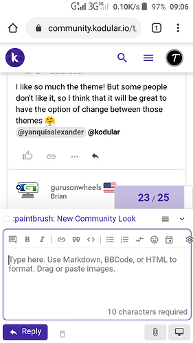
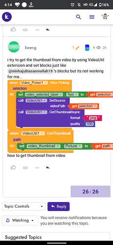
This theme is awesome but here’s the setting icon when we reply to post is not at his position.
Here’s ;
I found another problem in my mobile infinix hot 8 android 9
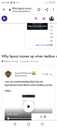
The title of the post is moving underneath rightward
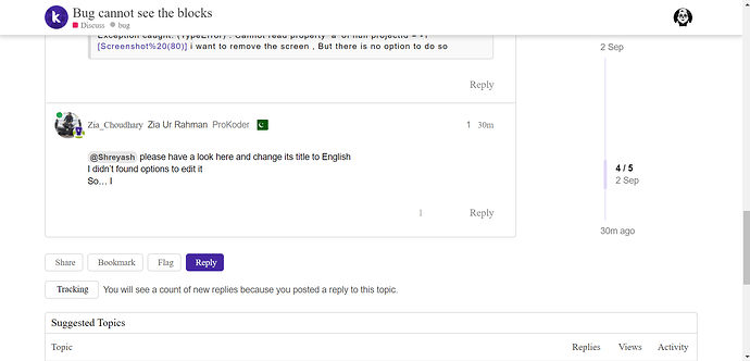
Moreover i found a post witg title in other languages i tried to edit it but not able to change it in English as i found no option to edit..
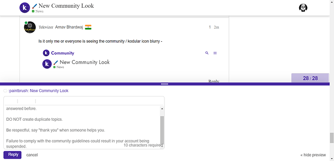
Is it only me or everyone is seeing the community / kodular icon blurry -
![]()
![]()
That’s really weird, since apparently the font doesn’t load either in your device ![]()
Could you check from the developer console of your browser?
Wait what? Your browser didn’t load the font as well. Try other browser.
which fonts you are Talking about.
i am not getting it.
As I know, a website usually have a font set.
I checked and I think the font should be jost.
i Tried Community in a New Tab.
There it was Fine.
But,
i am Loving this Guess Game.
Title of post overflow from screen i think it should be text wrap to next line
Because the theme wasn’t made for mobile first.
at least add a bookmark option near to question section
Don’t know it’s a bug or not but wants to inform Kodular Staff.
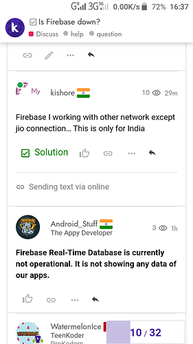
I have just saw a post in topic where some new posts are displaying at upward and old posts at downward.
Here’s Screenshot ;
Here’s Topic link ;
Nope.That isn’t a bug.The two topic was merged together so all the posts of the second topic was at the bottom of the first topic.That’s it.
