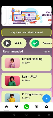
Suggest me some improvement…
The floating button not looking good and spaces are too much 6/10
7/10
Please Change The Background Colour Put Some Gradient Generated From
Change The Card View Background! to transparent
Background colors and Card viewColors are not matching perfectly
6/10
colors are not nice 5/10
Everything is okay but the color combinations are very bad so 6/10
Can I use these images as a card view background???
try use vertical
Personally, i would give this design a 5/10 because I neither like nor dislike the design.
There are some suggestions i think can improve this design. Such as:
-
Don’t use elevation- Personally I don’t like the elevation stuff in card view. I think completely flat designs are far better. So, i would recommend keeping elevation to 0.
-
Background- Use either white or black as background colour.
-
Change colour of card view- I think you should change the colour of card views to a grayish white tone. It will differentiate all card views from background. And the card views that are main focus of screen, give them a colour which is mixture of any colour and white.
-
Modern Icons- use modern icons.
Hope that helps
You can’t do it using cardview component but you can add image view inside card view
I have best option which will make it 10/10 use listview with
Image and text
0/10 … Need Learn about UI
The text in the cards should be vertically centralized
Suggest me something… I m new
10/3.9
It’s all right
