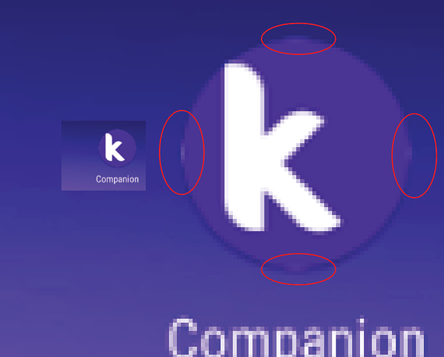
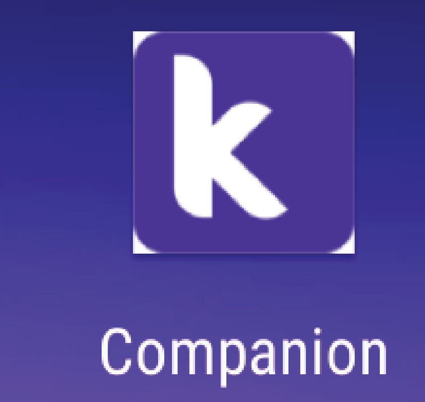
Nothing really important but it will help it look more professional:
Looks like the cropping took some pixels from the background.
Thanks for taking the time to flag this!
We have plans to design a logo specific to the Companion; we’ll take a closer look at the sizing when we do get around to it (mostly the next release)
I think it’s a problem of the adaptive icons because it also happened to my app icon when i rebuild it after the new update.
Yes.
Some insight here:
https://medium.com/google-design/designing-adaptive-icons-515af294c783
Keyline shapes can be found here:
By the way it could come with a redesign ![]()
![]()
I don’t think so. If you change the icon types in your device you will see that there’s a little line around the borders, which I think is what’s getting cropped by the icons system when you switch to round icons.
Just a heads up to make sure you extend (bleed) the background color outside the area to avoid this when you make the new icon.
Sorry for being annoying, this is something we graphic designers do (being annoying… ![]() ).
).
My icon doesn’t have white lines around the borders but after the rebuild of my app the new rounded icon has in the left and in the bottom sides the white pixels
If your original square icon has a proper bleed, then there will be no lines. Just make sure the background extends outside the cropping area, for example if your icon is 192px by 192px, make sure the background extends something like 200 x 200.
Honestly I with @yanquisalexander on this one. We havent had a redesign for about 2 years for the Companion, I think it’s time to match it with everything!
Looks like App Inventor (and Kodular) doesn’t support Adaptive Icons yet. Because when you set a icon, it is just a image, icon and background are not separated like other apps.
For example when you move the X app’s icon around the main screen, icon and background moves differently, they are not sticked each other.
You can see the effect by moving the app icon around the main screen as in this video:


