Hello @admins, I wanted to create a long list of the features I want. You can choose and add which one would like. If anyone has any other requests @everyone can reply to this post so admins can consider checking on them.
New components:
-
CardView: CardView can be useful to show information in a beautiful Material Design UI. It’s an essential on Makeroid if you ask me.(Implemented 3.0.1) -
AutoCompleteTextView: To automatically complete information the user inputs to the app. Can be used for sign-in pages maybe.
-
More types of TextView: Postal Address, Phone, E-mail, Multiline Text etc. (Types that can the user sets from the properties box.
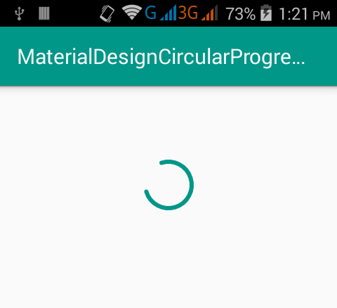
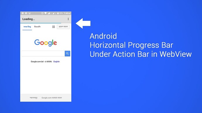
-ProgressBar(Also Horizontal): Not for the Notifier. For the page itself. This is important for most developers. -
ToggleButton: This is another alternative to CheckBox and the Switch.
-
Space: The space component for leaving spaces between components.(Implemented 3.0.1) -
StackView
-
ImageSwitcher
New features:
-
Themes: Customizable themes for the current project user is working on. For example; WithActionBar, AppTheme (The customized theme), NoTitleBar, AppCompat, AppCompat.Light, AppCompat.Light.NoActionBar, Material, Material.Light etc. -
Animations (Animator): Animations for everything. Components, Labels etc.
-
TensorFlow Support: TensorFlow support would be just amazing for the app.
-
Live Text Code Editor for Advanced Users: For advanced users, a live code editor would be awesome. Combined with the block editor, it would be so educative and easy to work with.
-
More advanced "Create new Project dialog/screen: The Create New Project dialog should not be limited to only to the name of the project but we should be able to upload the logo, description and other options before creating the project, just like Android Studio.
-
An easy way to edit menu items on the TitleBar: By this I mean to edit the 3 dot menu items. It’s hard to do it using blocks (Coding). It should be done from the properties view, like the ListView component with commas.
-
Changing the colors of the Status Bar Icons: I also reported this sugesttion before, but as this is available with Android Studio, it can be done with Makeroid too. Just trying and if working, it would be great to see. Because some people are using White themes on their apps and Status bar icons just disappear when a white color is used. Even Android Studio does this automatically without any user attention (by getting support from the Material Design Color Palette: Material Design)
Others:
-
Removal of the Device frame from the Designer view: I reported this issue before, but just want to remind for another time. The canvas for working is extremely little. I can’t work and I need to use the Tablet view. (For example Android Studio, App Inventor doesn’t have this. Yes I confess, it’s something good to have in design, but we need to also work easy, right?)
-
Android Wear Support: Yes, this is an extremely hard thing to do for you guys, but it uses the same technique: APKs, right? Just a suggestion, if possible it would be cool to have it on the editor.
Please reply to this discussion for more suggestions, for the admins to see them. This might help them.
Update: 3 July 2018

