Hey Community ,
I had shared some screenshots of my app you can tell if the ui is good or need any changes in between . I ll be glad if anyone given me suggestion ![]()
Hey Community ,
I had shared some screenshots of my app you can tell if the ui is good or need any changes in between . I ll be glad if anyone given me suggestion ![]()
Awesome ![]()
![]()
The Problem is it’s too Simple.
Don’t take it as a Hate.
But Nothing i can see which can Outperform the Competition.
Or let you stand in the Competition.
But i will Appreciate your Hardwork.
Take it -
![]()
Yes @ADDYLIN I know it that’s why I came here ![]() you can suggest me what improvements I need to make . I had seen many ui designs on dribble pinterest . And many more but haven’t find any practical solution
you can suggest me what improvements I need to make . I had seen many ui designs on dribble pinterest . And many more but haven’t find any practical solution ![]()
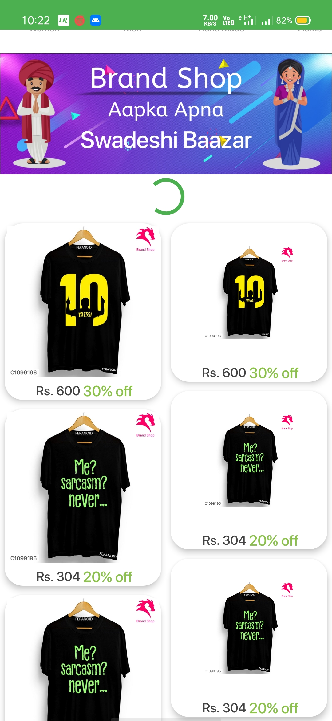
Some points you can look upon ![]()
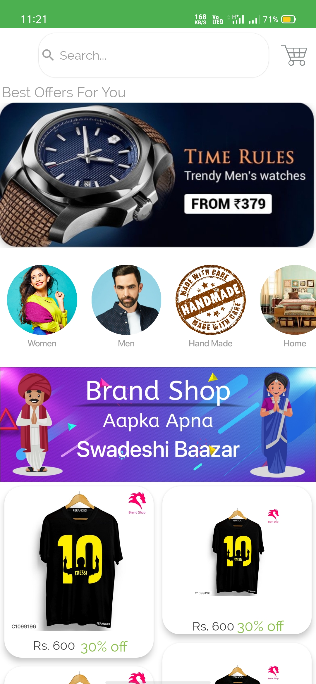
Decide the theme for your app. Like for example, the ‘Brand shop’ banner looks different from rest of the app
Decrease the corner radius of the cards displaying products.
In 4th screenshot, I think, you should move the categories (men, women, handmade, etc) above the ‘Best offers for you’ banner
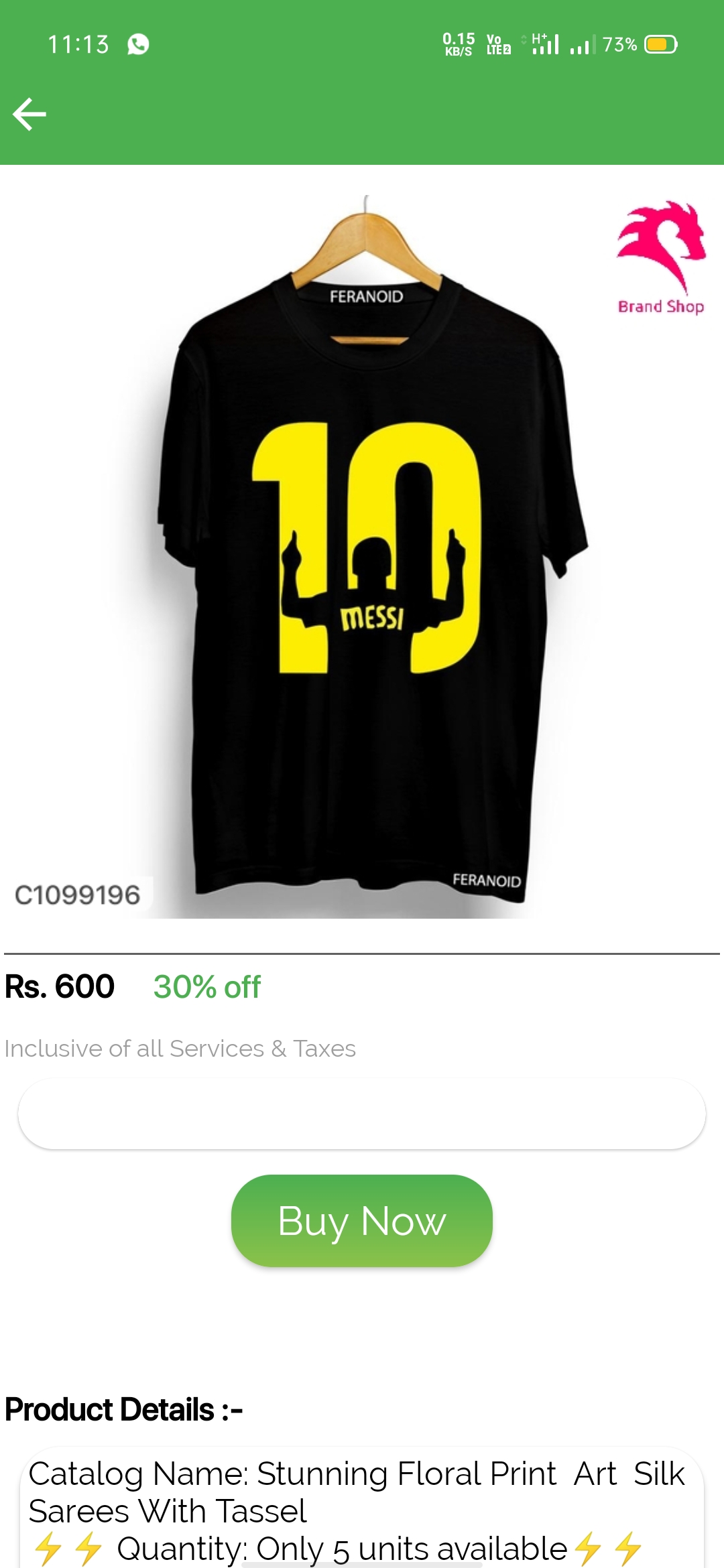
Have some line spacing in Product Details part. Also look if alignment is possible in this part. Don’t use unnecessary symbols(like the lightning symbol used now)
how to make ui like this??
i too made ui but not like this very simple
@Kidular_user can you show me your UI please ? So I can also see and make some changes
I used deephost custom design list view extension
it’s good…
This topic was automatically closed 30 days after the last reply. New replies are no longer allowed.