Hey all please suggest some tips to improve the ui of this dialog box for my upcoming app thanks ![]()
-
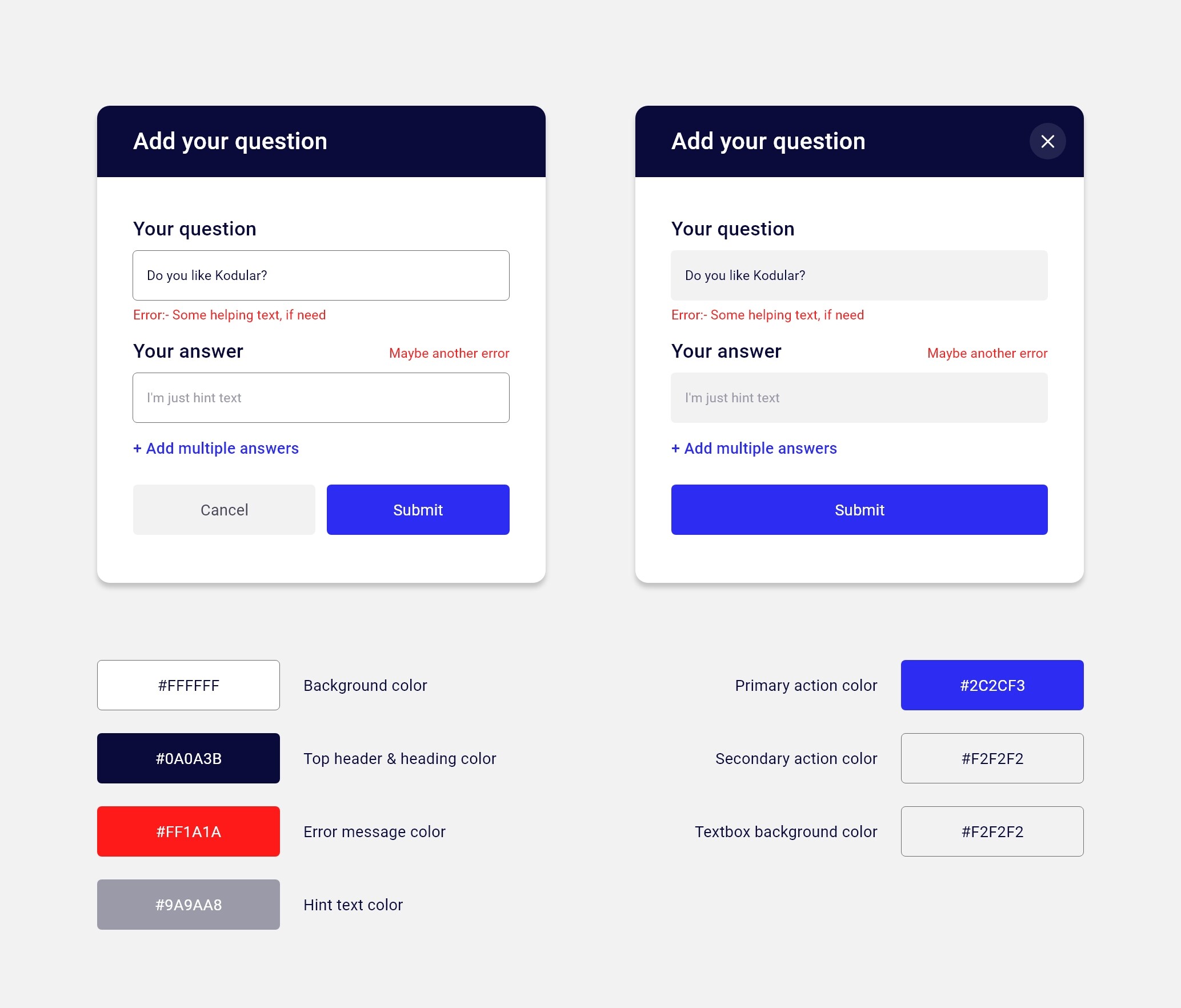
Make the blue button at the bottom with no space below or at left or at right of it and then set its width to fill parent and corner radius to 0 if using a cardview else if using button set shape to rectangular.
-
For textbox no need to set it inside cardview i suggest putting it in a vertical layout and putting the title on the top-left of the textbox with deleting textbox hint, same for second textbox. Or else delete completely the two titles and increase cardviews’ width (leave a space between the two cardviews) and write the title or whatever in the textbox’s hint instead.
-
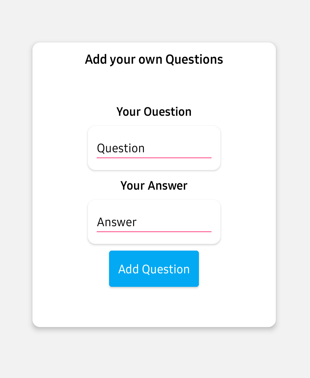
Now for the very first title, you mustn’t use long sentences or much words, let it simple and clear, so instead of “Add your own questions”, i think “Add questions” is enough, also for the button, instead of “Add question”, try “Save”/“Add”/“Finish”…
-
You may also increase corner radius of the cardview that contains every component of these to look more smooth or idk
 I just love increasing corner radius
  (Be careful that the radius doesn’t exceed a little less than the half of the cardview’s height or width else you’ll get some kind of double-sided ice cream cone
  )
)
I hope it helped ![]()
1 Like