Hello everyone 
I am pleased to present the direct successor to this guide
Recently, I discovered the Material Color Utilities library, which completely revolutionized the way I managed themes in my applications, allowing an extremely high level of customization for both the application itself and the end user.
Material Color Utilities in brief
MCU is a library developed by Google that allows you to automatically generate a complete color system for a theme starting from a single base color.
It creates a series of tones and uses them to generate different color roles (for example
primary,onPrimary,surface,background, etc.) following the Material Design 3 guidelines.The library is able to create both a
lightand adarkcolor scheme, automatically adapting the colors to maintain good contrast and visual consistency.In addition to this, it is also capable of doing more, but I wrote “in brief”
, so if you need more information, please refer directly to the official website
https://m3.material.io/
 Index
Index
1. generateColorScheme
2. themedComponents
3. getComponentType
4. applyColorScheme & applyColorSchemeAndFont
5. applyColorSchemeToSystemUI (optional)
6. Practical example
7. AIA
generateColorScheme

I’ll assume you already know how a WebViewer + HTML file + JavaScript file works, and to avoid making the guide too heavy, I’ll refer you to the explanation provided in this other guide.
Setup the WebView - JSON Tree Viewer in WebViewer (Without Extensions)
Offline viewer - JSON Tree Viewer in WebViewer (Without Extensions)
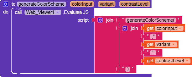
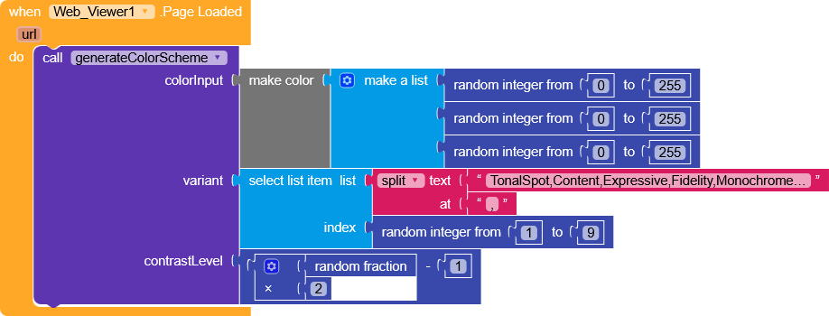
This procedure uses the JavaScript version of the Material Color Utilities library, called through WebViewer.EvaluateJS(generateColorScheme(parameters)).
The following parameters are passed:
| Parameter | Value |
|---|---|
colorInput |
#RRGGBB - R,G,B - int (native Kodular colors) |
variant |
TonalSpot (default) - Content - Expressive - Fidelity - Monochrome - Neutral - Vibrant - Rainbow - FruitSalad |
contrastLevel |
default 0.0 (default range -1..1) |
The procedure returns an object containing two main scheme:
lightdark
Inside each scheme are the various roles associated with their respective colors (int).
{
	"light": {
		"primaryPaletteKeyColor": -5414314,
		"secondaryPaletteKeyColor": -7180439,
		"tertiaryPaletteKeyColor": -7703484,
		"neutralPaletteKeyColor": -8227726,
		"neutralVariantPaletteKeyColor": -8031376,
		"background": -1802,
		...
        },
     "dark": {
		"primaryPaletteKeyColor": -5414314,
		"secondaryPaletteKeyColor": -7180439,
		"tertiaryPaletteKeyColor": -7703484,
		"neutralPaletteKeyColor": -8227726,
		"neutralVariantPaletteKeyColor": -8031376,
		"background": -15068912,
		...
     }
}
So let’s pay close attention that we will now have shades and color contrasts that are compatible with each other, divided by theme and role, which will simply correspond to the “position” of that component, for example, we might have a layout with the surface role, and a label on it will mainly have a textColor with the onSurface role.
themedComponents

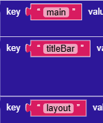
- As a first layer we have a text key that exists solely as a container, meaning it will only serve to group the components together and keep everything more organized.
- Going down a level we have the components that will be affected by the theme.
- And finally we’ll have a dictionary of component properties with the corresponding
role
- And finally we’ll have a dictionary of component properties with the corresponding
- Going down a level we have the components that will be affected by the theme.
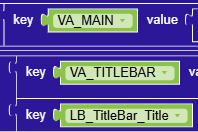
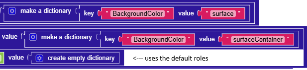
what you would put in RecyclerList.SetProperties but with roles instead of the value
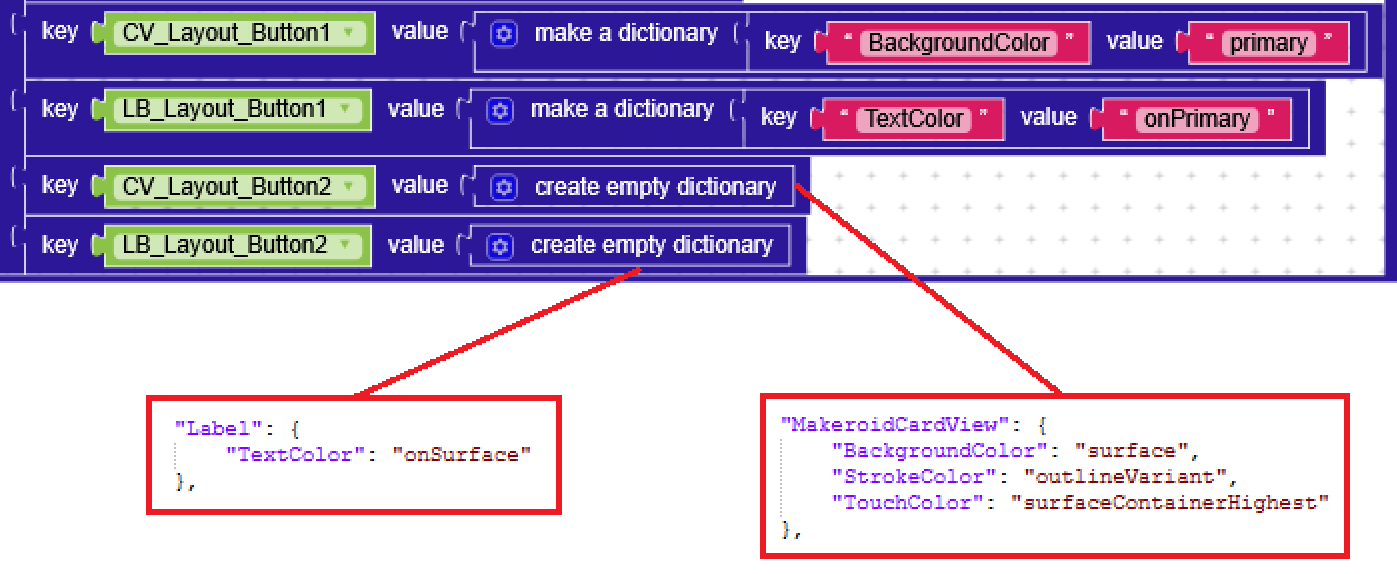
leaving the dictionary empty will apply the default roles from componentRoleDefaults
componentRoleDefaults?
This is probably the only truly smart thing I’ve done.
Initially, for each component I created a dictionary with all the properties, it wasn’t even a big problem because it was almost all copy-paste, until I realized I had a mile-long, unprofessional dictionary.
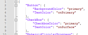
So I created a json with the main component types and their defaultProperties
Afterwards, the theme application procedure will usegetComponentTypeto figure out which component it is cycling through, and in case there are no properties present inthemedComponents, it uses the corresponding one incomponentRoleDefaultsIn my
componentRoleDefaultsI decided that card views are outlined by default
but nothing stops you from customizing it however you see fit!componentRoleDefaults.json
{
	"Button": {
		"BackgroundColor": "primary",
		"TextColor": "onPrimary"
	},
	"CheckBox": {
		"CheckboxColor": "primary",
		"TextColor": "onSurface"
	},
	"MakeroidCircularProgress": {
		"Color": "primary"
	},
	"ProgressBar": {
		"BackgroundColor": "surfaceVariant",
		"Color": "primary"
	},
	"DatePicker": {
		"BackgroundColor": "surfaceContainerHigh",
		"TextColor": "onSurface"
	},
	"Label": {
		"TextColor": "onSurface"
	},
	"MakeroidLinearProgressbar": {
		"IndeterminateColor": "primary",
		"ProgressColor": "primary"
	},
	"ListPicker": {
		"BackgroundColor": "surfaceContainer",
		"ItemBackgroundColor": "surfaceContainer",
		"ItemTextColor": "onSurface",
		"TextColor": "onSurface",
		"StatusBarColor": "surfaceContainer",
		"TitleBarColor": "surfaceContainer"
	},
	"Radiobutton": {
		"RadioButtonColor": "primary",
		"TextColor": "onSurface"
	},
	"Ratingbar": {
		"BackgroundColor": "surfaceVariant",
		"StarColor": "primary"
	},
	"Slider": {
		"ColorLeft": "primary",
		"ColorRight": "surfaceVariant",
		"ThumbColor": "primary"
	},
	"Spinner": {
		"ItemBackgroundColor": "surfaceContainer",
		"ItemTextColor": "onSurface",
		"PromptItemColor": "onSurfaceVariant",
		"SpinnerColor": "outline"
	},
	"KodularStateProgressBar": {
		"BackgroundColor": "surfaceVariant",
		"CurrentStateDescriptionColor": "primary",
		"ForegroundColor": "primary",
		"StateDescriptionColor": "onSurfaceVariant",
		"StateNumberBackgroundColor": "onSurfaceVariant",
		"StateNumberForegroundColor": "onPrimary"
	},
	"SwitchToggle": {
		"TextColor": "onSurface",
		"ThumbColor": "primary",
		"TrackColor": "primary"
	},
	"TextBox": {
		"BackgroundColor": "surfaceVariant",
		"CursorColor": "primary",
		"HighlightColor": "primaryContainer",
		"HintColor": "onSurfaceVariant",
		"TextColor": "onSurface"
	},
	"TimePicker": {
		"BackgroundColor": "surfaceContainerHigh",
		"TextColor": "onSurface"
	},
	"MakeroidCardView": {
		"BackgroundColor": "surface",
		"StrokeColor": "outlineVariant",
		"TouchColor": "surfaceContainerHighest"
	},
	"HorizontalArrangement": {
		"BackgroundColor": "surfaceContainer "
	},
	"VerticalArrangement": {
		"BackgroundColor": "surfaceContainer "
	},
	"KodularBottomNavigation": {
		"BackgroundColor": "surfaceContainer",
		"SelectedColor": "primary",
		"UnselectedColor": "onSurfaceVariant"
	},
	"MakeroidViewPager": {
		"TabsActiveTextColor": "primary",
		"TabsBackgroundColor": "surface",
		"TabsIndicatorColor": "primary",
		"TabsTextColor": "onSurfaceVariant"
	}
}


getComponentType

This is a helper function whose sole purpose is to identify a component by returning its class (Label, Button, etc.).
applyColorScheme & applyColorSchemeAndFont
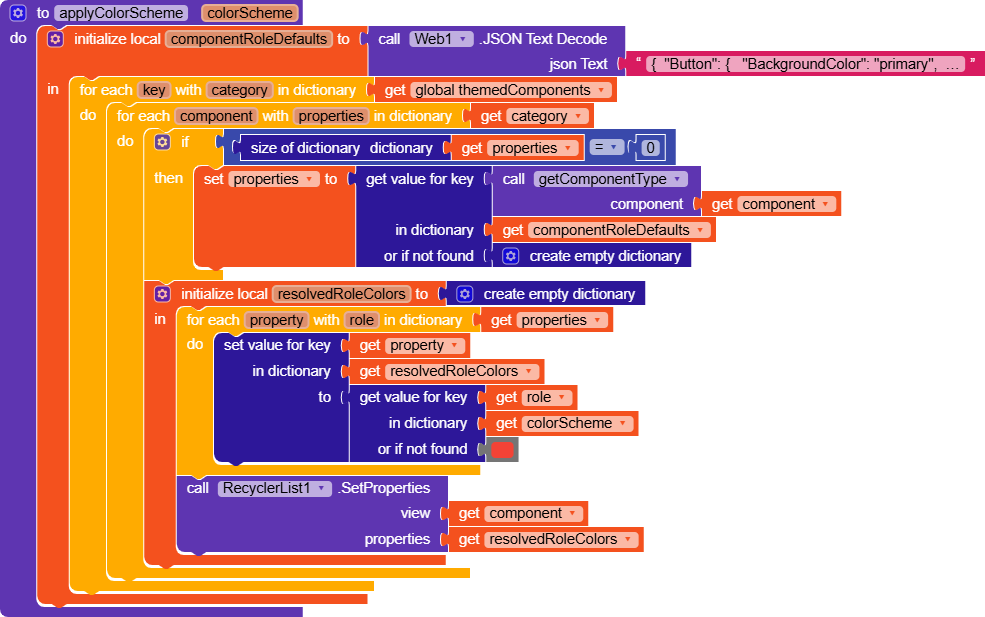
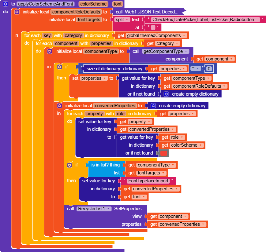
The procedures shown above are not up to date, so please refer to the ones included in the projects (the possibility of using different fonts has been added).
These two procedures are responsible for actually applying the theme to the components.
Both cycle through the categories and components of themedComponents and, using RecyclerList’s SetProperties method (replaceable with the same-named one in DynamicComponents), apply the properties, but let’s go into more depth shortly.
As explained earlier regarding the themedComponents variable, an empty dictionary will use the default values
applyColorSchemeAndFont additionally applies the font to all components in fontTargets (covers practically all the main native components)
If you want to use applyColorSchemeAndFont and have a different font for some components, for example Material Icons, you can specify it in themedComponents.

Why are KodularStateProgressBar and a few others missing?
Unlike most components that use the FontTypefaceImport property, some have special properties, the StateProgressBar, for example, has StateNumberTypefaceImport and StateDescriptionTypefaceImport.
If needed, it could still be implemented by adding an exception in the procedure.
Is it possible to use only native components? (without RL/DC)
Sure, it’s less convenient but not impossible.
Just handle everything through anyComponents, making use of the getComponentType functionIf the getComponentType = "X" use AnyX.BackgroundColor else if the getComponentType = "Y" use AnyY.BackgroundColor
applyColorSchemeToSystemUI
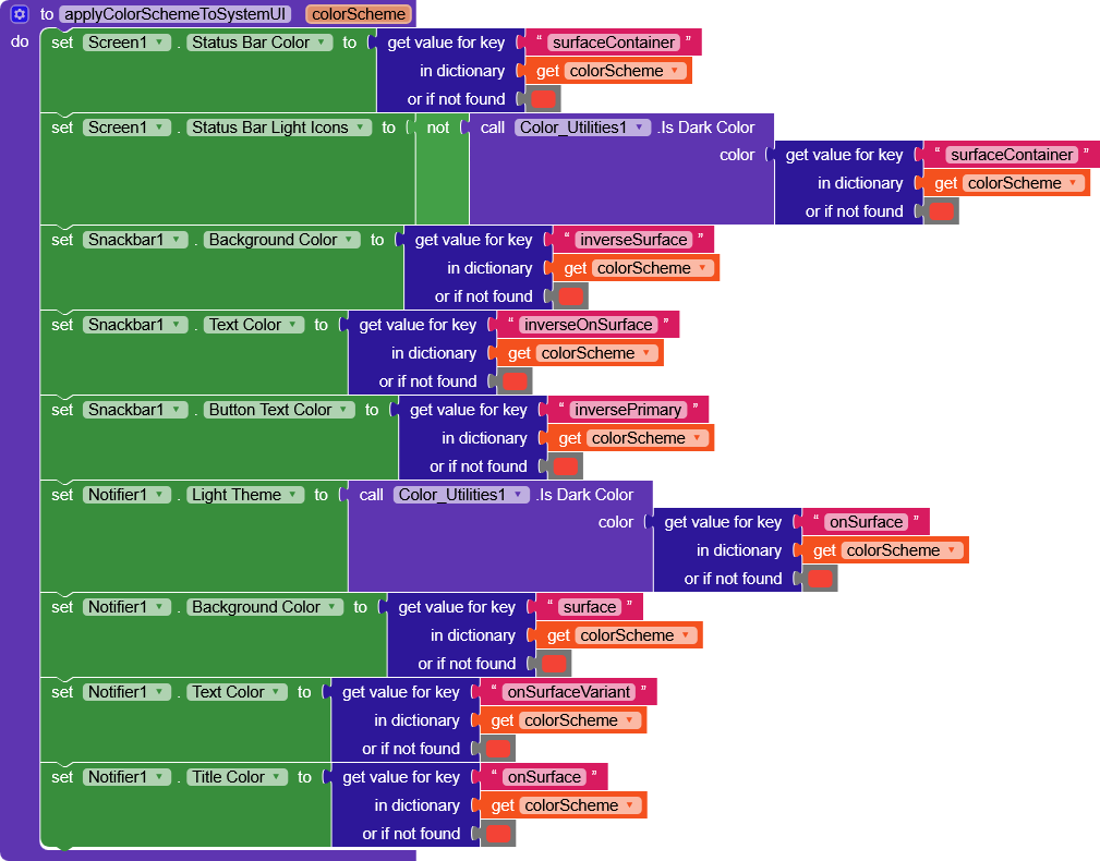
This function is an extra, meaning it can be removed and integrated into the other two procedures. It simply applies the roles to components that do not allow the use of .SetProperties (which are not AndroidViewComponents StatusBar, Snackbar, Notifier and others).
Practical example
Example 1 - Predefined themes
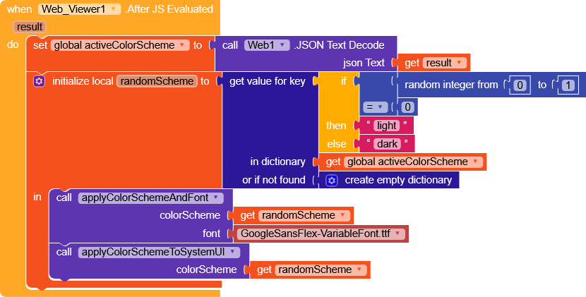
If we wanted to use predefined themes, it would be enough to simply save the output of generateColorScheme as text and store it somewhere, then call it back during initialization.
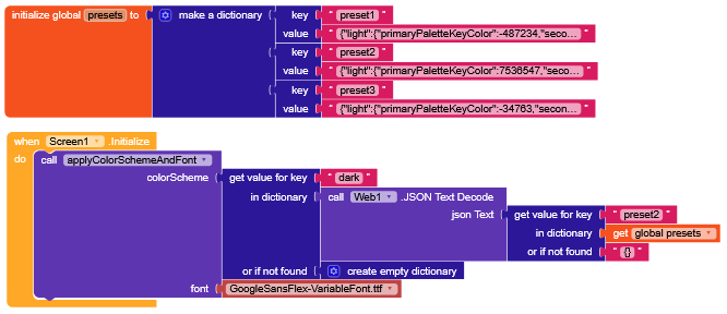
Since it is a JSON text, it must be converted using
Web.JSONTextDecode.
Example 2 - Random theme on each initialization
AIA
Essential AIA

MCU_Theme_Manager_Essential.aia (3.0 MB)
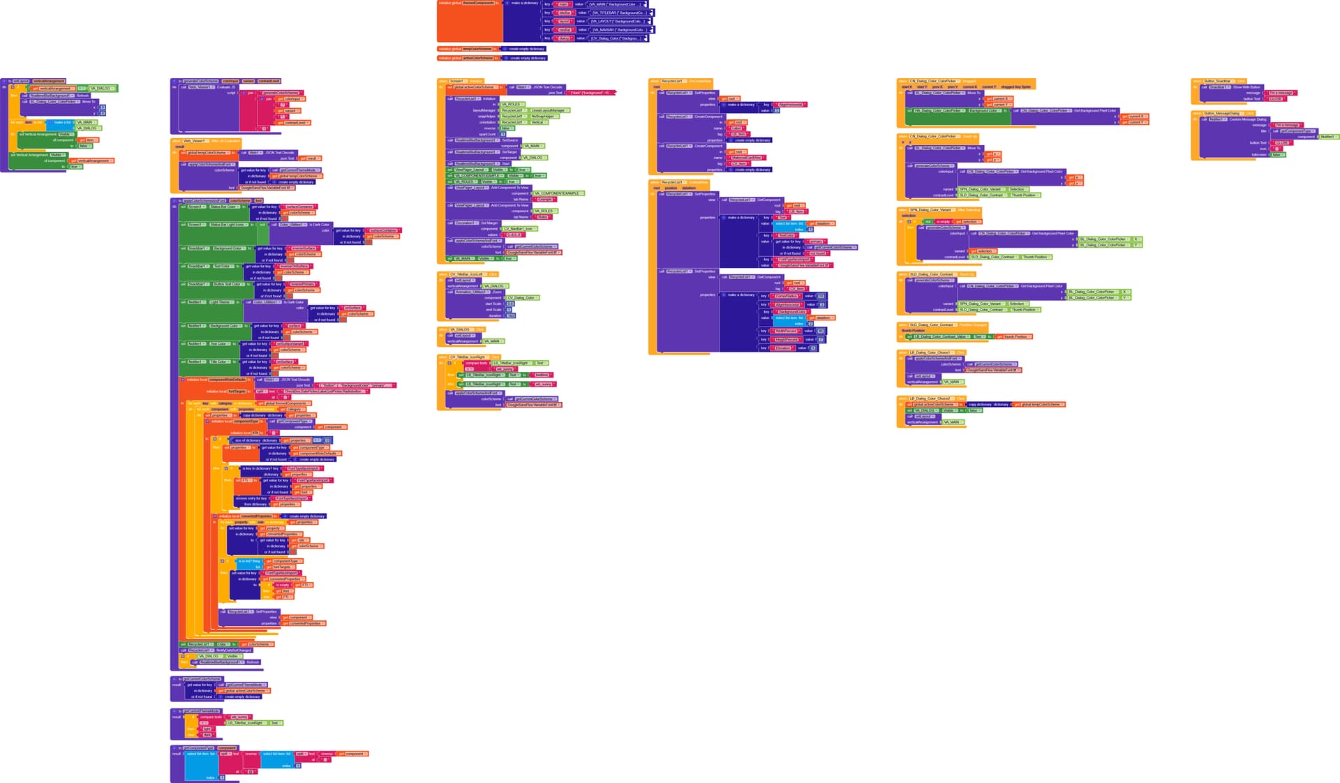
Enhanced AIA
MCU_Theme_Manager.aia (3.0 MB)
Hey, in this project there’s one of my extensions!
Take a look here [F/OS] - RealtimeBlurBackground
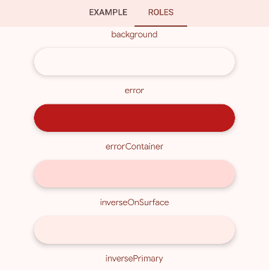
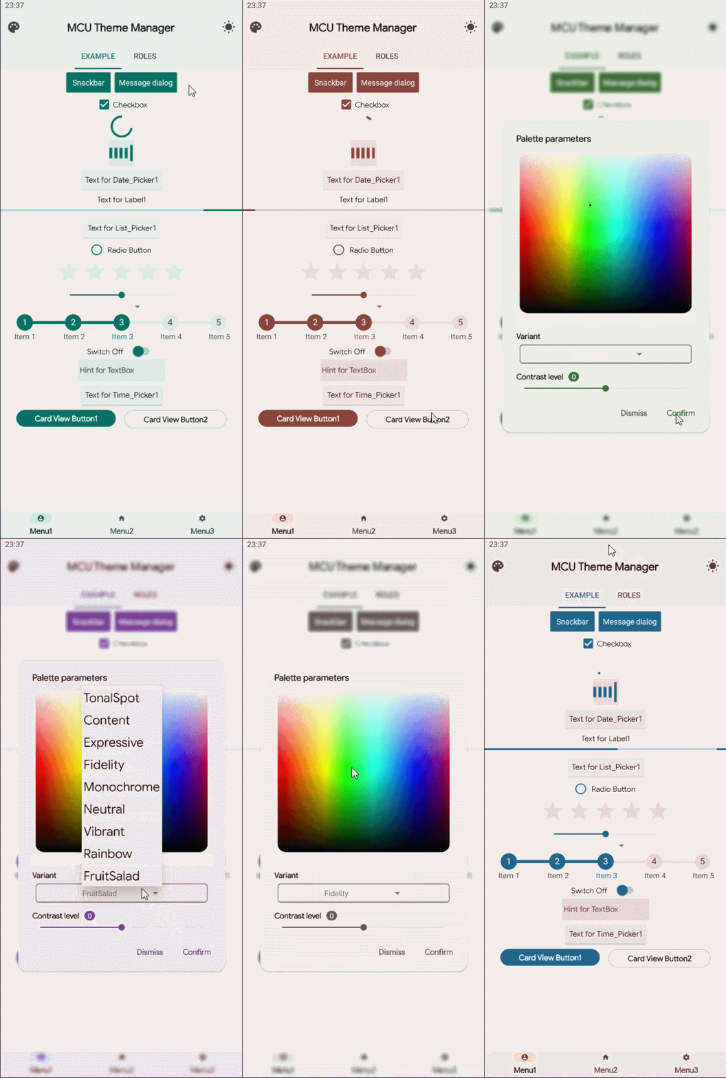
In this project, in the roles section, you can view all the available roles and see how they change based on the selected color.