Getting the Width of the Screen
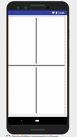
To get the width of the canvas is easy, just add an object (I’ll use an arrangement) and set its width to fill all the available content, it is important that this object has no obstacles and that can fill the entire width of the screen:
After that, then the only thing to do is to get the width of the arrangement, as it combre the whole width of the screen, the value returned will be the width of the screen:

Positioning the FAB
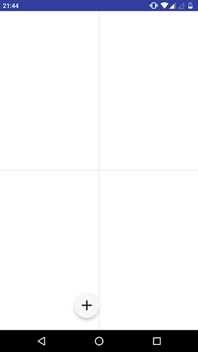
To position the FAB in the middle of the screen, we will divide the width of the arrangement / screen by 2:

See the result:
See, it was not centralized as expected, this is because the positioning of the FAB is not based on the center of the object, but on the right margin and lower margin, we will solve.
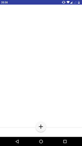
To solve this “slip” we have to subtract the result of the previous division by the radius of the FAB, unfortunately I do not know the exact diameter of the FAB, so I relied on the width of an arrangement comparing its size with the FAB, i arrived at the result of 55 pixels at its normal size, does the radius correspond to half the diameter of the circle: 55/2 = 27.5.
If the developers know the exact size of the FAB please let me know ![]() .
.
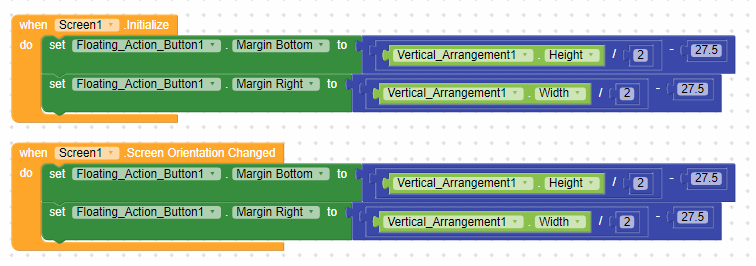
Now, with the radius obtained, we can centralize the FAB, do the same, but now subtracting the previous result by 27.5, which is the radius of the FAB:

And the result will be this:
Vertically also
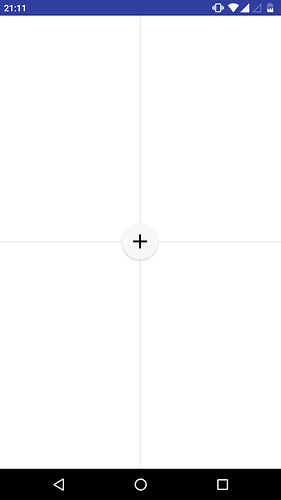
You can also centralize the FAB vertically, just do the same step-by-step, but this time with the height of the object:

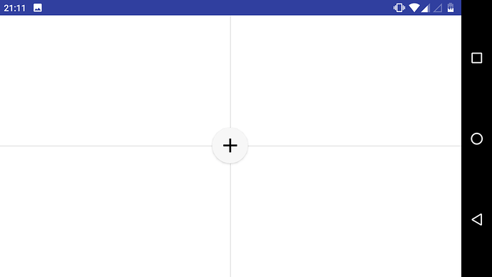
FAB centered on the screen:
Final details
Just like at startup, I recommend adding an event for when the screen orientation changes, so the FAB will be centered in both portrait and landscape mode:
Result:
I hope I have explained everything right, and that everything works the same for you, to reproduce this result I am using a G2 bike, which has a 5’’ screen, but with some settings to make things smaller, everything seemed very responsive, test the AIA file on your smartphone and show the result! ![]() .
.
Source code
FAB_Center.aia (2,7 KB)
