Hi everyone 
Today I wanted to share with you all this method to create a simple notification badge with native components.
Layout
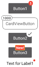
We’ll need to create a layout composed as shown in the image below
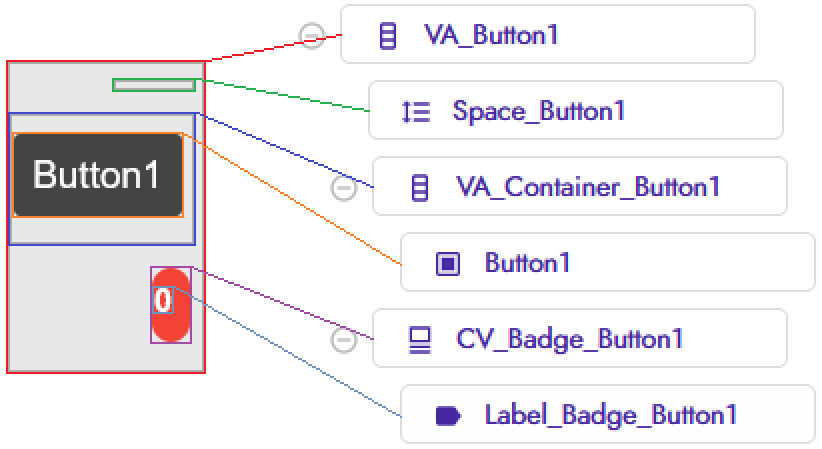
Button1can be any component
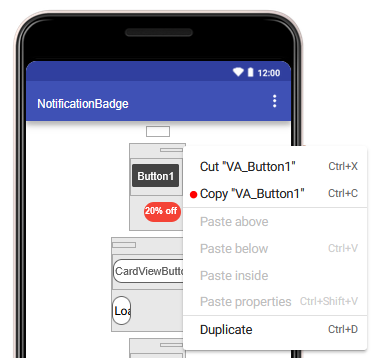
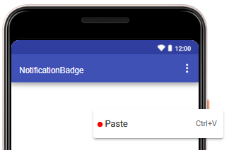
Fast copy/paste layout
I hope you’re familiar with the copy and paste button in the layout screen, it’ll save you some time.
Blocks
The block section consists of two procedures
- one to generate the badge
createBadge - and one to set the text
setBadgeText
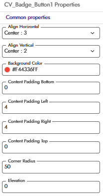
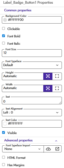
createBadge
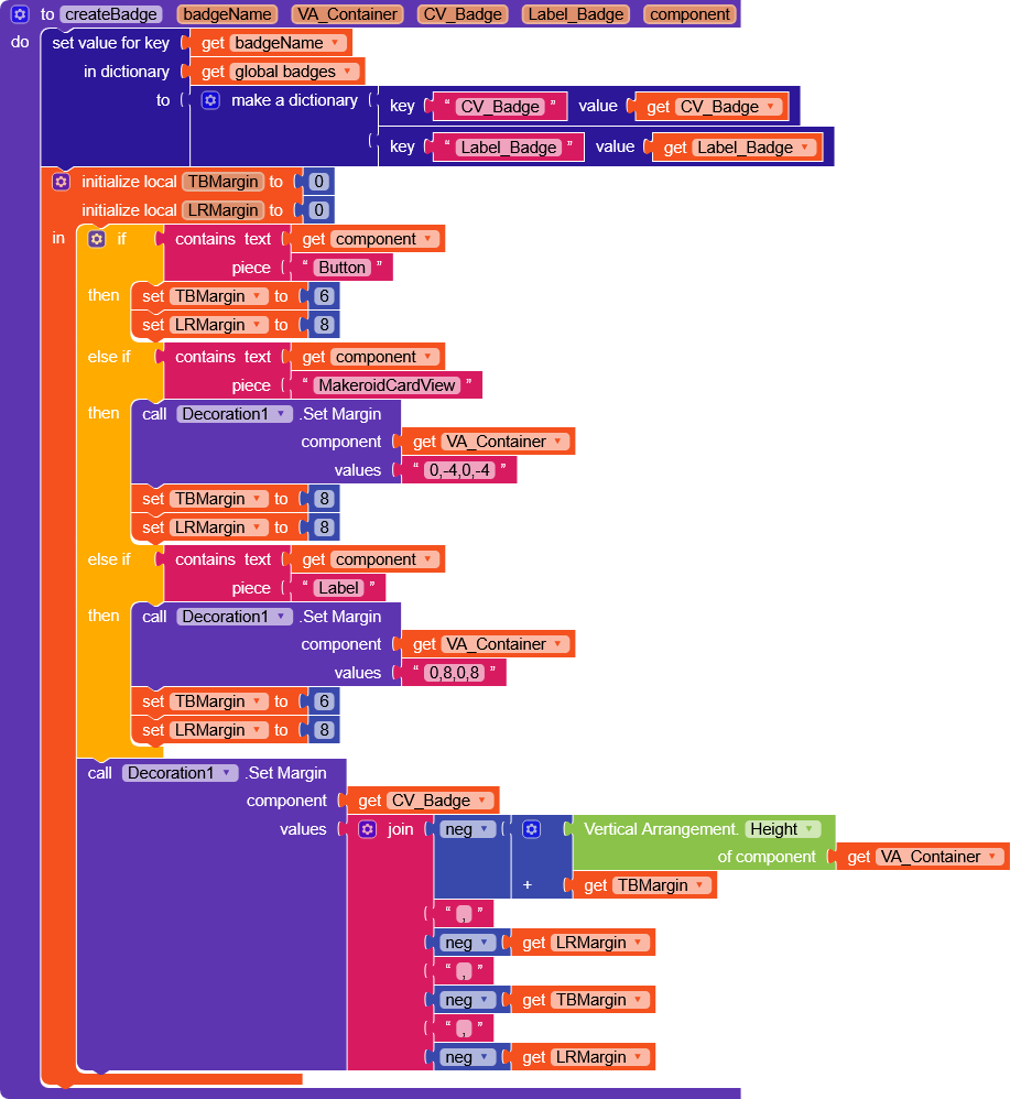
badgeName(a unique name of your choice to assign to the badge)VA_ContainerCV_BadgeLabel_Badgecomponent(the component on which the badge will be placed)
This function will create a dictionary in badges variable with CV_Badge and Label_Badge to later call setBadgeText by passing only the badge name and the text.
Then it will create custom margins based on the component passed (Buttons, CardViews and Labels have different automatic margins) and finally sets a negative margin to the badge so that it overlaps the component.
In case you use other components, it may be necessary to create additional exceptions, but it’s very simple.
You just need to play around with theSpacecomponent in the layout, with theTBMarginandLRMarginvariables, and if necessary, adjust the left and right margins ofVA_Container.
Anyway, I’m available if you need help with your own project.
setBadgeText

badgeNametext
It simply checks the passed text (= “” or 0) and sets text to LabelBadge by retrieving the component from the dictionary.
if 0 or “”, the badge becomes invisible
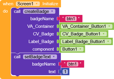
Now in the screen Initialize it will be enough to initialize the badges with createBadge, and setBadgeText.
To demonstrate the potential of creating your own badges, I’ve made a project that includes several different types
…but the possibilities are endless
Result
These variants are not included in the project, but as you can see, they haven’t undergone major changes in particular, the second element contains a Circular_Progress, and the last one an image.
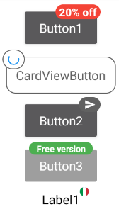
To create this effect, I simply modified the padding ofCV_Badgeto 3,3,3,3 and set theLabel_Badgeheight and width to 1px.
TheLabel_Badge.Textis irrelevant, and you can set any character
AIA
NotificationBadge.aia (8.8 KB)
Happy  oding!!