Hello Everybody
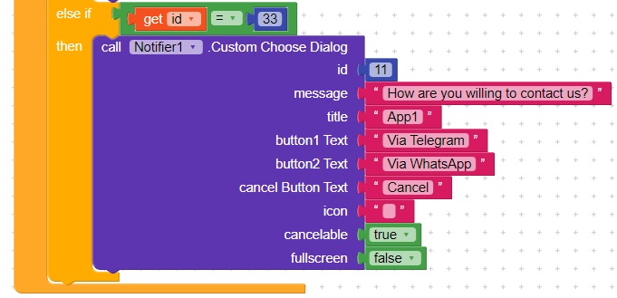
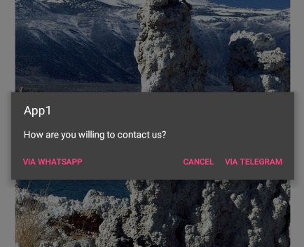
I created a custom dialog box with two choices(buttons) and a cancel button. Only problem is when I run the app in both companion and cell phone it joins the cancel button with one of choices and send the other choice to the far left side. I think Cancel button must be separated and choices be together. Look at screenshots below:
Hi @alireza66
This is perfectly normal and is as intended by Google when they came up with the material design guidelines.
The guidelines state that the positive action button is to be to the extreme right, to the immediate left of which is to be the negative action button. In case you want to give your users an indeterminate choice, it has to be placed in the extreme left.
Maybe the dialog is not a good way of implementing the sharing options.
I suggest you make your own “contact us” menu using the bottom sheet component.
It will work similar to the sharing component.
This is weird. It is a custom choose dialog right? two choices and a cancel button. It is very obvious that choices must come together and other button types separated. I wonder why google has such a strange guideline! in my example, telegram and whatsapp are both exactly similar in action and type. I’m gonna ask this in google forums and see what’s their excuse. Thanks BTW.