Custom Indicator
Hello everyone, As you know I have already published a Dots Indicator extension but I am launching this one new because I have lost my extension sources that’s why I have not updated it. Also it has a total 8 animation styles or dots transfer animation and it is much customizable than previous one. And due to animations that I used in this extension need different version for Androidx and android support library so some change need some changes in package that why I cant update previus one.
Thanks @msr79526 for sponsoring the extension
Let see some block and their documentation.
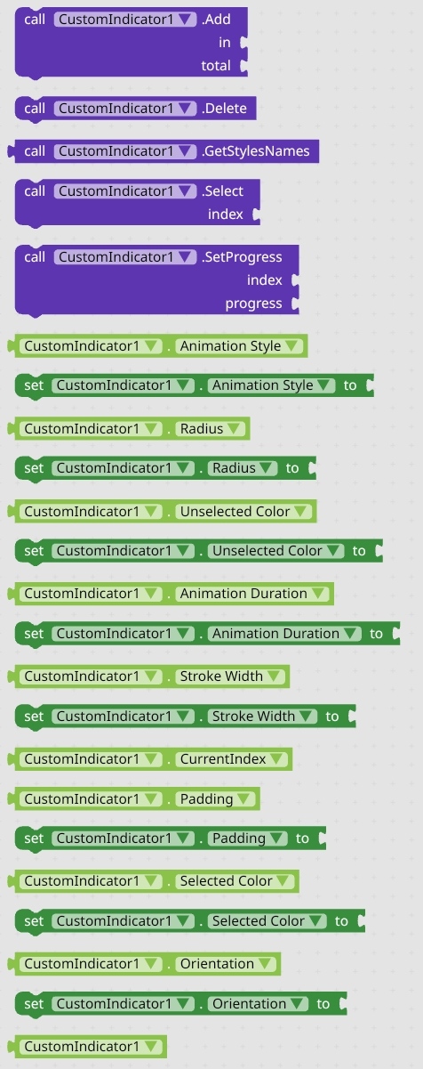
All Blocks
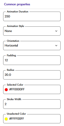
Properties
Animation Styles
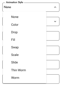
There are total 8 animation styles or dots transfer animation. you can head to the Preview section for seeing the preview of these animations
Orientation
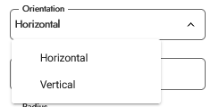
This time I have implemented the orientation too. i.e, Vertical and Horizontal
Documentation
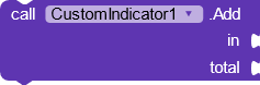
This block create the dots in given layout in in parameter with quantity in total parameter. Once the dots is created you can recreate them. For recreating them you need to remove all the created dot with the help of Delete block.
This block remove all the created dots and then You will be able to recreate them.
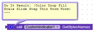
This block return a list of all available animations style
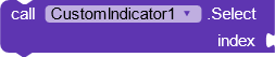
This block set the selected dots for given index. Index starts from 1.
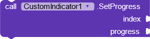
This block set the index with a progress value. What is progress? The progress defines the progress of dots. In simple words if you give a value of 0.5 then the dots will not be selected or transferred whole it will be transferred half. Progress value must be between 0 to 1 in float. Currently this block is Deprecated.
Using Property
Now there are some property blocks You can use them for customizing the dots or you can set the value directly in properties.
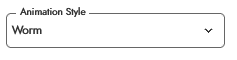
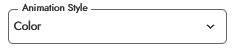
Animation Style
Using Blocks
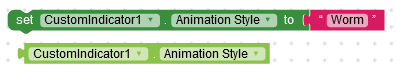
This block set the animation style that you want
Using Property
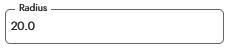
Radius or Size
Using Block
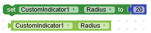
This block set the radius of the dot circles. Note:- It is not the corner radius of the dots. It decide the size of the dots. It is the radius of circle dots.
Using Property
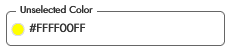
Unselected Color
Using Block
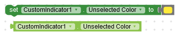
This block set the unselected dots colors or inactive dots colors
Using Property
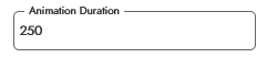
Animation Duration
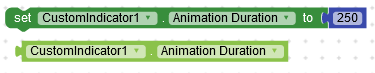
This block set the animation duration or duration that will be taken by dots while transferring to next or given index
Using Property
Stroke Width
Note:- This is only applicable when the animation style will be set to Fill otherwise it is not applicable
Using Block
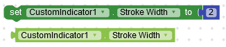
This block set the stroke of the dots. Note:- It is only applicable to Fill animation otherwise it wont work. There is not stroke color property it will be decide by unselected color of the dots.
Using Property
Get Index
This property will return the current selected dot index
Padding
using Block
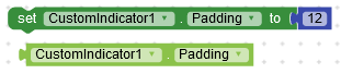
This block set the padding of dots indicator. It is gap or distance between each dots.
Using Property
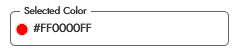
Selected Color
Using Block
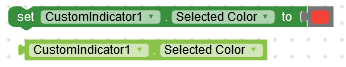
This block set the selected dot color or the active dot color
Using Property
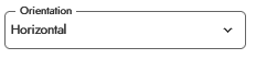
Orientation
Using Blocks
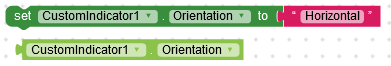
this block set the orientation of the dots. If orientation will set to Horizontal then the dots will be created horizontally and if orientation will set to Vertical then the dots will be created Vertically.
Using Property
Usage and Preview
Let see How to use them and its preview
Usage
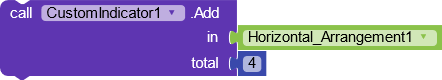
You can create the dots with this simple block.
I am not going to provide the block of animation as there is same block for every animation. You just need to set the animation style by property or blocks.
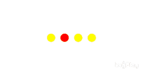
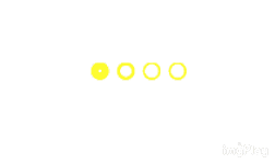
Preview
Let see previews now
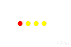
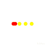
Color Animation

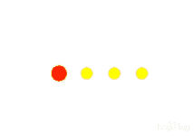
Drop Animation
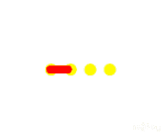
Fill
Swap
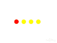
Scale
Slide
Thin Worm
Worm
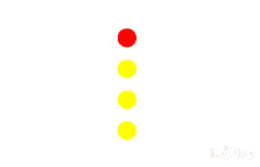
Vertical Orientation
Downloads
Donate
If you like my work then donate if you can 
Credits
Thanks to @Shreyash for his super Rush .
Suggestion and issue are welcome
If you like the extension then like the topic
Thank You All
 .
.
 oding
oding … I have a suggestion when we use the extension for multiple indicators with different colors and animations we will not be able to achieve it so if possible you can declare the params selected color, inactive color,padding and maybe id in the add block else we will have to add many custom indicators, hope you consider my suggestion
 .
.
 I love it