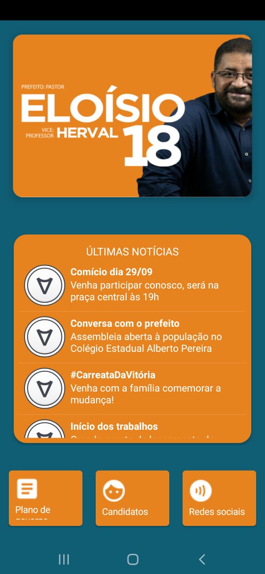
I created a “header” in the application with a card and an image inside the card.
On large screens, the header behaves well, not distorting the image (Screen 1). However, when the cell phone screen decreases, the image is distorted (Screen 2).
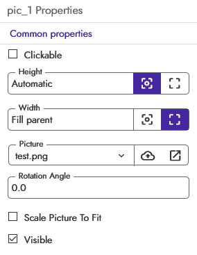
You need to keep the arrangement height proportional to the the width. Your problem is that you are using a fixed height percentage. That will squish the image in a smaller screen or stretch it in a larger one.
Solution:
First, set the arrangement width to whatever width you need to.
Then use this formula to get the height necessary for the image to not get stretched or squished:
Make sure you put everything inside a scrollable arrangement in case the height of the image ends up pushing the lower components outside the viewable area.
I don’t know about cards. I never used those. I guess they are the same as an arrangement? If you need the round corners then do what I said. If not, use an image component and do what @Baraa_Awwad said.
To do what I said, just use the math blocks to do the calculations as I explained up there.