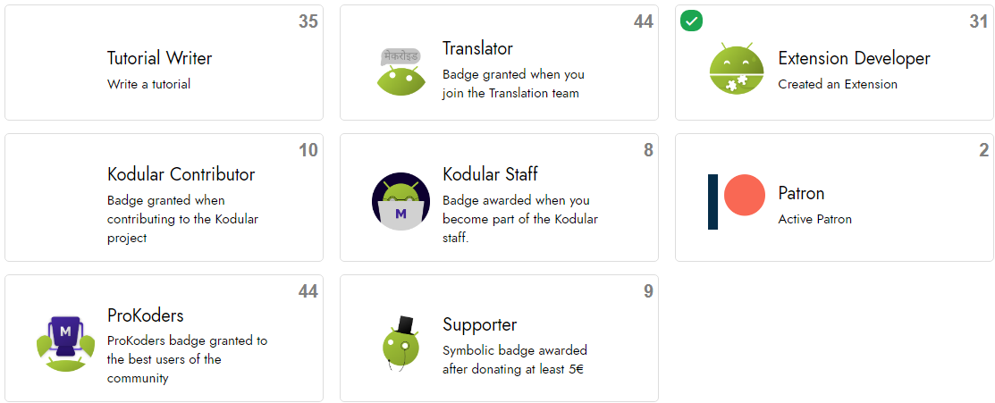
🖌 New Community Look

…and with the alignment of icons too.

PS: I personally liked the old theme better. Can’t we have an option to choose between themes like we had one before?

6 Likes

@Shreyash I am fixing the errors as they are reported.

1 Like

I just did a commit which should fix it :+1:

It’s being a bit difficult for me to debug this, mainly because of the Topic Timeline (Sidebar next to the posts) :confused:


But as stated above, the theme is open source, and contributions are more than welcome. :hugs:

3 Likes

What’s with this giant space?

3 Likes

I totally agree

4 Likes

Also some badges aren’t looking right :point_down:


I think There must be a back button here.but a history button shows else ( maybe it isn’t right.And the icon is in its right place )
image
Also the gif icon isn’t visible at all:
image
And finally the full screen composer.I still can click on.But it doesn’t show nay icon.

EDIT: also there was here an info button so we can tell why are we editing?Also this button icon disappeared:
image
image

Would be nice to have a image icon before the location.

1 Like

I was just thinking that is it really new? :sweat_smile:
Somedays ago i had gone to settings and activated this theme :no_mouth: and it is still active

2 Likes

I can’t find an option to set it to dark mode

I’m still working on it…

But first I want to focus on solving current problems

4 Likes

I’ve found another problem :sweat_smile:
When we click on the number of replies a dialog should appear there.In the new them this dialog is missing icons.See this:


It should be like that:
image

1 Like

terrible subject. my eyes hurt. make a choice of topics

1 Like

Text without any coherence.

1 Like

Your work is very Professional !

2 Likes

I like so much the theme! But some people don’t like it, so I think that it will be great to have the option of change between those themes :hugs:
@yanquisalexander @kodular

2 Likes

i dont see any diff. been the same i know for the past 2 weeks .
maybe spacing is a little different.

It would be nice if like button gets solid instead of outline when liked

6 Likes

This theme is awesome but here’s the setting icon when we reply to post is not at his position.
Here’s ;

2 Likes

I found another problem in my mobile infinix hot 8 android 9


The title of the post is moving underneath rightward

Moreover i found a post witg title in other languages i tried to edit it but not able to change it in English as i found no option to edit…

3 Likes

Is it only me or everyone is seeing the community / kodular icon blurry -


image