Docs
## Events:
ListViewImageText has total 8 events.
1. ItemSelected
Fired when an item is clicked. Position is 1‑based.
| Parameter |
Type |
| position |
number |
| id |
text |
| title |
text |
| artist |
text |
| image |
text |
| duration |
text |
| liked |
boolean |
2. ItemLongClick
Fired when an item is long-clicked. Position is 1‑based.
| Parameter |
Type |
| position |
number |
| id |
text |
| title |
text |
| artist |
text |
| image |
text |
| duration |
text |
| liked |
boolean |
3. LikeClicked
Fired when the like button is clicked. Position is 1‑based.
| Parameter |
Type |
| position |
number |
| id |
text |
| title |
text |
| artist |
text |
| image |
text |
| duration |
text |
| liked |
boolean |
4. DownloadClicked
Fired when the download button is clicked. Position is 1‑based.
| Parameter |
Type |
| position |
number |
| id |
text |
| title |
text |
| artist |
text |
| image |
text |
| duration |
text |
5. PlayPauseClicked
Fired when the play/pause button is clicked. Position is 1‑based.
| Parameter |
Type |
| position |
number |
| id |
text |
| title |
text |
| artist |
text |
| image |
text |
| duration |
text |
| isPlaying |
boolean |
6. ItemSwipedLeft
Fired when the user swipes an item from right to left. Position is 1‑based.
| Parameter |
Type |
| position |
number |
| id |
text |
| title |
text |
| artist |
text |
| image |
text |
| duration |
text |
| liked |
boolean |
7. ItemSwipedRight
Fired when the user swipes an item from left to right. Position is 1‑based.
| Parameter |
Type |
| position |
number |
| id |
text |
| title |
text |
| artist |
text |
| image |
text |
| duration |
text |
| liked |
boolean |
8. BottomReached
Fired when the list is scrolled to the bottom (last item becomes visible).
Methods:
ListViewImageText has total 24 methods.
1. AnchorTo
Anchors this component into the given container
| Parameter |
Type |
| container |
component |
2. RefreshList
Forces the list to refresh (redraw).
3. ClearAndReplaceWithList
Clears the entire list and replaces it with items from a YailList of [id, title, artist, imageUrl, duration, likedByList]. Duplicate IDs are ignored within the new list.
4. AddMusicItemWithId
Adds a music item with a unique ID, image, title, artist, duration, and a list of users who liked it. Duplicates (same ID) are ignored.
| Parameter |
Type |
| id |
text |
| image |
text |
| title |
text |
| artist |
text |
| duration |
text |
| likedBy |
list |
5. AddMusicItemWithLikesJson
Adds a music item with a unique ID, image, title, artist, duration, and a JSON string representing the list of users who liked it. Duplicates (same ID) are ignored.
| Parameter |
Type |
| id |
text |
| image |
text |
| title |
text |
| artist |
text |
| duration |
text |
| likedByJson |
text |
6. AddMusicItem
Legacy: Adds a music item without ID.
| Parameter |
Type |
| image |
text |
| title |
text |
| artist |
text |
| duration |
text |
| liked |
boolean |
7. AddMusicItemWithLikes
Legacy: Adds a music item without ID. Duplicates (same title & artist) are ignored.
| Parameter |
Type |
| image |
text |
| title |
text |
| artist |
text |
| duration |
text |
| likedBy |
list |
8. AddItem
Legacy: Adds an item (image, title, subtitle).
| Parameter |
Type |
| image |
text |
| title |
text |
| subtitle |
text |
9. ClearList
Clears all items and image cache.
10. RemoveItem
Removes item at the specified 1‑based position.
| Parameter |
Type |
| position |
number |
11. UpdateMusicItemWithLikes
Updates an existing music item with new likedBy list. Position is 1‑based.
| Parameter |
Type |
| position |
number |
| image |
text |
| title |
text |
| artist |
text |
| duration |
text |
| likedBy |
list |
12. UpdateMusicItem
Updates an existing music item with simple liked flag (for current user). Position is 1‑based.
| Parameter |
Type |
| position |
number |
| image |
text |
| title |
text |
| artist |
text |
| duration |
text |
| liked |
boolean |
13. SetLikedBy
Sets the list of users who liked the specified item. Position is 1‑based.
| Parameter |
Type |
| position |
number |
| likedBy |
list |
14. GetLikedBy
Returns the list of users who liked the specified item. Position is 1‑based.
| Parameter |
Type |
| position |
number |
15. GetLikedByJson
Returns the list of users who liked the specified item as a JSON string. Position is 1‑based.
| Parameter |
Type |
| position |
number |
16. SetPlaying
Sets the playing state of the item at the given 1‑based position (true = playing, false = paused).
| Parameter |
Type |
| position |
number |
| playing |
boolean |
17. GetPlaying
Returns the playing state of the item at the given 1‑based position.
| Parameter |
Type |
| position |
number |
18. SelectItemByIdTitleArtist
Selects the item matching the given id, title, and artist and optionally scrolls to it.
| Parameter |
Type |
| id |
text |
| title |
text |
| artist |
text |
| scrollToIt |
boolean |
19. SelectItemWithPlaying
Selects the item at the given 1‑based position, sets its playing state, and optionally scrolls to it.
| Parameter |
Type |
| position |
number |
| playing |
boolean |
| scrollToIt |
boolean |
20. SelectItemByIdTitleArtistWithPlaying
Selects the item matching id, title, artist, sets its playing state, and optionally scrolls to it.
| Parameter |
Type |
| id |
text |
| title |
text |
| artist |
text |
| playing |
boolean |
| scrollToIt |
boolean |
21. Search
Filters the list by query (case‑insensitive) on title and artist. Empty query shows all items.
| Parameter |
Type |
| query |
text |
22. SelectItem
Selects the item at the given 1‑based position and optionally scrolls to it.
| Parameter |
Type |
| position |
number |
| scrollToIt |
boolean |
23. ScrollToPosition
Scrolls the list to make the given 1‑based position visible.
| Parameter |
Type |
| position |
number |
24. ScrollToBottom
Scrolls the list to the last item.
Designer:
ListViewImageText has total 40 designer properties.
1. HighlightColor
- Input type:
color
- Default value:
E0E0E0
2. RowHeight
- Input type:
non_negative_integer
- Default value:
0
3. ImageWidth
- Input type:
non_negative_integer
- Default value:
64
4. ImageHeight
- Input type:
non_negative_integer
- Default value:
64
5. CornerRadius
- Input type:
non_negative_integer
- Default value:
0
6. TitleTextColor
- Input type:
color
- Default value:
000000
7. TitleFontSize
- Input type:
float
- Default value:
16.0
8. TitleFontTypeface
- Input type:
typeface
- Default value:
0
9. TitleFontBold
- Input type:
boolean
- Default value:
False
10. TitleFontItalic
- Input type:
boolean
- Default value:
False
11. TitleHTML
- Input type:
boolean
- Default value:
false
12. ArtistTextColor
- Input type:
color
- Default value:
444444
13. ArtistFontSize
- Input type:
float
- Default value:
14.0
14. ArtistFontTypeface
- Input type:
typeface
- Default value:
0
15. ArtistFontBold
- Input type:
boolean
- Default value:
False
16. ArtistFontItalic
- Input type:
boolean
- Default value:
False
17. ArtistHTML
- Input type:
boolean
- Default value:
false
18. DurationTextColor
- Input type:
color
- Default value:
888888
19. DurationFontSize
- Input type:
float
- Default value:
12.0
20. DurationFontTypeface
- Input type:
typeface
- Default value:
0
21. DurationFontBold
- Input type:
boolean
- Default value:
False
22. DurationFontItalic
- Input type:
boolean
- Default value:
False
23. DownloadButtonText
- Input type:
string
- Default value:
?
24. LikeButtonText
- Input type:
string
- Default value:
?
25. LikedButtonText
- Input type:
string
- Default value:
?
26. PlayIconText
- Input type:
string
- Default value:
?
27. PauseIconText
- Input type:
string
- Default value:
?
28. DownloadButtonColor
- Input type:
color
- Default value:
000000
29. LikeButtonColor
- Input type:
color
- Default value:
000000
30. LikedButtonColor
- Input type:
color
- Default value:
FF0000
31. PlayButtonColor
- Input type:
color
- Default value:
000000
32. ButtonTextSize
- Input type:
float
- Default value:
18.0
33. ScrollAnimationEnabled
- Input type:
boolean
- Default value:
True
34. BackgroundColor
- Input type:
color
- Default value:
FFFFFF
35. DividerColor
- Input type:
color
- Default value:
FFFFFF
36. DividerHeight
- Input type:
non_negative_integer
- Default value:
1
37. ImageSide
- Input type:
integer
- Default value:
1
38. PlaceholderImageUrl
- Input type:
string
- Default value:
https://cdn-icons-png.flaticon.com/512/7500/7500224.png
39. ErrorImageUrl
- Input type:
string
- Default value:
https://cdn-icons-png.flaticon.com/512/2748/2748558.png
40. GenericImageUrl
- Input type:
string
- Default value:
https://cdn-icons-png.flaticon.com/512/7500/7500224.png
Setters:
ListViewImageText has total 41 setter properties.
1. CurrentUser
Sets the current username for like detection.
2. HighlightColor
Background color of the selected item.
3. RowHeight
Sets the row height in pixels (0 = wrap content).
4. ImageWidth
Sets the image width in pixels.
5. ImageHeight
Sets the image height in pixels.
6. CornerRadius
Sets the corner radius for images in pixels (0 = square).
7. TitleTextColor
Sets the title text color.
8. TitleFontSize
Sets the title font size in sp.
9. TitleFontTypeface
Sets the title font typeface.
10. TitleFontBold
Sets whether the title is bold.
11. TitleFontItalic
Sets whether the title is italic.
12. TitleHTML
Sets whether the title text should be interpreted as HTML.
13. ArtistTextColor
Sets the artist text color.
14. ArtistFontSize
Sets the artist font size in sp.
15. ArtistFontTypeface
Sets the artist font typeface.
16. ArtistFontBold
Sets whether the artist text is bold.
17. ArtistFontItalic
Sets whether the artist text is italic.
18. ArtistHTML
Sets whether the artist text should be interpreted as HTML.
19. DurationTextColor
Sets the text color for the duration field.
20. DurationFontSize
Sets the text size (in sp) for the duration field.
21. DurationFontTypeface
Sets the font typeface for the duration field.
22. DurationFontBold
Sets whether the duration is bold.
23. DurationFontItalic
Sets whether the duration is italic.
24. DownloadButtonText
Text for the download button (Material icon or custom).
25. LikeButtonText
Text for the like button when not liked.
26. LikedButtonText
Text for the like button when liked.
27. PlayIconText
Text for the play icon (Material icon).
28. PauseIconText
Text for the pause icon (Material icon).
29. DownloadButtonColor
Color for the download button.
30. LikeButtonColor
Color for the like button when not liked.
31. LikedButtonColor
Color for the like button when liked.
32. PlayButtonColor
Color for the play/pause button.
33. ButtonTextSize
Text size for download/like/play buttons (in sp).
34. ScrollAnimationEnabled
Enable/disable slide-in animation when items become visible.
35. BackgroundColor
Background color of the list.
36. DividerColor
Sets the divider color.
37. DividerHeight
Sets the divider height in pixels.
38. ImageSide
Sets image side: 1=Left, 2=Right.
39. PlaceholderImageUrl
Sets the placeholder image URL shown while loading.
40. ErrorImageUrl
Sets the error image URL shown when loading fails.
41. GenericImageUrl
Sets the generic image URL used when an item’s image URL is empty.
Getters:
ListViewImageText has total 42 getter properties.
1. CurrentUser
Sets the current username for like detection.
2. SelectedPosition
Returns the currently selected position (1‑based, -1 if none).
3. HighlightColor
Background color of the selected item.
4. RowHeight
Sets the row height in pixels (0 = wrap content).
5. ImageWidth
Sets the image width in pixels.
6. ImageHeight
Sets the image height in pixels.
7. CornerRadius
Sets the corner radius for images in pixels (0 = square).
8. TitleTextColor
Sets the title text color.
9. TitleFontSize
Sets the title font size in sp.
10. TitleFontTypeface
Sets the title font typeface.
11. TitleFontBold
Sets whether the title is bold.
12. TitleFontItalic
Sets whether the title is italic.
13. TitleHTML
Sets whether the title text should be interpreted as HTML.
14. ArtistTextColor
Sets the artist text color.
15. ArtistFontSize
Sets the artist font size in sp.
16. ArtistFontTypeface
Sets the artist font typeface.
17. ArtistFontBold
Sets whether the artist text is bold.
18. ArtistFontItalic
Sets whether the artist text is italic.
19. ArtistHTML
Sets whether the artist text should be interpreted as HTML.
20. DurationTextColor
Sets the text color for the duration field.
21. DurationFontSize
Sets the text size (in sp) for the duration field.
22. DurationFontTypeface
Sets the font typeface for the duration field.
23. DurationFontBold
Sets whether the duration is bold.
24. DurationFontItalic
Sets whether the duration is italic.
25. DownloadButtonText
Text for the download button (Material icon or custom).
26. LikeButtonText
Text for the like button when not liked.
27. LikedButtonText
Text for the like button when liked.
28. PlayIconText
Text for the play icon (Material icon).
29. PauseIconText
Text for the pause icon (Material icon).
30. DownloadButtonColor
Color for the download button.
31. LikeButtonColor
Color for the like button when not liked.
32. LikedButtonColor
Color for the like button when liked.
33. PlayButtonColor
Color for the play/pause button.
34. ButtonTextSize
Text size for download/like/play buttons (in sp).
35. ScrollAnimationEnabled
Enable/disable slide-in animation when items become visible.
36. BackgroundColor
Background color of the list.
37. DividerColor
Sets the divider color.
38. DividerHeight
Sets the divider height in pixels.
39. ImageSide
Sets image side: 1=Left, 2=Right.
40. PlaceholderImageUrl
Sets the placeholder image URL shown while loading.
41. ErrorImageUrl
Sets the error image URL shown when loading fails.
42. GenericImageUrl
Sets the generic image URL used when an item’s image URL is empty.
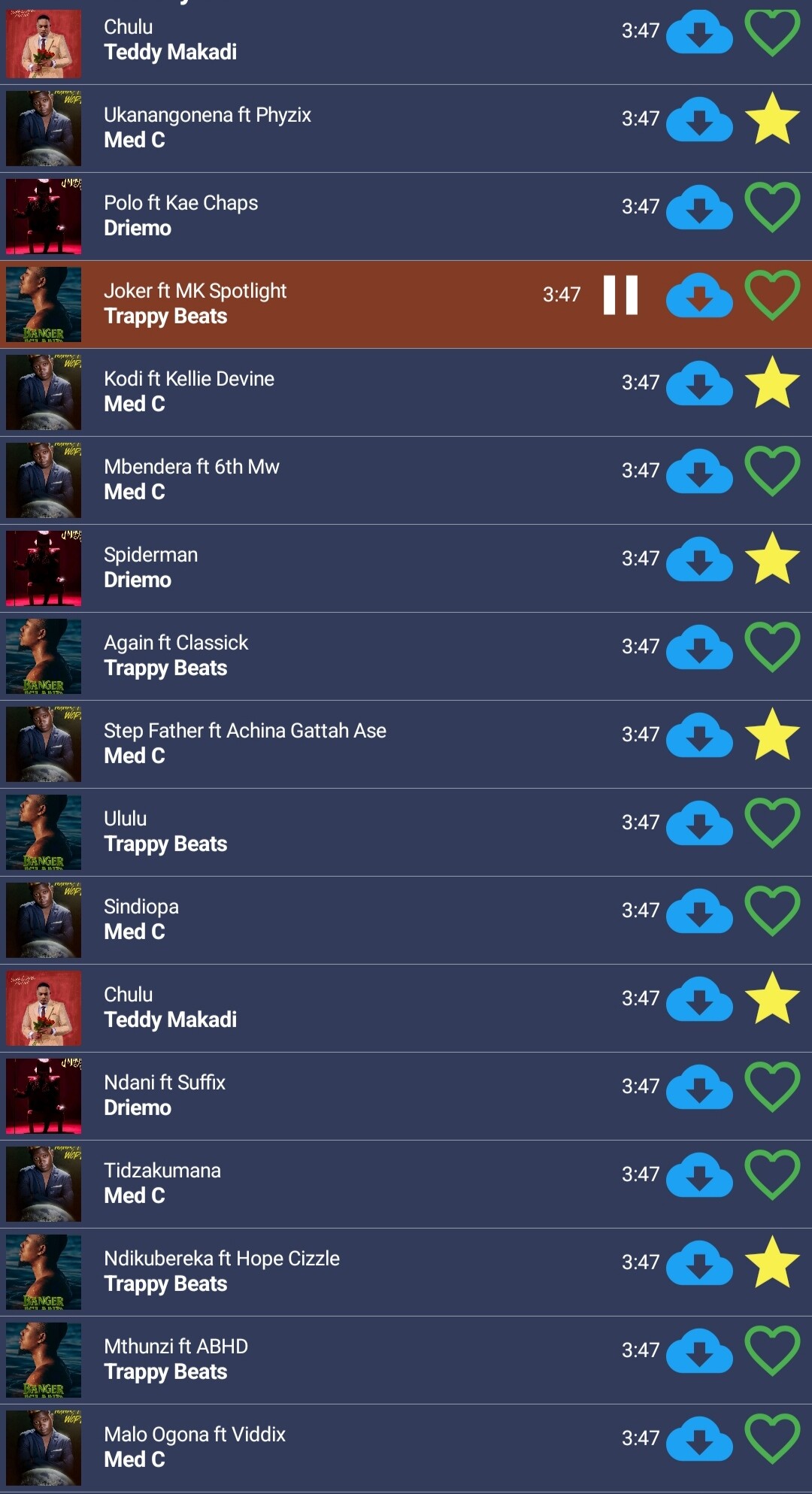
I modified this code because am in need of simple playlist with more features, i know this can be possible with RecyclerList but i can’t survive  so java was my last option, since my issue with music player was solve am now working on it. As of now i wasn’t able to add aia, but in few day i will.
When i have more time i will make it look more better but for now that’s enough for me
 Specifications
 Package: com.bosonshiggs.listviewimagetext
 Size: 32,00 KB
 Version: 1.0
 Minimum API Level: 7
 Updated On: 2025-06-20T03:00:00Z
 Built & documented using: FAST v3.7.0


