🧩 DynamicListView
An extension for Kodular.Dynamic CardView List with async batch loading, customizable animations, and extensive item management
 Specifications
 Package: io.jai.dynamiclistview
 Size: 34.35 KB
 Minimum API Level: 7
 Updated On: 2025-05-21T18:30:00Z
 Built & documented using: FAST v3.4.0
Hello Team this time i have created another tiny extension for the favour of kodular community. This can be achieved by Dynamic component extension but this will save your time and code, error if you prefer this model of list view
- User can set image (round as well as square)
- Users can add list of title, subtitle as a yailist
- User can enjoy the feature with fav button (if heart choosen red star will be filled with red, else small red will filled if choosen)
- Also user can have description under the above said layout in any number of lines (if doesnot need can be hidden)
- Above all you i also have provided one more cardview button to have the index. (this also can be hidden if do not need)
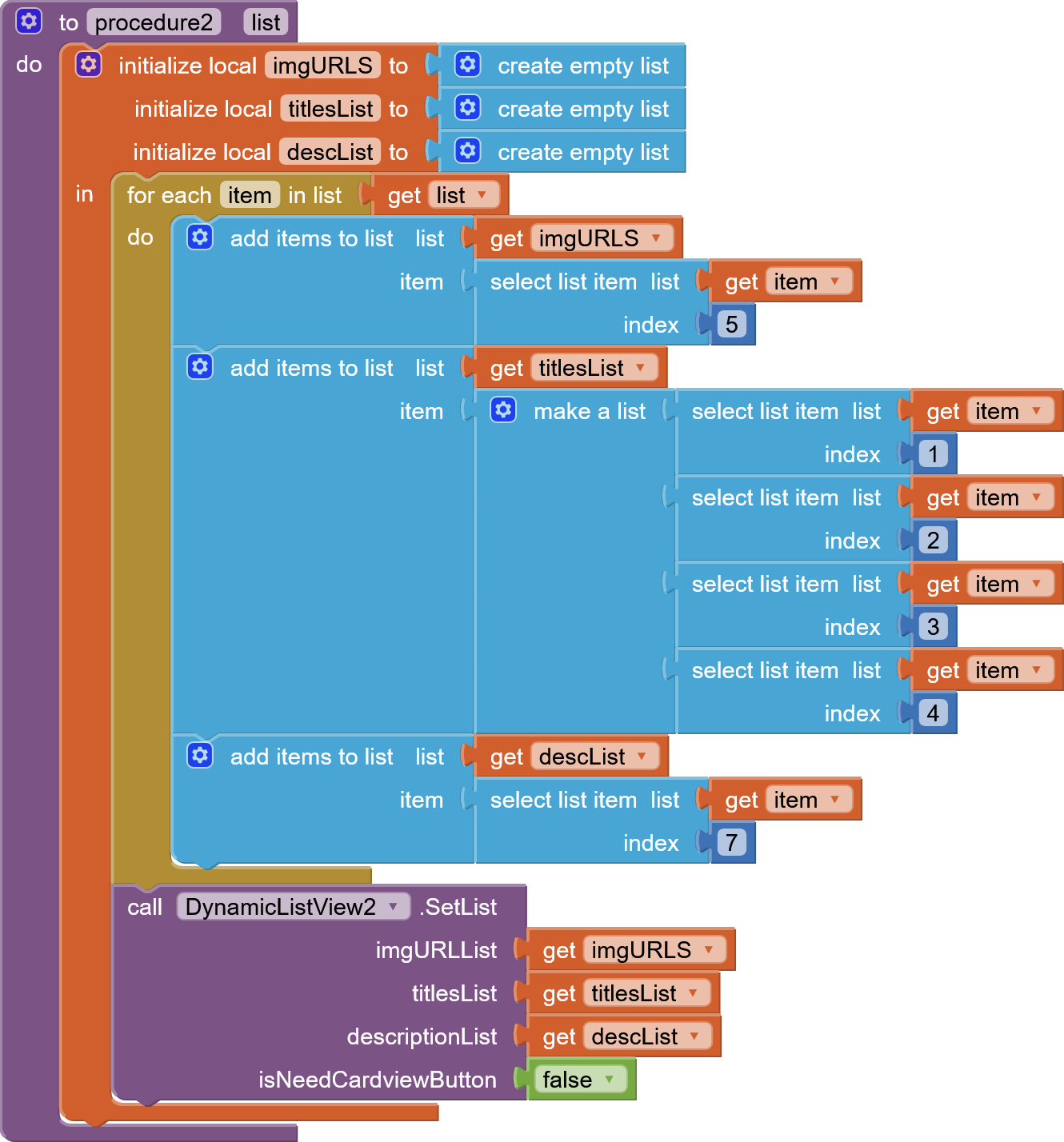
Users can create Dynamic list in two ways.
-
As add items ( by using for each items from the list)
-
or after making list you can pass

For user friendly i have added few event dispatcher


Also added few animation while creating the componets as well as while scrolling up and down ( but it was limited right now)

Available animation for CreationAnimationType = {“Fade”, “Slide”, “Scale”, “Bounce”}
Available animation for ScrollAnimationType = {“Off”,“Fade”, “Slide”, “Scale”, “Bounce”}
DynamicListView
Dynamic CardView List with async batch loading, customizable animations, and extensive item management
Events:
FavoriteClicked
Fired when a favorite button is clicked, returns 1-based index and row data [imageUrl, titles, description, isFav]
| Parameter | Type |
|---|---|
| index | number |
| rowData | list |
RowClicked
Fired when a row is clicked, returns 1-based index and row data [imageUrl, titles, description, isFav]
| Parameter | Type |
|---|---|
| index | number |
| rowData | list |
DescriptionClicked
Fired when description text is clicked, returns 1-based index and row data [imageUrl, titles, description, isFav]
| Parameter | Type |
|---|---|
| index | number |
| rowData | list |
ItemLoaded
Fired when an item is loaded, with the number of loaded and remaining items
| Parameter | Type |
|---|---|
| loadedCount | number |
| remainingCount | number |
CardviewButtonClicked
Fired when the cardview button is clicked, returns 1-based index and row data [imageUrl, titles, description, isFav]
| Parameter | Type |
|---|---|
| index | number |
| rowData | list |
ItemVisible
Fired when an item becomes visible during scrolling, returns 1-based index
| Parameter | Type |
|---|---|
| index | number |
Methods:
Initialise
Initializes the DynamicListView in the specified container with animation
| Parameter | Type |
|---|---|
| container | component |
AddItem
Adds an item with image URL, list of titles, description, and cardview button flag
| Parameter | Type |
|---|---|
| imgURL | text |
| titles | list |
| description | text |
| isNeedCardviewButton | boolean |
SetList
Sets the full list with image URLs, titles, descriptions, and a cardview button flag for all items
| Parameter | Type |
|---|---|
| imgURLList | list |
| titlesList | list |
| descriptionList | list |
| isNeedCardviewButton | boolean |
DeleteAll
Removes all items from the list
DeleteByIndex
Removes an item at the specified 1-based index
| Parameter | Type |
|---|---|
| index | number |
InsertItemAtIndex
Inserts an item at the specified 1-based index
| Parameter | Type |
|---|---|
| index | number |
| imgURL | text |
| titles | list |
| description | text |
| isNeedCardviewButton | boolean |
GetItemData
Returns the data [imageUrl, titles, description, isFav] for the item at the specified 1-based index
| Parameter | Type |
|---|---|
| index | number |
Return Type: list
UpdateItem
Updates the item at the specified 1-based index
| Parameter | Type |
|---|---|
| index | number |
| imgURL | text |
| titles | list |
| description | text |
| isNeedCardviewButton | boolean |
Properties:
RoundImage
If true, displays images as circular
RoundImage
If true, displays images as circular
TitleTextColor
Sets the title text color (ARGB)
TitleTextColor
Sets the title text color (ARGB)
TitleFontBold
If true, sets the title font to bold
TitleFontBold
If true, sets the title font to bold
TitleFontSize
Sets the title font size in sp
TitleFontSize
Sets the title font size in sp
Title1TextColor
Sets the first title text color (ARGB)
Title1TextColor
Sets the first title text color (ARGB)
Title1FontBold
If true, sets the first title font to bold
Title1FontBold
If true, sets the first title font to bold
DescriptionTextColor
Sets the description text color (ARGB)
DescriptionTextColor
Sets the description text color (ARGB)
DescriptionFontBold
If true, sets the description font to bold
DescriptionFontBold
If true, sets the description font to bold
DescriptionFontSize
Sets the description font size in sp
DescriptionFontSize
Sets the description font size in sp
CardviewButtonText
Sets the text for the cardview button
CardviewButtonText
Sets the text for the cardview button
CardviewButtonBackgroundColor
Sets the cardview button background color (ARGB)
CardviewButtonBackgroundColor
Sets the cardview button background color (ARGB)
CardviewButtonTextColor
Sets the cardview button text color (ARGB)
CardviewButtonTextColor
Sets the cardview button text color (ARGB)
CardviewButtonVisible
If true, displays the cardview button
CardviewButtonVisible
If true, displays the cardview button
CardViewBackgroundColor
Sets the cardview background color (ARGB)
CardViewBackgroundColor
Sets the cardview background color (ARGB)
CardviewStrokeColor
Sets the cardview stroke color (ARGB)
CardviewStrokeColor
Sets the cardview stroke color (ARGB)
CardviewStrokeWidth
Sets the cardview stroke width in dp
CardviewStrokeWidth
Sets the cardview stroke width in dp
CardElevation
Sets the elevation of the cards in dp
CardElevation
Sets the elevation of the cards in dp
CardCornerRadius
Sets the corner radius of the cards in dp
CardCornerRadius
Sets the corner radius of the cards in dp
IsFavButtonHeart
If true, uses a heart icon for the favorite button
IsFavButtonHeart
If true, uses a heart icon for the favorite button
IsFavButtonRound
If true, makes the favorite button round (affects star icon only)
IsFavButtonRound
If true, makes the favorite button round (affects star icon only)
FontPath
Sets the font file for titles and description (path to .ttf in assets)
FontPath
Sets the font file for titles and description (path to .ttf in assets)
FavIconOn
Sets the drawable resource for favorited state (asset path)
FavIconOn
Sets the drawable resource for favorited state (asset path)
FavIconOff
Sets the drawable resource for non-favorited state (asset path)
FavIconOff
Sets the drawable resource for non-favorited state (asset path)
CreationAnimationType
Sets the animation type for item creation as Fade, Slide, Scale, Bounce
CreationAnimationType
Sets the animation type for item creation as Fade, Slide, Scale, Bounce
ScrollAnimationType
Sets the animation type for scrolling as Fade, Slide, Scale, Bounce
ScrollAnimationType
Sets the animation type for scrolling as Fade, Slide, Scale, Bounce
Credit:
This extension was created by FAST EXTENSION BUILDER and the owner @JEWEL for his wounderful platform. thank you jewel
@Sashkin_Bro for testing the extension and share his screenshots, Thank you man
@Akshat_Rana for the documentation from here


Here, You can customize the folowing
- cardview bg colour, stroke color, stroke width, corner radius
- Image can be rounded or squared
- Can set Titles as a yaillist. You can set as much as you want. In the above code we used 4 items. Here first Title also can be customized rest also can be customized.
- As said earlier fav button, description and cardview button also can be customized thier colour, visibility etc.
.
Extension
Version 1 : io.jai.dynamiclistview.aix (34.4 KB)
Published on : 2025-05-22T17:45:00Z
If time permists test my extension and share your feedbacks or report bug.


