Custom List View
This extension allow you to create a custom list view with an Image, Title , Subtitle and a secondary text elements. It comes with a lot of features such as Drag and Drop and Swipe item with both sides. You can use extension to load images. You can customize the list view with designer properties.
Thanks @Henry for sponsoring the extension ![]()
Let see some blocks and their documentation.
All Blocks
There are 8 events, 17 method blocks and 28 set properties tht makes this list view fully customisable.
All Events
All Methods
All Designer Properties
Documentation

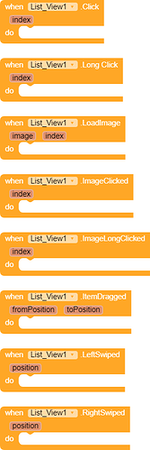
This event raises when any item clicked with position of the clicked item.

This event raises when any item long clicked with position of the clicked item.

This event raises when your item’s image need to be loaded. You can use Image Utility component to load the image or some extension(not all).

This event raises when item’s images is clicked with the position of the clicked image.

This event raises when item’s image is long clicked with the position of the clicked image.

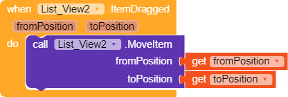
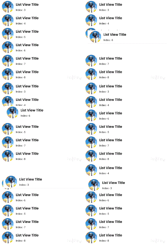
As I said the list view have drag and drop feature. This event raises when an item is dragged to another place. It gives you two parameter fromPosition is the position from where the item has been dragged or toPosition where the item has been dragged(new position). You would need to enable the Draggable property for making able to drag your views.

This event raises when the item is swiped to left side. It will give you the position of the item in parameter. You will need to enable the LeftSwipeAble property otherwise item would not be able to swiped.

This event raises when the item is swiped to right side. It will give you the position of the item in parameter. You will need to enable the RightSwipeAble property otherwise item would not be able to swiped.

This block create the list view to given container. If the list view is already added to any container then nothing will happen.
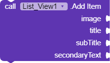
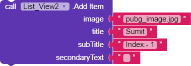
This block add an item to the list view with title,subtitle, image and secondary text. They can be nullable.
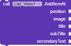
This block do the same above job but it add the item at given position.
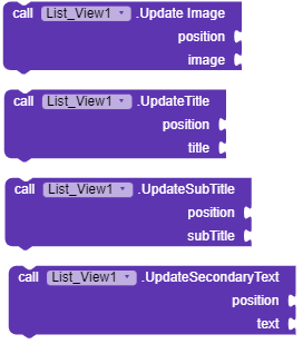
These block can be used to update the item with position.

This block move the item to given position from given position. You will see an animation while item are switiching.

This block removes the item from specific position. You will see here an animation too.
![]()
This block removes all the items from list view.
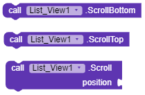
These block are used to control scroll of list view.
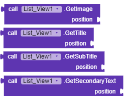
These blocks helps you to get the item details from specific position.

Set the item’s background color.
![]()
Set to true then item can be dragged. You need to control them by blocks then.

Set the size of item’s image. Default is 60.

Set the icon that will be shown when the item is swiped to left direction.

Set the text that will be shown when the item is swiped to left direction.
![]()
If set to true then the list will be reversed.
![]()
Set the icon that will be shown when the item is swiped to right direction.

Set the background color that will be shown when the item is swiped to left direction.
![]()
If set to true then item would be able to swipe in right direction.

Set the background color that will be shown when the item is swiped to right direction.

Set the text that will be shown when the item is swiped to right direction.
![]()
Set the custom font typeface of the secondary text of an item.

Set the vertical alignment of the secondary text of items.
![]()
Set the secondary text color of items.
![]()
Set the font size of the secondary text of items.
![]()
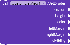
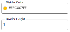
If set to true then a divider will be shown between items.
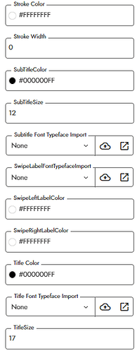
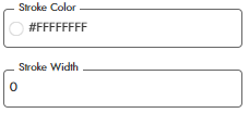
Set the stroke property of the item’s image view.
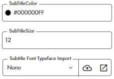
Set the subtitle property of the items
![]()
Set the custom font typeface of the label that will be shown when the view is swiped.
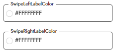
Set the text color of the labels that will be shown when the item is swiped.
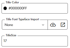
Set the properties of the title of items.
Usage
Let see little usage so you can understand how to use it.
Adding an Item

Updating the item

Moving the Item

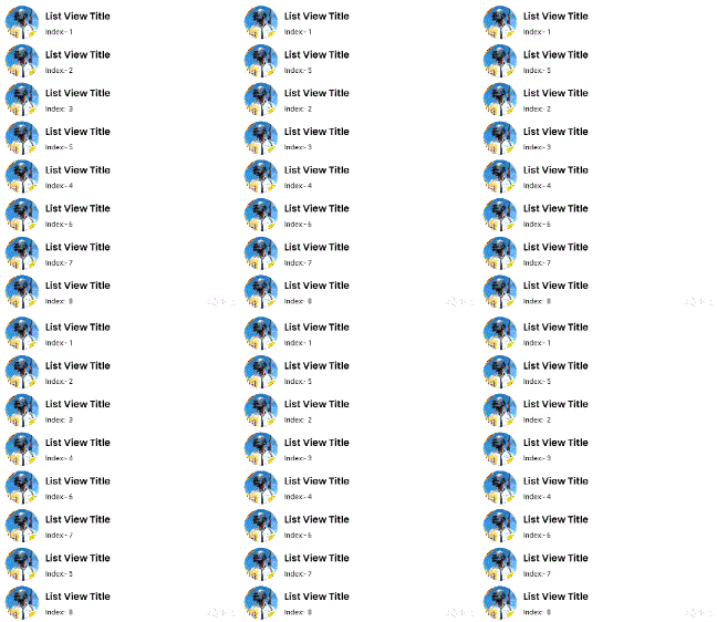
Removing the Item


Dragging Items
Make sure to check the Draggable property
![]()
Enable Swiping of Items
Make sure to check the following properties.
![]()
For enabling the swipe in left direction.
![]()
For enabling the swipe in right direction.
![]()
![]()
We have set the icon on both sides.
Swipe Actions
How will you move or remove item while swiping or dragging.
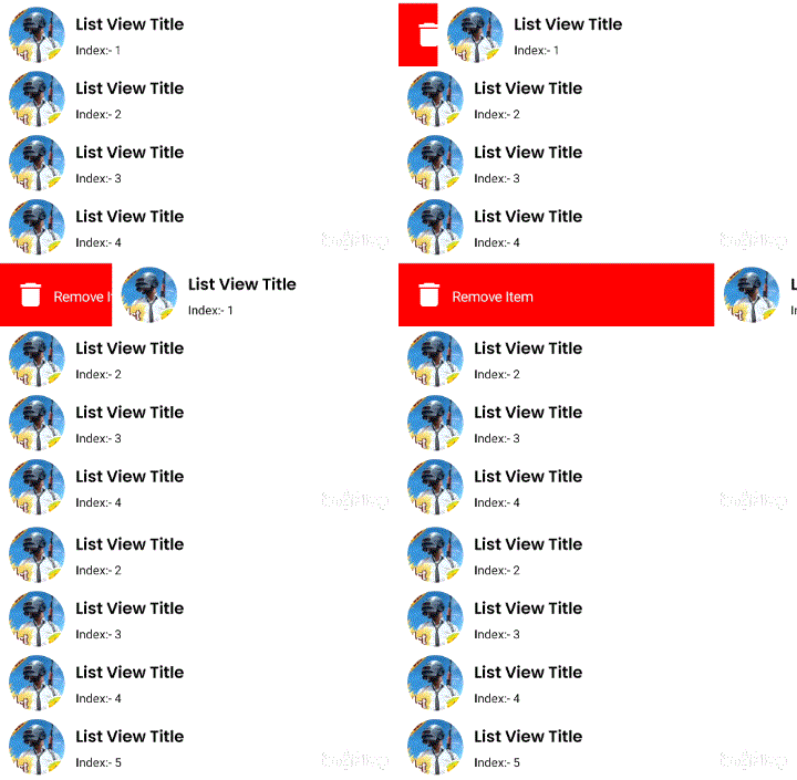
When the item will swiped right, we will remove that item by position.
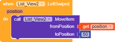
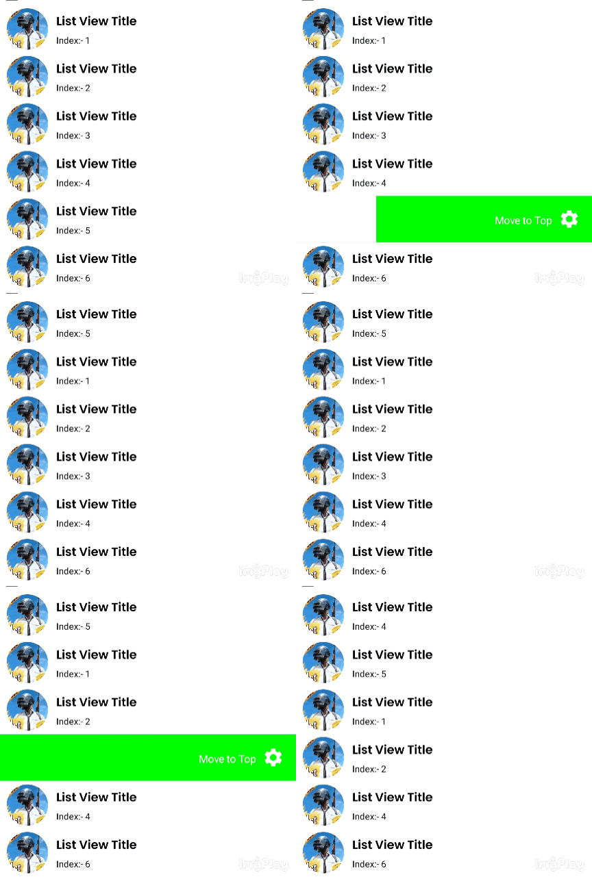
When the item is swiped in left direction, we will move the item to the top position.
When the item is dragged we will move the item from it’s older place to it’s new place.
Loading Image
We can load the image by picasso extension by @vknow360 and can use Image Utility component to load the images.
However, if you uses picasso extension then you won’t get rounded circle image.
Download
Version 1 [Not working]
Download AIX
You can download latest version from here :
Donate
If you liked my any work or the extension, you can support by donating some amount.
Paypal: paypal.me
UPI: iamwsumit@kotak
Credit
Thanks @Shreyash for the super powerfull Rush .
Worked very hard for this long extension so like the extension if you like it ![]()
Suggestion and issue are welcome
Thanks you
Sumit![]()
