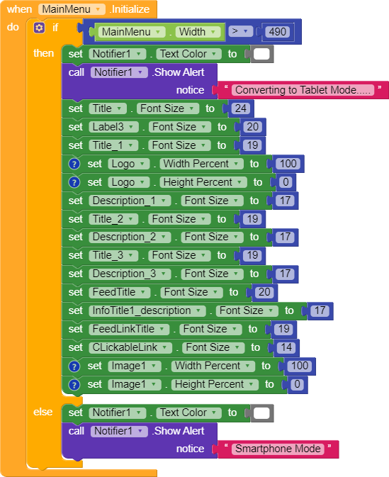
Hello Kodular Developers, I have seen a few pertaining to “Resizing Apps” or “Responsive Screen Sizes” and I believe I found a small alternative to some of the problems people are having. From reading Resize Apps on Different Screen Size, the first step would be to ==set the sizing in Screen1 to “Responsive”.== The next step would be to ==set all components to a percentage instead of pixels.== Setting components to “pixel” mean they are static and wont change in size. With percentages, the component has a range of values to adjust if the screen size is different. Now, this is what I did and it surprisingly worked for me. Here is a screenshot of the code I added to my Main Menu page.
ScreenShot -----
So what I’ve decided to do was check for a particular screen size. After doing my homework and reading many forum posts, screen width sizes for phones are usually under 490. So now looking at my code I’m basically telling the program when the screen initializes and if the screen width is greater than 490, then do the following. I also have somewhat of a check system implemented in there and basically, if the screen width is greater than 490, show alert “Converting to Tablet Mode” and if not show alert “Smartphone Mode”.
When making my app, I usually start with the phone look then after the phone look is good I move to the tablet view which allows me to experiment with different size components. I put the view into tablet mode and adjust the sizes of the components or as you see in my code, I changed a lot of text boxes to be bigger. Once you’ve done that grab a tablet if you can and make your adjustments. But remember the key is the check system which can really help you in making sure your either in smartphone mode or tablet mode.
I’m not really the best developer or app maker but I felt the need to share this. If I’m wrong or you have any questions let me know or post a comment and tag me! Thanks!
That is a good tip. I will use it in my future projects.
Do you know if that 490 is somehow a standard number every phone or small screen device will return?
I went through a lot of device screen size sites to get the best number possible and from what I found, anything bigger than 490 is basically a small to regular size tablet. If that is what your asking. If you need me to clarify just let me know.
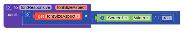
This is for my phone. So you have to look for the screen.width value of your own phone and replace the 411. Then use the fontsize that looks good on your phone.
So basically in your code above, the fontSizeAspect is the screen size of your phone?? And if the fontSizeAspect is the screen size of your phone, you would multiply that by screen width divided by 411? Or is 411 the screen size of your device?
If the screenwidth of my phone is 411 and the screenwidth of someone else is also 411 then the fontsize will be exactly what i showed because it will be 24 * 411/411 which is a ratio of 1 so 24.
Say the screensize of the other is 500 then the app will show 24 * 500/411 is fontsize of 29.
Yes that is correct. Because the other has a bigger screen it will be able to show a bigger letter. If the other has a smaller screen then the font will be smaller.
Hi Peter, I am struggling here to ajust font size accordig to the size of screen. My problem is a little different because I need the text to have 90% the width of the screen. But your procedures gave me some ideas that I will work on as soon as possible.
That said, let me ask you one thing: If the result of fontresponsive procedure is not a natural number, what happens? I mean, the font size can be a not integer number, as 24.568? Or would it cause some bug?
I know it is a very silly question, feel free not to answer, but my phone is not working and due to this f****ing pandemia I can’t fix it, so I have to work without live testing or compiling the apk.
If the android system can’t work on not integers numbers for font size I will try to create a procedure that convert the number generated into the closest integer number.
