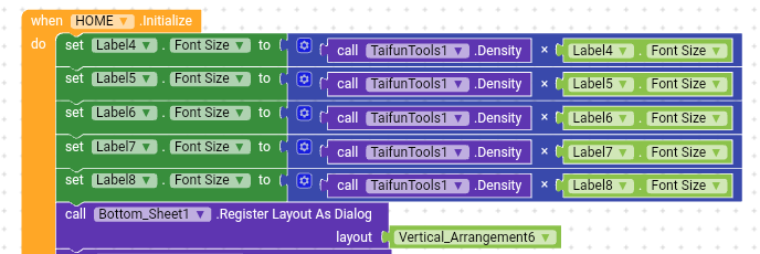
I use this procedure in all my apps. There is no problem with the decimals
It’s no different to setting vertical arrangement height to a percentage of screen height. If the screen height is 2160 pixels and you set the height to 12% it comes to 259.2 pixels which is obviously nonsense. I think Android OS will take care of it and round it.
Font size has nothing to do with screen sizes.
Font size depends on the phone pixel density which varies from phone to phone.![]()
I suggest you to follow this method ![]()
If you want to set same size for all labels then instead of so many blocks, you can use “any Label” component.
Thanks, my friend. I will work with these procedures for now whithou bigger worries.
I suggest you to follow this method ![]()
Very interesting to know it. I didn’t understand very well but I will read more about it and test with different phones when I can. Thanks for the tip.
Actually, the system is already taking care of that by default in responsive mode, so no need to do this.
As far I remember it was you who actually suggested this method
Maybe to find out how big the font size will be however, as I can’t recall that can you post a link where I stated that.
https://community.thunkable.com/t/responsive-text-scalable-text-tutorial-resize-text-english/3800/2
https://community.thunkable.com/t/problem-in-responsive-design-app-looks-different-on-different-devices/21360/6
https://community.thunkable.com/t/how-to-make-fontsize-unifrom-across-devices/3934/6
In none of those post have I stated those blocks you posted
You proposed the concept of of screen density
is this method working for anyone else because when i use this method, my label font size is enlarged too much
so you mean to say that we need to replace the 411 with screen.width? or keep the 411 constant?
Yes Definitely you Need to Change 411, Peter stated in his Post Clearly.
Does this method works for components ??
