Majority of the phones are 360dp however, there are phones with odd sizes, such as width size 540dp, 480dp, 384dp
Edit, Damn forgot Peter’s phone size 411dp
Majority of the phones are 360dp however, there are phones with odd sizes, such as width size 540dp, 480dp, 384dp
Edit, Damn forgot Peter’s phone size 411dp
It is density that determines that, Peter has either 2.6 or 3.5

They didn’t add the Pixel 3/XL or Pixel 4/XL and it’s their own phone 
How to automatically adjust the dpi of an image?
Hi Peter, I am struggling here to ajust font size accordig to the size of screen. My problem is a little different because I need the text to have 90% the width of the screen. But your procedures gave me some ideas that I will work on as soon as possible.
That said, let me ask you one thing: If the result of fontresponsive procedure is not a natural number, what happens? I mean, the font size can be a not integer number, as 24.568? Or would it cause some bug?
I know it is a very silly question, feel free not to answer, but my phone is not working and due to this f****ing pandemia I can’t fix it, so I have to work without live testing or compiling the apk.
If the android system can’t work on not integers numbers for font size I will try to create a procedure that convert the number generated into the closest integer number.
I use this procedure in all my apps. There is no problem with the decimals
It’s no different to setting vertical arrangement height to a percentage of screen height. If the screen height is 2160 pixels and you set the height to 12% it comes to 259.2 pixels which is obviously nonsense. I think Android OS will take care of it and round it.
Font size has nothing to do with screen sizes.
Font size depends on the phone pixel density which varies from phone to phone.
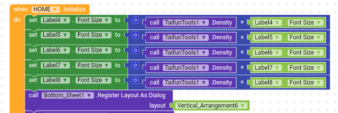
I suggest you to follow this method 

If you want to set same size for all labels then instead of so many blocks, you can use “any Label” component.
Thanks, my friend. I will work with these procedures for now whithou bigger worries.
I suggest you to follow this method 
Very interesting to know it. I didn’t understand very well but I will read more about it and test with different phones when I can. Thanks for the tip.
Actually, the system is already taking care of that by default in responsive mode, so no need to do this.
As far I remember it was you who actually suggested this method
Maybe to find out how big the font size will be however, as I can’t recall that can you post a link where I stated that.
In none of those post have I stated those blocks you posted
You proposed the concept of of screen density
This post was flagged by the community and is temporarily hidden.
is this method working for anyone else because when i use this method, my label font size is enlarged too much
so you mean to say that we need to replace the 411 with screen.width? or keep the 411 constant?
Yes Definitely you Need to Change 411, Peter stated in his Post Clearly.