Have an already prepared UI design
This step is really important. You should design the UI first in a Designing tool like Figma. The reason is simple; to know what to expect.
Don’t have a good idea?
Do you not have a good idea for a UI design? You could visit the Dribbble Mobile section. There are hundreds of thousands of posts.
https://dribbble.com/shots/popular/mobile
Use nice fonts
Fonts are really important for apps. You can find some best ones at here:
https://medium.muz.li/top-5-ui-fonts-for-website-mobile-apps-d78829e58f7e?gi=5f3ef3eb8313
Where can I download fonts?
There are many websites for that. Here’s one => https://www.dafont.com/
Here’s another one, probably 99 % already knows it, but ok: https://fonts.google.com/
Do not overuse animations
This is pretty self-explanatory, please don’t overuse animations.
Do not create useless features
A good example of this is a loading screen that for e.g. always takes 2000 milliseconds to finish, and it doesn’t load a thing.
Use good icons
Please don’t download icons, and then put them as an image. They will be so blurry and will take more space (APP). Instead, use the Material font in the Label properties.
For the name of the material icons, visit this website:
https://material.io/resources/icons/
Use HQ images
If your app needs internet connection, I will always advise you to store the images on a server, and load them in the app. It will reduce the App space. Also, enable Enable High quality images in the Screen1 properties.
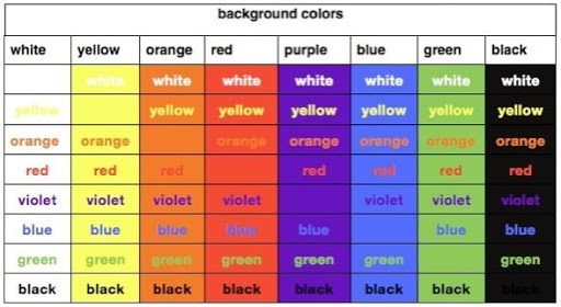
Know color contrast
Please don’t make the user’s eyes go blind ![]()
Here’s a pallete that might help:
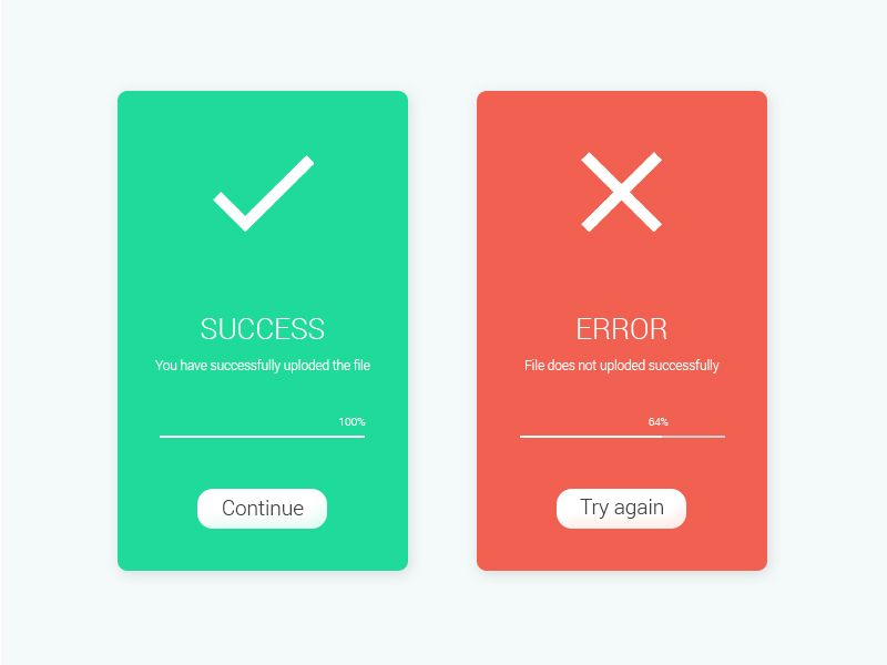
Make custom notifier dialogs
Kodular’s default notifier dialogs aren’t the best, so I suggest making your own.
Here’s an idea:
Check if your app is needed
Before even starting, check if the app is needed. For example, please don’t make browser apps, music players, etc. There are 100s on the Play Store.
Do not spam with ads
I get it, everyone needs to earn but do not bombard users with ads.
Things you mustn’t do:
- Have more than 2 banners visible at the same time
- Run a clock and show an interstitial every e.g. 60 seconds
- Run accidental-click ads
Create a board of things needed
To keep you organized, I suggest you make a board on Trello.
Here’s my example.
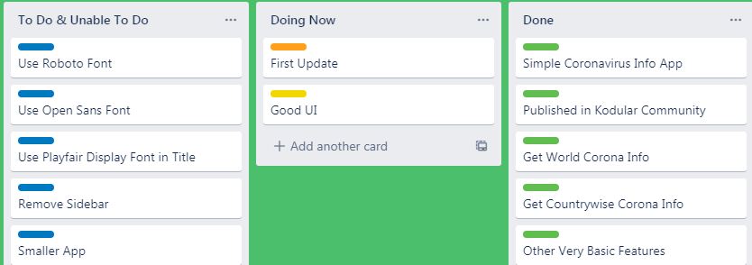
Yes, I know, super nice.
Responsive elements
look at your sizings! No app is good if it just displays good on your device but not on others! So, look up resources and Guides for Responsive screen sizing, e.g.
Card View
If you’re using Card View in an arrangement, then you can set the arrangement background color to Light grey, then set the card view evaluation to Zero or you can reverse it.
If you want to do similar to this
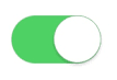
then you can take a card view, Properties: -
Color: Your wish, Padding (All): 0, Corner Radius: 100, Elevation: 0.
Then add your switch inside.
Margin
Please, maintain some margin in-app at left and right, use 2-4% Space. It looks arranged and neat.
Dark Mode
If you add dark mode option in you’re app then you can: -
- Use Dark grey #121212 instead of pure black, it strains the user’s eye.
- Use light grey for card views
- Use white/purple background for buttons and black for text, don’t use blue color while using dark mode.
If anyone finds more tips feel free to edit this Wiki.
Credit to @Sherpuraala!
Use Buttons Made With Card view
If we use Card view as a button then it looks good.
More details are in this guide.
Guide credit to @Xoma