Since in PM we found a solution,
I wanted to make it public so it can be useful to everyone.
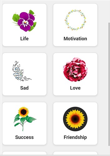
The result we need to achieve is this
First, we perform a getValue
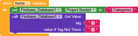
and obtain the structure in this format.
{
	"Category1": {
		"data": [
			"data1",
			"data2",
			"data3",
			"data4",
			"data5"
		],
		"image": "https://site.com/image.png"
	},
	"Category2": {
		"data": [
			"data1",
			"data2",
			"data3",
			"data4",
			"data5"
		],
		"image": "https://site.com/image.png"
	}
}
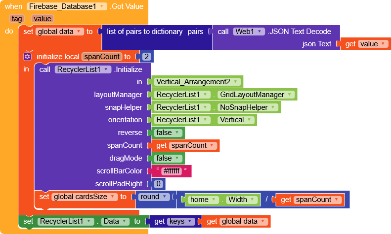
Here I decided to add spanCount to modify two parameters at once:
- the spanCount of the RecyclerView
- and a variable that we’ll use to keep the cards always square.
then we set RecyclerList.Data with the keys of data (Category1,Category2).
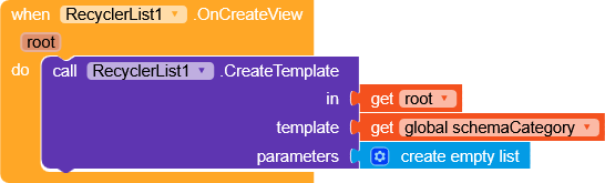
We create a very simple template (I put it in
schemaCategory variable for convenience).
Template
{
    "name": "schemaCategory",
    "metadata-version": 1,
    "author": "Unknown",
    "platforms": [
        "creator.kodular.io"
    ],
    "extensions": {},
    "keys": [],
    "components": [
        {
            "id": "CV_Category",
            "type": "MakeroidCardView",
            "properties": {
                "AlignHorizontal": 3,
                "AlignVertical": 2,
                "ContentPaddingLeft": 16,
                "ContentPaddingRight": 16,
                "CornerRadius": 10,
                "FullClickable": true
            },
            "components": [
                {
                    "id": "CV_Category_Image",
                    "type": "MakeroidCardView",
                    "properties": {
                        "AlignHorizontal": 3,
                        "AlignVertical": 2,
                        "ContentPaddingBottom": 0,
                        "ContentPaddingLeft": 0,
                        "ContentPaddingRight": 0,
                        "ContentPaddingTop": 0,
                        "CornerRadius": 1000,
                        "Elevation": 0,
                        "Height": -2
                    },
                    "components": [
                        {
                            "id": "Image_Category",
                            "type": "Image",
                            "properties": {
                                "Height": -2,
                                "Width": -2,
                                "ScalePictureToFit": true
                            },
                            "components": []
                        }
                    ]
                },
                {
                    "id": "Label_Category",
                    "type": "Label",
                    "properties": {
                        "FontBold": true,
                        "FontSize": 20,
                        "Width": -2,
                        "Text": "Text for Label1",
                        "TextAlignment": 1
                    },
                    "components": []
                }
            ]
        }
    ]
}
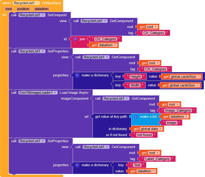
In OnBindView,
- we set the height and width of the card to
cardsSize, - load the image with DevTBImageLoader extension so that it remains cached (you could also use Picasso or similar extensions),
- and set the title of the card.
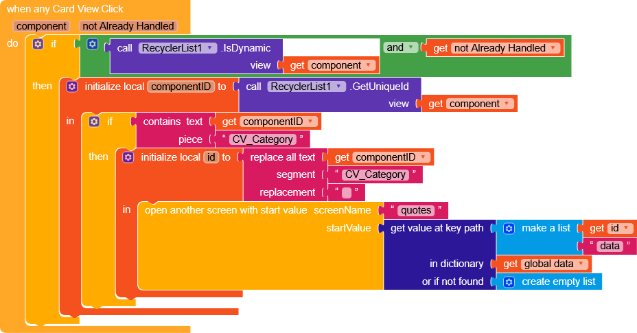
On click, we send to another screen the dictionary containing the data value, which will then be shown in a ListView.
Result

There are a few small tweaks that can be made to make it identical, but I’d say the functional part is there.