tobidwest
November 10, 2018, 9:06am
1
Good morning,
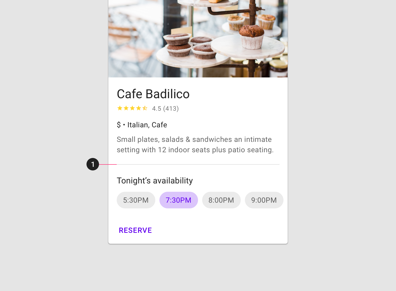
I’d like to have such a button in a card view component as it can be seen in this picture here (the one with the caption “reserve”).
I know there is an extension but I want my card to look like the one generated with this component (and corner radius set to 30).
Anyone knows how to do this?
Thanks in advance, enjoy your day!
schnleon
November 10, 2018, 9:16am
2
Hello,
2 Likes
Shreyash
November 10, 2018, 9:16am
3
Why don’t you customise the already available cardview component?
3 Likes
tobidwest
November 10, 2018, 5:25pm
4
@Shreyash Thanks, but I can’t found any option to add buttons @schnleon Thanks, but I want it to look like a button with visual feedback.
Shreyash
November 10, 2018, 5:27pm
5
What about dragging and dropping a button in the cardview?
1 Like
tobidwest
November 10, 2018, 5:28pm
6
Doesn’t look like a card button
Shreyash
November 10, 2018, 5:29pm
7
You need to customize it to make it look like a card button.
tobidwest
November 10, 2018, 5:30pm
8
@Shreyash
Shreyash
November 10, 2018, 5:32pm
9
What about changing font size?
1 Like
tobidwest
November 10, 2018, 5:39pm
10
@Shreyash
Shreyash
November 10, 2018, 5:49pm
11
It seems you are a beginner.
tobidwest
November 10, 2018, 5:53pm
12
Thanks for trying to help me, but I found a solution
I added space set to “fill parent”. On the right of it I put a card view with white background and a label with the text the button should have. Then I set the card to full clickable and content botton/top padding to 0.
1 Like
yusufcihan
November 10, 2018, 8:15pm
13
Actually I can say this is not your solution, @Shreyash already said that: Change the properties of button for looking like card button.
2 Likes
tobidwest
November 10, 2018, 8:59pm
14
I did not change how the button looks, I use a small card view for.
system
December 10, 2018, 8:59pm
15
This topic was automatically closed 30 days after the last reply. New replies are no longer allowed.