Discuss about Makeroid Builder v3.0.1 (Bugs + Suggestions + User Opinions)

Hello,
When I launched the builder I’ve seen a few bugs that I suggest you guys to fix it with a 3.0.2 or 3.1 update because there are some design and performance bugs.

Bugs

  1. [BLOCKS EDITOR] The lag on the blocks editor is here for another time, worse. It’s working so laggy that I can’t code. The previous build was more stable on the blocks editor.
  2. [LANGUAGE SWITCHER] In the language change menu the “Turkish” language is named as “Türk” that is wrong on language names. It should be called “Turkish”.

languagesmenu

  1. [DESIGN - SPLASH SCREEN] The CheckBox that allows us to hide the splash screen forever needs to have a bit more space to display more good. This way it’s looking bad.

splashscreenbug

  1. [EMULATOR GAP] There is a small gap inside the device and the elements. This is not a new bug but it’s not fixed since the old update.

  1. [THEME SWITCHING] When I switch to the dark theme, the gray text stays gray but it should change to white. Only the creation and edit dates are gray. The app title on the main list changes to white.

  1. [TABLET LAYOUT BUG - EMULATOR] The tablet layout bug is still here.

Suggestions

  1. [COMPONENTS MENU - POLL] So this one is based on other users opinions. So I’m going to add a poll here.

Did you liked the new components design (left bar)

  • Yes
  • No

0 voters

  1. [EXTENSIONS SUB MENU - COMPONENTS VIEW] The “Add Extension” button could be oriented to center not left. It will look better on center.

extensionbutton

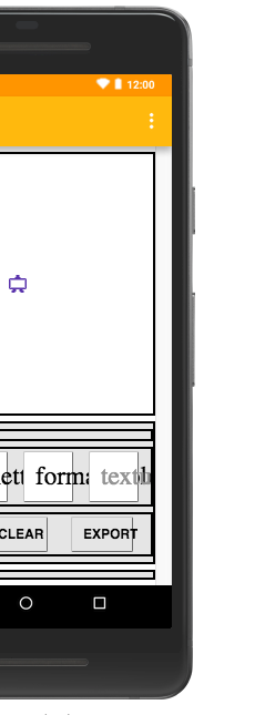
  1. [TEXTBOXES (INPUT)] As you know, Material Design has updated their guidelines and now they’ve redesigned the textbox and it has a square around it. You can see images on the internet. So these textboxes could be designed like them.

mdtextbox

  1. [GET SUPPORT FAB BUTTON] The “Subscribe to Updates” Fab Button has a small white line around it. If removed it would look better as Material Design doesn’t have something like that in it’s standards.

fab

IMPORTANT NOTE: These bug and suggestion reports are targeted to make the Makeroid Builder more stable. It doesn’t have a target to disturb your business or in any other way.

IMPORTANT NOTE 2: Any other bugs found will be replied to this thread. Please if you’ve also found any bugs or have any suggestions please reply to this thread.

Thank you for serving a good web app like Makeroid for letting us creating apps easier :slight_smile:.

2 Likes

Thanks for all of this, it’s quite useful. We’ll try our best to work on all this.

That’s where the scrollbar would be if you had the “Scrollable” property enabled.

I will take a look into this.

1 Like

Yes understood now, but is it possible to hide that gap when the scrollbar is not active?

Because I don’t have enough space to work and design my app while that gap is there.

1 Like

by the way, just forgot including in the list (adding to the list now):

The tablet layout bug is still here

Treating it point by point:


@Conor is going to take a look to this


That Switcher takes the ORIGINAL language name from the original language
So, in Turkish case it’s Türk


@Vishwas Can you fix it?


As @Conor said, it’s due to the Scrollable property


@Vishwas :sweat_smile:


We asked @ProKoders what they thought, and they said they liked it


@Vishwas


@Vishwas What do you think?


That’s OneSignal button. We can’t change it too much. The ring must stay there

It’s there too in AI2 server, but we aren’t sure to be able to remove it

1 Like

don’t remove it, just hide it when it’s not necessary as I’ve said.

1 Like

Happy to hear that :slight_smile:

But in Turkish it doesn’t have any sense the word “Türk”. Yes, we’ll be able to understand it but… still it’s wrong.

If you ask me, it takes extra space, unnecessary space. The listview was less fancy, but it used to take less space and it was easier to see. But If you still think that It’s going to stay that way, I suggest you to design them as cards as they will look better. This way it’s so, solid.

Here is the new design Google provided. (Material Design)

OK understood :slight_smile:.

Hello @TurboProgramming
Thanks for reporting these bugs.

We’ll look into this. A minor issue which will be fixed for the next update.

The dark theme has a few things yet to be perfected. As of now, I can only ask you to use the light theme until we fix these issues.

Could you elaborate?

We have a scalable phone which will be released soon.

Rather than simply asking for a yes/no opinion and dividing the forum into two, we would prefer constructive criticism as to how it can be improved.

Thanks for your help and interest in making Makeroid better!

1 Like

But that is done like that in ALL languages…
We can’t change that :disappointed:

İt can be ‘‘Türkçe’’
Turkish citizens are called to ‘‘Türk’’

2 Likes

Okey :+1:

I’ll update it for next version

1 Like

I hope you realise that these are text fields, and not text boxes.
There’s a difference.

Text boxes do not have the box like background unless they are multiline

please see my updated answer. I’ve provided screenshots and links to the original Material Design Guidelines page. They’re called “States”.

Wow. Great idea. That’s what I want :slight_smile: Thanks.

I’ve said at the end that if anyone has other feedback and suggestions to reply to this thread. Of course I didn’t meant something like that.

Always no problem :slight_smile:. Thank YOU for serving us a better version of App Inventor :smiley:.

That design is applied to the multiline text fields + single-line.

Also the reason I’ve said to change that is that they will look better. This way it’s a bit complicated to understand where are the textboxes. Because there are so many elements in the properties page. That way it will look, “Clean”. Try and see :slight_smile:

1 Like

We have heard plenty of times from our users, not excluding you, that Makeroid can be more material.
We presume that when we do bring in such changes, the requirements of our users do not change beyond recognition. That being said, the new grid view doesn’t cause any usability issue. When you think about it, there is more area from which a component can be dragged .

No by that I was talking about the properties view. That has the app name field, background color etc.

@TurboProgramming I was talking about this.

Guys,

This is a topic about bugs or about suggestions?