New version:
ABOUT THE EXTENSION
Creates a new RecyclerView and allows you to dynamically add widgets to it. Which can have their own styles depending on their type. This extension support extension addOns, which extends widget support. Basic extension supports Buttons,ImageButtons, Card, TextBox, Image, Arrangement, ProgressBar, RatingBar and Label.
RECYCLERVIEW
“A flexible view for providing a limited window into a large data set.”
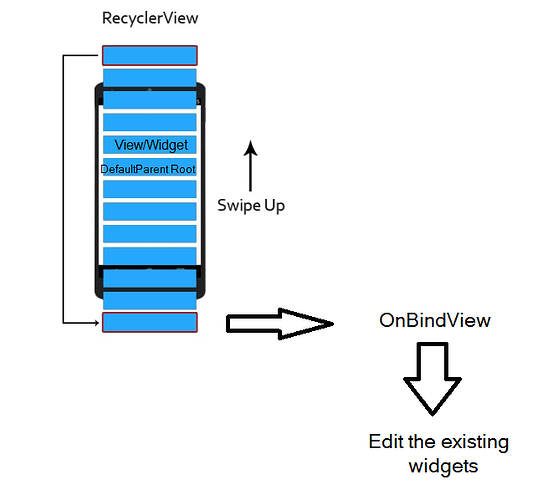
The RecyclerView recycles all the views inside it, creates only the views necessary to fill the screen size it occupies, and edits the existing views each time it is scrolled (and each time an item needs to be edited it changes position). RecyclerView is scalable compared to dynamic components, which is an option, but not recommended for larger data because widgets must be created the same number of times as the amount of data, which can (very likely) lead to a lot of errors in the performance of our applications.
POPUP MENUS
Popups were added to show options over your widgets, you can choose between those two:
- CUSTOM COMPONENT POPUP
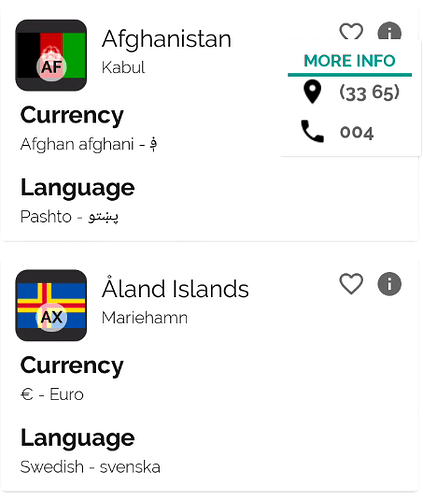
Select your popup component and show it over every item.
ANIMATIONS
Do item changes with animations.
PLACEHOLDER
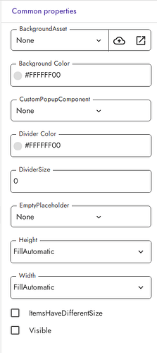
Configure a placeholder component that will be displayed when the list is empty (image above).
DIVIDER
Set a divider between each item, depending on RecyclerView layout manager.
LAYOUT MANAGER
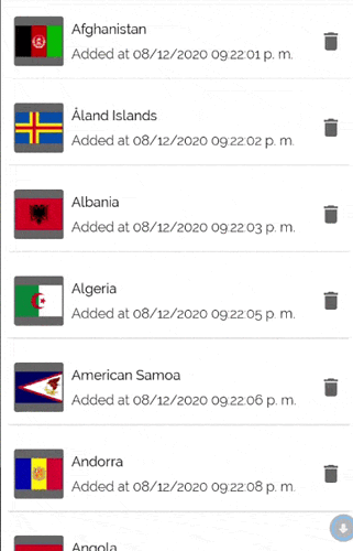
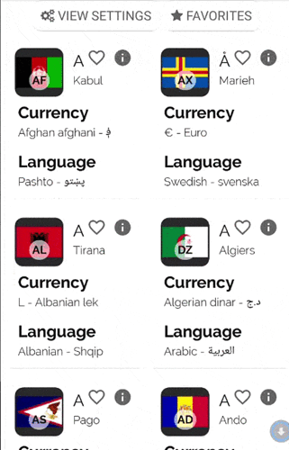
Edit the layout manager easily and quickly according to your requirements. Supported layout managers : “GridView, ListView and StaggeredListView”.
WIDGET ADDONS
The extension supports complementary widgets that are other extensions that allow the support of new widgets for our RecyclerView.
BASIC WIDGET PROPERTIES
Each widget has different editable properties than others, even addons could have their own properties and blocks, here is a list of some common properties:
SIZE
WIDTH
How wide the widget wants to be.
HEIGHT
How tall the widget wants to be.
WEIGHT
Indicates how much of the extra space in the parent will be allocated to the widget.
DISPOSITION
ORIENTATION
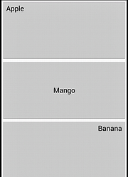
Set if the arrangement should be a column(vertical) or a row(horizontal).
GRAVITY
Specify the gravity of a container, all its content will be positioned according to its gravity.
PADDING
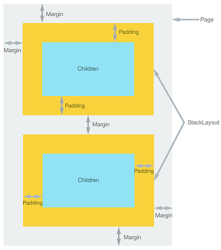
Distance from edges to content.
MARGIN
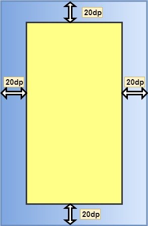
Distance from the sides of the widget to the next (or the widget where it is contained).
ELEVATION
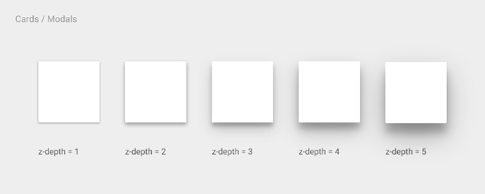
The Z axis position.
BACKGROUND
BACKGROUND
Widget Background, it could be a color, an asset, an url, or a list of colors(for gradients).
BACKGROUND GRADIENT DIRECTION
in case the background of the widget is a gradient, we can select its direction
TEXT
TEXT
Is the text that the widget will display.
TEXT COLOR
TEXT SIZE
FONT TYPEFACE
MAX TEXT LINES
It is the maximum number of lines that a widget can draw.
HINT TEXT
Placeholder text for TextBoxes.
HINT TEXT COLOR
Placeholder color for TextBoxes.
IMAGE
PICTURE SOURCE
String that points to file, asset or url.
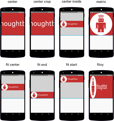
SCALE TYPE
The method that Image uses to scale the picture.
SCALE SIZE
Is the proportion with which the image will be scaled, from 0.0 to 1.0(full image size).
COLOR FILTER
Images can apply a color over pictures.
PALETTE
ITEMS SIZING
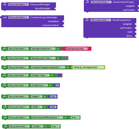
Property “ItemsHaveDifferentSize”, if RecyclerView items size will be the same or won’t change, the property should be disabled, this way the RecyclerView could have even a better app performance. If the items have for example a label that will draw differents mount of line depending on data, this property should be enabled.
BLOCKS
CREATION BLOCKS
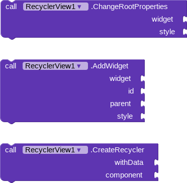
These blocks have to be used to start the recyclerview, you can add different widgets with their own style, edit the “Root arrangement” style and which widget it will be, those widgets “AddWidget” and “ChangeRootProperties” have to be used before “CreateRecycler”.
The “CreateRecycler” block adds the RecyclerView to the screen and make a link between data list and it. Any data change could be reflected using “Notify…” blocks.
LAYOUT MANAGER
These blocks can be used to change RecyclerView layout manager. Actually supports List, Grid and StaggeredGrid. They should be used with “SetLayoutManager” block.
STYLE
The Style is a dictionary containing widget properties which could be used directly or in global Variables if it needs to be used in many widgets.

You can also make a list of Styles or Variable styles, if a widget need to copy a style but make some changes.
RUNTIME BLOCKS
These blocks could be used after or before RecyclerView is initialized.
WIDGET EDITION BLOCKS
These widgets have the responsability of make widgets changes, each widget could react different to these blocks, as could not support them. AddOns could have their own edition blocks.
These widgets usually need two important variables, the widgetId(which was choosen when it was created) and the rowPosition(we can get it from events).
EVENTS
![]()
“OnBindView” is called when RecyclerView gets scrolled and shows a new item. “position” and “groupPosition” will be provided by the event, so we just need some blocks to edit the widgets when RecyclerView changes its position.
“OnPopupItemClicked” is called when a popup menu item is selected or when a custom popup closes.
“OnRecyclerCreated” is called when RecyclerView is on screen and ready to work.
“OnWidgetClicked” is called when any widget from any position is clicked, it returns the widgetId, position and rowPosition, so we can edit the widgets when they are clicked.
NOTIFY… BLOCKS
These blocks notify RecyclerView that data changed and then it updates the visible items.
